
Fox Créateur. Monday Music — Monday Music es una productora y editorial de música de Barcelona. Harper's Bazaar - Carolina Herrera. Production audiovisuelle et nouveaux médias. Design Studio, Lausanne, Switzerland. The Boston Globe. The Work Cycle. More Hazards More Heroes. Build a Website - Squarespace.
Rally Interactive. 50 Examples of Responsive Web Design. Nowadays, it's not only important to develop your clients' websites to look good on all browsers, and on PC and MAC, it's also a must that websites are viewable on tablets and mobile devices.
A lot of people opt for making one version of their site for desktop and another for mobile. Others choose Responsive Design, a mix of fluid grids and layouts, flexible images and an intelligent use of CSS media queries. There are quite a few sites dedicated to lending a hand with responsive grids, Gridpak, CSSGrid, Skeleton and SimpleGrid, just to name a few.
Here are 50 (plus 1) examples of responsive websites. Go to website. Solo - Project management for the modern freelancer. Trends. Na stronie używamy plików cookie w celu ułatwienia korzystania ze strony, tworzenia statystyk, dostosowywania reklam do zainteresowań.
Jeśli się nie zgadzasz na cookies, zmień ustawienia przeglądarki. Więcej informacji. Zgodnie z obowiązującym prawem informujemy, że nasze strony wykorzystują pliki cookies. Informacje zapisane w plikach cookies mogą być wykorzystywane do: tworzenia statystyk które pomagają zrozumieć, w jaki sposób użytkownicy serwisu korzystają ze stron internetowych, co umożliwia ulepszanie ich struktury i zawartości,utrzymania sesji użytkownika serwisu (po zalogowaniu), dzięki której użytkownik nie musi na każdej podstronie serwisu ponownie wpisywać loginu i hasła,dostarczania użytkownikom treści reklamowych bardziej dostosowanych do ich zainteresowań. W przeglądarce internetowej można wyłączyć całkowicie obsługę cookies lub zmienić szczegółowe ustawienia dotyczące plików cookies. Home. Niessing München. Change – Help Make It on Behance. SilkTricky. SixSixSeven – The Next Step. Advice Fontshop Fonts.com Typo Berlin Selekkt Codingpeople F1online Bölling.
Galerie Verzeichnis Magazin Blog Jobs Facebook 35.071Google+ 32.708Twitter 9.380Newsfeed 7.519 SixSixSeven – The Next Step Tweet Like Plus Marktplatz für junges deutsches Produkt-design selekkt.com. Flow Festival 8.-12.8.2012. Massive Digital Creative Agency. dConstruct 2011. Sweet Hat Club. WWF France. Home - Rock Werchter 2013. Public Class. Revolution. W+K Amsterdam - everything. ARAMA / FÆBRIC. Oded Arama is a 33 years old designer from Tel Aviv, Israel. In the following interview you can read about his way of becoming a shoe designer and founding his own brand ARAMA. How did you get to study in London? Oded Arama: As I was about to obtain my B. Des degree in Fashion design from the Shenkar College in Israel, I was working with a shoemaker in Tel Aviv to help me create the shoes for my womenswear collection.
I was absolutely amazed by the creative process for the shoes and its beautiful outcome, and just had the feeling it was only the beginning of something much greater.Months later I travelled to London for a very exciting internship in fashion studio “Preen”, where I had the privilege of being part of the creative process for the spring/summer 2009 collection. Was that a dream of yours, because the school is really good? When did you decide to start a shoe brand? What do young people need to know if they think about becoming a shoe designer? What was the biggest challenge? MORE Mobile Relations - Work. MINIMA. FO (FRAGILEOBSCURITY) Atlason. 30 Grid-Based Websites.
Recognition and prestige for Web Designers and Agencies 30 Grid-Based Websites February 22 By awwwards-team In Web Design Grid-based layouts have become very popular in web design Share on Facebook Share on Twitter Share on Google Share on Stumbleupon Share on Pinterest Share on Linkedin In the last two years or so, grid-based layouts have become very popular in web design.
By Awwwards Team awwwards.com Awwwards – recognizing the talent and effort of the best web designers, developers and agencies in the world. Hanging up the moon. Interview with Martin Pyper on Posters in Amsterdam. Martin Pyper from Me Studio is a designer with a drive and a very nice design blog.
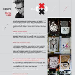
He has built up a lot of design and art directing experience over the years at agencies like VBAT, CCCP media collective, BBDO and PPGH/JWT. Now he works mainly solo creating designs in diverse styles and doing all the tasks and chores that make a design agency run. From building identities to making coffee. He considers himself lucky. Because he still loves his job as much as he did 20 years ago. Q:What made you start as a designer? Q:What do you like about designing posters? Q:Where do you get your inspiration from? Music is definitely my greatest source of inspiration as a person. Portfolio of art director & web strategist Alessandro D´agnano. Naomi Atkinson - Designer and Illustrator. 2012 Sasquatch Music Festival! Think Vitamin - A blog for web designers and developers. Plant-Based Eating At Its Best.
Sparkbox. An Austin, Texas based Architecture & Design Studio. Stephen Caver — Luck is probability taken personally. Totally Ace Website Design & Development in Manchester. Skive Festival 2012.