
Content Choreography. CSS3 Multiple Column Layout Module. The Multi Column Layout Module has been introduced to help us create columns quickly and easily using CSS3 only.
In this tut I'm going to be taking a look at some of its properties and demonstrate them through a series of examples. Introduction Anyone who has tried to create multiple columns in the past using CSS will already know that this type of layout has been achievable for a long time. However, this has often resulted in the use of hacky techniques and floats. More often that not this has been quite time consuming and definitely not the easiest of layouts to create. The new approach, which is an extension to the current CSS box model, allows content to run from one column to another and makes it easily adaptable for different viewing devices and dynamic data. Designing for Large Screens. The premise behind a responsive web isn't purely that websites be built in a mobile-friendly way.

It's about setting our content free so that it can be experienced by whatever means necessary – and that includes at large scale. Let's take a look at the design considerations behind the often neglected huge desktop screen. What's the Big Deal? What's the Big Deal? Sketchsheets for Responsive Web Design. With the constant evolution and popularity of mobile devices, designing web sites responsively is essential.
Unlike designing for a static or fixed web site, the fluidity and flexibility of a responsive site can make the design process tricky and at times almost impossible to successfully convey visually your design ideas. We are here to help you out by highlighting some of the most useful and basic tools available for responsive design: A pencil and some paper. Or, just to be clearer, sketchsheets specifically for designing responsive websites. Here they are: Giving Content Priority with CSS3 Grid Layout. Responsive Column Layouts. Posted at Web Designer Wall Typically, to create a column layout, you would need to add the first or last classes to reset the margin space and clear the float. Today I'm going to share a very simple CSS trick to create a responsive column layout using nth-of-type pseudo class. I use this trick to code the WordPress themes at Themify. It doesn't require any first or last class and the number of columns can be adjusted base on the viewport.
In other words, it can be toggled from 4-column to 3-column or 2-column, etc. The inconvenience of using the first & last classes Normally we would add a .first or .last class to clear the margin space and float in the grid. Designing responsive websites (AKA mobile sites) properly. Posted at Andres Pagella Over the course of my career, I have been very fortunate to work with many creative and talented UX/UI and Visual designers that were able to come up with great solutions to very complex problems. Luckily, I still do. But whereas many of my creative colleagues have kept the pace with the advances of technology, it'd seem to me that others are struggling to design responsive websites properly. Understandably, keeping the pace with the advances of technology, specially web technology, can become overwhelming - specially when you need to practically change your entire set of tools and the way you work every 2 or 3 years (if you want to keep up to date, obviously, which some people decides not to do).
Give Floats the Flick in CSS Layouts. Posted at Sitepoint by Andrew Tetlaw If you're new to CSS layouts, you'd be forgiven for thinking that using CSS floats in imaginative ways is the height of skill.
If you have consumed as many CSS layout tutorials as you can find, you might suppose that mastering floats is a rite of passage. You'll be dazzled by the ingenuity, astounded by the complexity and you'll gain a sense of achievement when you finally understand how floats work. Don't be fooled. You're being brainwashed. Opt-Out Responsive Design? Posted at CSS-Tricks by Chris Coyier Reader Glynn writes in: I'm wondering if you'd ever seen a responsive web design in which a "see full site" link was included. I know that when developing a responsive design we should stay away from hiding content completely, however some users may actually prefer pinching and zooming and using good old fashioned horizontal menus on their devices.Have you seen an example of this and how do you think it could be approached?
Responsive CSS Framework Comparison: Bootstrap, Foundation, Skeleton. Bootstrap 4.0.0-alpha is a fairly large update to the framework.
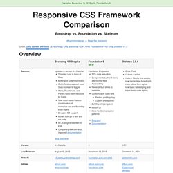
It has dropped Less support in favor of Sass, converted from px-based to rem-based sizing, improved its grid system, and dropped IE8 support. Also, all its JS plugins were re-written in ES6, it now uses a customized reset CSS file called Reboot, and offers flexbox support via a Sass boolean variable. In addition to this update, Bootstrap now offers themes at themes.getbootstrap.com. Also, Bootstrap will continue supporting version 3, unlike the dropping of version 2 support after the release of version 3. The Infinite Grid. Posted at A List Apart by Chris Armstrong Grid systems are a key component of graphic design, but they’ve always been designed for canvases with fixed dimensions.
Until now. Today we’re designing for a medium that has no fixed dimensions, a medium that can and will shape-shift to better suit its environment — a medium capable of displaying a single layout on a smartphone, a billboard in Times Square and everything in between. We’re designing for an infinite canvas — and for that, we need an infinite grid system. It’s common to think of responsive design as multiple layouts: mobile, tablet, desktop, etc. Create fluid layouts with HTML5 and CSS3. Responsive Web Design Patterns. Responsive Patterns A collection of patterns and modules for responsive designs.

Submit a pattern. Complex Navigation Patterns for Responsive Design. The most frequently asked question I get since posting my responsive navigation patterns article is: How do I handle complex navigation for responsive designs?”
Great question, but before we get down to brass tacks, I urge you: use mobile as an excuse to revisit your navigation. Look at your analytics. Don't Overthink It Grids. The vast majority of websites out there use a grid.
They may not explicitly have a grid system in place, but if they have a "main content area" floated to the left a "sidebar" floated to the right, it's a simple grid. If a more complex layout presents itself, people often reach for a grid framework. They assume grids are these super difficult things best left to super CSS nerds. That idea is perpetuated by the fact that a lot of the grid systems they reach for are very complicated.
Diving Into CSS Regions. A responsive CSS grid system. Responsive Tables with CSS/JS. Why We Built This When we looked around at the various implementations of responsive tables on the web, we saw lots of interesting ideas but nothing we thought was a really great implementation.
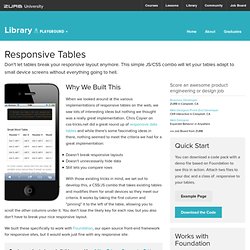
Chris Coyier on css-tricks.net did a great round up of responsive data tables and while there's some fascinating ideas in there, nothing seemed to meet the criteria we had for a great implementation: Doesn't break responsive layouts Doesn't unnecessarily hide data Still lets you compare rows With those existing tricks in mind, we set out to develop this, a CSS/JS combo that takes existing tables and modifies them for small devices so they meet our criteria. Flexible Web Design: Creating Liquid and Elastic Layouts with CSS. CSSeasy.com - Learn CSS the modern way. Responsive 3D Panel Layout.
Website Navigation Trends for Various Layouts. CSS Templates. Pixel Perfect Responsive Design Testing Tool. Web Template Generator. Building an Online Web Design Portfolio. Superheroic JavaScript MVC Framework. Responsive web design. CSS-Only Responsive Layout with Smooth Transitions. Style Tiles.
Tricks for Responsive Design. Making the design to be responsive is very easy as shown in my Responsive Design in 3 Steps tutorial, but maintaining the elements to look aesthetically balanced on all breakpoint layouts is an art. Today I’m going to share 5 of my commonly used CSS tricks along with sample cases for coding responsive designs. They are simple CSS properties such as min-width, max-width, overflow, and relative value — but these properties play an important part in responsive design.
View Demos 1. Responsive Video (demo) This responsive video CSS trick was discovered by tjkdesign.com. 2. Max-width property allows you to set the max width of the element. Max-Width Container In the example below, I specify the container to display at 800px if possible, but it should not exceed 90% of the boundary width. Responsive Image You can make the image auto resize to the max width of the boundary by using max-width:100% and height:auto. The above responsive image CSS works on IE7 and IE9, but doesn’t work on IE8.
Mockups. So you've just taken some killer photos with your new DSLR, or you captured a great video with your iPhone — what's next? While it feels natural to just post media quickly to your Facebook Page, sometimes great photos or video need their own home in the form of a personal website. But on the other hand, it's not easy to make a website layout that complements rich media. Responsive Web Design. Responsive web design has been a trending topic for a little while now, plenty of tools have been developed around this technique to help designers and users to get the most out of their mobile and tablet browsers. Even if responsive design is not limited to small devices, most of the resources published today target the mobile and tablet world and try to provide easy ways to build beautiful and flexible websites.
When dealing with responsive design, the first thing most designers think about is media-queries. In this article, we will go far beyond the media queries, and showcase a list of pretty useful tools and resources everybody could use to improve the display of their website for mobile, tablet, and of course desktop browsers. Just Build Websites. Webdesign tutorials.
Responsive Design Workflow: Mobilism 2012.