Grid Based Web Design Resources. As a complement to our prior post "30 Grid-Based Websites", we've made a selection of indispensable resources like layout frameworks, tutorials, books, templates and useful tools that can help you understand and implement grid based design in your projects.
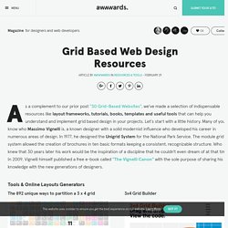
Let's start with a little history. Many of you know who Massimo Vignelli is, a known designer with a solid modernist influence who developed his career in numerous areas of design. In 1977, he designed the Unigrid System for the National Park Service. The module grid system allowed the creation of brochures in ten basic formats keeping a consistent, recognizable structure. Who knew that 30 years later his work would be the inspiration of a discipline that he couldn't even dream of at that time. Tools & Online Layouts Generators The 892 unique ways to partition a 3 x 4 grid The 3 × 4 grid poster is a computation-based design.
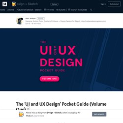
Photoshop Grids and Plugins Frameworks Books & Geekeries This notebook is designed for digital designers. The ‘UI and UX Design’ Pocket Guide (Volume One) □ 8.
Should Designers at least understand how code works? 🙈🙉🙊 Should designers code? Oh this debate will be here till the end of time, and I’m not getting into that particular argument, but instead sharing my thoughts on why it can be beneficial to at least understand how code works. From personal experience I feel having a knowledge of code has been extremely beneficial to building great relationships with engineers on a project when the time has arisen, and even for those times when I’ve been working alone.
Along the way I picked up enough coding knowledge to be dangerous, and this helped me when working solely on a project, and not farming out the development. 8-Point Grid: Typography On The Web. DAESK. Do More. Work less. – Analyze your work and focus on what matters. 6 Landing Page Design Tips for Small Business Owners. Behance. 10 Modi di Utilizzare gli Effetti Parallasse sui Siti Web. Se vuoi sapere come usare gli effetti parallasse sui siti web, noi abbiamo la soluzione giusta per te.
Gli effetti parallasse servono per conferire profondità e ricchezza al design del tuo sito web semplicemente scorrendo due o più immagini che, ad esempio, raccontano una storia o evidenziano caratteristiche importanti di un prodotto. Gene Crawford, un illustre designer, sostiene che: «Per attirare l’attenzione degli utenti è importante costruire effetti visivi intorno alla tua narrativa». Ebbene, l’aspetto interessante dei parallasse è proprio questo: tengono incollati i visitatori del tuo sito e, inoltre, sono loro a decidere quando scorrere le immagini, senza stress e a seconda dei loro ritmi. WordPress offre tantissimi temi corredati da questi effetti, quindi, se vuoi dare un tocco in più al tuo sito non farteli scappare. Non sai come usarli? 29 layout per siti web con effetti di animazione spettacolari. 18 Great Examples of Sketched UI Wireframes and Mockups - Web Design Ledger.
Whether you’re designing a user interface for a website or an iPhone app, it’s always a good idea to start with a wireframe.
It can be a big time saver if you’re able to nail down the placement of major layout elements early on in a project. There are a number of wireframing applications out there, but a lot of user interface designers like to start out on paper with sketches of what things might look like. With so many tools available to quickly create digital wireframes, some may argue that this is an unnecessary step in the design process. But I think the free flowing style of a sketched wireframe or mockup can be refreshing. Besides, there’s nothing like good ole pencil and paper to get the creative juices flowing. For this post, I’ve collected 18 great examples of sketched UI wireframes and mockups. NationWide / NASCAR. 15 Beautiful and Minimalist Websites. Some weeks ago I published 20 Amazing UI/UX Web Designs, where I talked about the importance of minimalism (in color and layout), neatness and one clear message (like business cards).
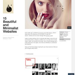
Lately I’ve been working a lot on corporate web design (check #3) and summarizing what a company is, believe me, it’s no easy task. For that reason, today I am focusing on this topic. Each of these examples did a pretty good job on this aspect, all are fast and effortless to understand. And beautiful. Hope you find these designs inspiring for your future web site. 1. 2. 3. everisDigital 4. 5. 6. 7. Applying the Rule of Thirds to Web Design. This is a fascinating subject that doesn’t always get discussed in the realm of web design.
Photographers are probably familiar with the rule of thirds related to photo composition. But how can interface designers use the rule of thirds to create interesting digital designs? In this post I want to explain the rule of thirds and share a few tips on applying the rule into a website layout. Not everyone will find this helpful and it’s often better to stick with a regiment that expedites the process. Yet the rule of thirds is such a basic concept that it’s definitely worth learning about how it works and how it applies to website layouts. The Grid. 20 progetti per interfaccia grafica flat da scaricare gratis.
Username: Password:
30 esempi di layout per siti web minimalisti di colore scuro. Username: Password: Fargot Password?
/ Help. Grafica per landing page creative da cui prendere spunto. Username: Password: