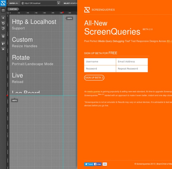


Responsive Website Design What is Responsive Website Design? A responsive website is a single website that adapts to the device of each unique visitor, whether desktop, smartphone, or tablet. A responsive website dynamically re-sizes its content and imagery for a variety of different screen sizes in order to ensure the website is effective and easy to use on any device. Why should I use Responsive Website Design? Rapidly growing mobile usage
Replacing Respond JS with Sass So you’re building some really cutting/bleeding edge web sites. You’re using HTML5, CSS3, and media quieries to serve your users some fast, repsonsive, and beautiful code/websites. Your life is great, and you love the work you’re producing… Then you have to make sure your code is working in legacy browsers like IE7 and 8… So you throw some polyfils like Modernizr at these legacy browsers… and now they understand HTML5. You used progressive enhancement from the beginning, so the CSS3 you’re using looks fine in browsers that don’t understand it.
Welcome to Jinja2 — Jinja2 2.7-dev documentation Jinja2 is a modern and designer friendly templating language for Python, modelled after Django’s templates. It is fast, widely used and secure with the optional sandboxed template execution environment: <title>{% block title %}{% endblock %}</title><ul>{% for user in users %} <li><a href="{{ user.url }}">{{ user.username }}</a></li>{% endfor %}</ul>
Web Culture: Grid-based Layout Designs The semantic web has brought on a new generation of Internet technology. As designers and developers work together to redefine the rules of the web, the number of open-source projects and third-party APIs continues to grow. The opinions of web scholars differ on the use of grid systems. Many argue that setting grid points limits the creativity of designers. Others contend that a grid provides a scientific basis for a design to be perfected. SelectNav.js - responsive drop-down menu - pure JavaScript About SelectNav.js is a JavaScript plugin that lets you convert your website navigation into a select drop-down menu. Used together with media queries it helps you to create a space saving, responsive navigation for small screen devices.
Responsive Web Design: Using Fonts Responsively Typography is one of the most important aspects of responsive web design, and optimizing your fonts for mobile devices is an absolute necessity if you want your content to be palatable across all screen sizes. Fortunately, the process of building flexible fonts is not very difficult. When we talk about flexibility (which is the guiding principle in this case), we cannot overlook the specified size of the font we’ve chosen to adapt for our responsive website. We may use different metrics for this purpose, including pixels, ems, rems, or percentages. Choosing the right metric is critical for designing a malleable, responsive interface. In this continuation on responsive web design, I’ll explain how to manage dynamic fonts responsively, and I’ll analyze all of the aforementioned metrics, comparing the strength and weaknesses of each choice.
Elastic Image Slideshow with Thumbnail Preview Today we want to show you how to create a simple elastic slideshow with a thumbnail preview. The slideshow will adjust automatically to its surrounding container and we can navigate through the slides by using the thumbnail previewer or the autoplay slideshow option. View demo Download source iScroll This script has been superseded by iScroll 4 . This page is kept for historical reasons . Project info Meteor Track invitations and RSVPs to events. With d3.js animations. Try it yourself In about 3 minutes, you'll make your own copy of All Tomorrow's Parties and deploy it live on the Internet for you and your friends to use. No programming knowledge required!
CSS3 Responsive Slider / Carousel Using Radio Buttons Select catcher Created by Ian Hansson (@teapoted) Art from Brendan Zabarauskas (@bjzaba_). Icons from the iconSweets set. Responsive Multi-Level Menu A responsive multi-level menu that shows its submenus in their own context, allowing for a space-saving presentation and usage. View demo Download source Today we want to share an experimental drop-down menu with you. The main idea is to save space for menus that have a lot of content and sub-levels. Each sub-level in this menu will be shown in its own context, making the “parent” level disappear. This is done with subtle animations that are defined in separate animation classes.