
Logo design: 60 pro tips. Great logo design requires a complex mixture of design skills, creative theory and skilful application.
Any designer worth their salt can create a fit-for-purpose logo, but truly mastering all aspects of the craft takes time. Exclusive offer: Save 15% on Adobe Creative Cloud now. Blog – Golden Ratio in logo designs. Golden Ratio in logo designs.
Beauty and aesthetics have been praised from time immemorial. But little did people know that the most effective, perfectly balanced, and visually compelling creations followed the tid-bits of mathematics. At least not until 1860, when German physicist and psychologist Gustav Theodor Fechner proposed that a simple ratio, an irrational number defines the balance in nature. The Golden Ratio! Fechner’s experiment was simple: ten rectangles varying in their length-to-width ratios were placed in front of a subject, who was asked to select the most pleasing one. 25 Creative and Inspiring Typography Logo Designs. Typography Logo has a very simple and effective design. if you look at the logo design showcase like logopond.com, you will find a thousands of typography logo collection which indicates that this type of logo is very popular among designers.
In today’s post, I want to show you some of the most creative and inspiring typography logo designs. You might also want to check out our related posts below; 1. Fix it. 15 Famous And Successful Logo Redesigns - What Has Been Improved? As we realize that we are now living in the Brand Era, where everything is branded and labelled we are more concern to companies we believe can help us, shops where we can get our supplies, or websites we trust to keep our data or information securely.
This is how a company’s logo appeal as the first thing costumer will consider to trust or not. Among thousands of logos out there, some of them may look cheesy and cheap, and some visually give us confident. In order to grab our attention and get our trust, many companies even consider to re-brand/redesign their logo. As might be expected, the company will have to take the risk and be prepared of the pros and cons of this act. They should have really consider the reasons behind the redesign of their brand.
One Object Movie Minimalism by Pascal Richon. Pascal Richon is a multimedia student from Montbeliard, France.
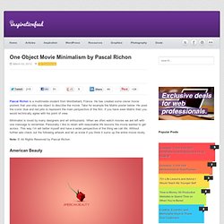
He has created some clever movie posters that use only one object to describe the movie. Take for example the Matrix poster below: He used the iconic blue and red pills to represent the main perspective of the film. If you have seen Matrix then you would technically agree with his point of view. Minimalist is loved by many designers and art enthusiasts.
When we often watch movies we are left with one message to remember. Note: © All Rights Reserved by Pascal Richon American Beauty. New Metro Style Windows 8 Logo - Fail or Win? Microsoft has recently unveiled their new Windows 8 logo design.
With the up-coming release for the new operating system, which will unifying desktop and mobile operating systems, Microsoft decided the need for a logo refresh. The new logo heavily pushes the Metro design aesthetic. The old multi-colored waving flag that has defined Windows for over a decade is now gone. Microsoft hired the global design firm Pentagram to re-imagine the logo. Pentagram has previously worked with clients like Rolls-Royce, Nissan, United Airlines, Penguin Group and other prestigious companies. In the early versions of the Windows logo the flag was originally intended to be seen as a Window. Consumer Dilemma. 100 Awesome Logos With Script Typography. Logo Circle Collection - Coconuts Art.
30 Examples of Inspiring Health and Medical Logo Designs. Creating logo for private health service is an important think to create brand visibility.
A health or medical logo designs should be able to draw attention of its customers, relevant, straight to the point and easy to understand. However, it’s not easy to do this, to creating a good health logo design you really need inspiration and a lot of creativity. Below is a good example of health and medical logo designs. All of these logos listed below are great for inspiration and suitable for designers who will create a logo design project for a private health service such as: Dental clinic, hospital, pharmacies, clinical laboratory, drug stores, private health insurance, etc. How Starbucks Transformed Coffee From A Commodity Into A $4 Splurge. Stanley Hainsworth has been a catalyst for the great brands of modern times.
He was creative director at Nike and then Lego. He was vice president global creative at Starbucks in an era when the coffee purveyor was experiencing phenomenal growth. Starbucks has been hailed, acknowledged, and praised again and again for its excellence in branding and marketing, in creating a branded experience that can satisfy the connoisseur, bring in new converts, be accessible to all, and irresistible in its appeal. Stanley defined the very feel of Starbucks in an era when the brand was becoming a cultural icon. Helvetica Font - 40 Excellent Logos Created with Helvetica. It’s over fifty years old, it’s the most widely used font ever, and it has recently become the subject of its own movie.
Logos, Identities, Brands...What's the difference? Design an Ambigram Logo With Your Name. Ambigrams are a particularly complex type of typographical art that can be read identically in different orientations.
They typically take the form of a word that reads the same way upside down as it does right side up. Today we’re going to see what’s involved in creating ambigrams and walk through creating a basic one on our own. What Is An Ambigram? In its most basic form, an ambigram can be a simple symbol that looks the same at two or more orientations. More complex forms involve words, groups of words or even entire sentences. 28 Best Branding and Business Tips Articles of September 2011. This is our monthly series were we share useful brand and business tips articles all from the previous month. We hope this series can help you to strengthen your brand identity and growing your business. If you would like to be kept up to date with brand and business resources, you can follow us on Twitter or by subscribing to our RSS feed. by Elizabeth Gast Rebranding can involve several things. It can be anything from updating your company look, to changing the name, to changing the services or products provided.
40 More Clever Logos With Hidden Symbolism.