
Visual Identity for Arch Residential - Logo Designer. Arch Residential is a lettings-focused estate agency that operates out of Borough in South East London.
The company approached graphic designer Denis Mallet, of London-based studio DMWORKROOM, to help create a stronger and more memorable visual identity. As the main constitutive logo element, Denis created an iconic symbol using the first letter of the business name. Branding for a Kid’s Café: Moomah - Logo Designer. Moomah is a café and play space that encourages creativity and connection between parents, children, and friends.
Founder Tracey Stewart commissioned New York-based branding agency Apartment One to develop an organic, dynamic brand language that would translate her vision for a multigenerational collaborative space into a memorable brand. Apartment One set out to first identify the essence of Moomah, eventually simplifying it into four core values: connect, create, discover, and nourish.
They then developed a visual brand language that would convey these ideals, designing variations of the logo with everyday objects that represented each value. Immersive Logo Design for Soho’s Ampersand Building - Logo Designer. British designer Tom Hingston has created an “immersive logo” for the reception of the Ampersand building in London’s Soho.
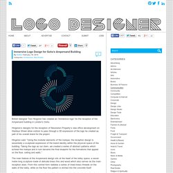
Hingston’s designs for the reception of Resolution Property’s new office development on Wardour Street allow visitors to pass through a 3D expression of the logo he created as part of his overall brand for the project. Hingston said: “Using the modular elements of the marque, the reception design is essentially a sculptural expression of the brand identity within the physical space of the building.
Taking the logo as our stem, we created a series of abstract patterns which echoed the marque and in turn became the final blueprint for the formations that appear on the floor, ceiling and walls.” The main feature of the Ampersand design sits at the heart of the lobby space; a seven metre long sculpture made of delicate brass fins and wood which also serves as the main reception desk. Tom Hingstonwww.hingston.net. Greenspace Helps Shape ‘Anthology’ Property Brand - Logo Designer.
Anthology is a large-scale residential London property development company, backed by global asset management firm Oaktree Capital Management.
In addition to a strategic and naming process, London-based creative consultancy Greenspace has created a master brand and visual identity system for the residential developer. The designers say the identity will evolve with each new development, alongside marketing collateral and bespoke on-line tools. Greenspace developed the brand driving idea; ‘Stories of Homes, Built from London’ – from which the name ‘Anthology’ subsequently arose. Anthology’s primary business aim is to build homes in London, for Londoners.
Believe In Creates New Brand and Packaging for Finchtail - Logo Designer. Finchtail is a new company focused on creating simple and useful products that are sustainably made.
Their first product is a cardboard tablet stand, and their new identity, packaging and launch materials have been developed by brand design studio Believe in. Initially Believe in worked to define the brand strategy, based around the company’s goal to solve everyday problems with simple products that work well. The strapline (simple useful) things was adopted, along with a commitment to using fewer resources and better design.
Branding for Communications Agency ‘XXL’ - Logo Designer. Established in 1996, XXL is an international communications company specialising predominantly in fashion and accessories, beauty, and lifestyle.
The identity for the Barcelona-based communications agency was designed by global brand specialists Base Design. XXL was seeking a design solution that would be as bold as its name. Starting with the idea of geometric pieces talking with each other, the designers constructed a logo with a stencil typeface, in extra, extra-large characters. The tagline “brands in action” clarifies XXL’s area of expertise. Base Designwww.basedesign.com. Personal Identity Design: Lucas Young - Logo Designer. Lucas Young is a 19 year old graphic designer who is passionate about all things print and typography.
Currently a student in Toronto, Ontario (Canada), Lucas has already started developing his own individual aesthetic imprint. His personal logo-mark may be regarded as being somewhat experimental and evolving at this stage, in that it consists of two almost separate designs; the first a futuristic logotype displaying only the initials LY, and the other an expressive handwritten script conveying his name in full. Both variants are subsequently ringed by an outer circle. Lucas Youngwww.cargocollective.com/lucasyoung. Identity for Fashion Designer, ‘Kovács Ágnes’ - Logo Designer. Ágnes Kovács (in Hungarian Kovács Ágnes) is a young, up-and-coming fashion designer from Hungary.
Specialising in the design of leather bags and accessories, Ágnes was chosen as the winner in the Newcomer accessories category at this year’s Central European Fashion Days event, which formed part of the ”Gombold újra! Central Europe” fashion competition. Logo for a Personal Trainer: Erin Eleini Fitness - Logo Designer. Erin Eleini is an all round health and fitness enthusiast; she is currently a fitness instructor and nutrition coach at Vivid Fitness – an Australian personal trainer company based in Sydney.
For the design of her personal logo-mark, Erin turned to brand identity specialist Damp Design. The agency is headed by graphic designer and illustrator Matt Dampney (who also happens to run his own mens fashion label called “DAMP”). Matt’s objective was to create a strong, bold visual statement for Erin’s branding design. Personal Branding: Beste Birer - Logo Designer. Beste Birer is a graphic designer who hails from Turkey; she recently graduated from the graphic design department of Mimar Sinan Fine Arts University in Istanbul.
Her self identity, ‘Beste Birer’, is reduced to a monogram using the initials BB. The two letters are interwoven in an almost three dimensional arrangement. Beste’s logo-mark is additionally accompanied by a couple of playful animations that illustrate and explain how the two different styles of the letter B interact, coalesce and fuse with one another. Beste Birerwww.bestebirer.com. Animated Monogram Identity: Katalin Boromissza - Logo Designer. Hungarian student Katalin Boromissza is currently studying graphic design at Budai Rajziskola, or the Budapest School of Art. With the help of her teachers Skrapits Borbála and Hegyi Béla, Katalin has designed her own personal logo-mark in the form of a moving monogram.
The experimental approach involves three separate design variations, all of which take as their starting point the initials KB. Katalin Boromisszawww.behance.net/borkaty. Personal Identity: Graphic Designer, Paweł Wiśniewski - Logo Designer. Paweł Wiśniewski is a freelance graphic designer currently based in Wloclawek, Poland. Personal Identity: Ayoob Ullah - Logo Designer. Ayoob Ullah is a freelance graphic designer from Vancouver, British Columbia in Canada. Formed from the initials of his name, the acronym Au represents his personal brand identity. The overarching theme of the logo is the famous Golden Ratio. Ayoob has constructed and devised his design using the precise mathematical proportions of the “divine section”. Personal Branding: Louise Mertens - Logo Designer. Belgian designer Louise Mertens is a graduate of St Lucas Antwerp University College of Art & Design (Antwerp), where she recently completed a bachelor’s degree in graphic design.
For her personal identity design, Louise decided on using the initials of her name. The letters L and M are arranged, formed and interconnected around the edges and vertices of a cube. Besides doing freelance work, Louise is currently pursuing postgraduate studies at the aforementioned institute. She formerly worked as both a model and photographer, and the two strands continue to influence and inform her work. Louise Mertenswww.louisemertens.com. Identity Design for Digital Consultancy ‘Metronet’ - Logo Designer. Metronet is a digital marketing consultancy that delivers services such as SEO, PPC management, analytics tracking and web design to a wide range of clients.
Norwegian creative agency Work in Progress was appointed by Metronet to design its logo. Lead graphic designer and Work in Progress co-founder Torgeir Hjetland took visual influence from early computer screens. The combination of a dark grey (almost black) background and light bright green text is designed to suggest a DOS interface. For added authenticity, the type used is OCR-B, a monospace font that was developed back in 1968 to meet the criteria set by the European Computer Manufacturer’s Association. “The illustration for the identity is an abstract global system of interconnected computer networks between people,” explains Torgeir.
The ‘computer network’ theme continues on into and through the business’s office interiors, which were also designed by Work in Progress. Torgeir Hjetlandwww.workinprogress.no. Rebranding for CVM: Creation Visual Merchandising - Logo Designer. Australian retail architecture consultancy Creation Visual Merchandising specialises in creating unique visual displays for commercial interior spaces. A’ Graphics and Advertising Design Competition: Call for Entries - Logo Designer. Corporate Design for Social Advertising Agency, ‘Healing Brush’ - Logo Designer. Healing Brush is a social advertising organisation based in Bundang in South Korea that addresses various global issues through campaigns to support low-income groups in society. The organisation’s motto (“Opening the closed and wounded heart”), was visualised through the logotype that features “h+b” in high contrast against a solid-coloured background. Also, the various dingbat fonts that represent different global issues are applied to household items.
The identity design, which is the product of a collaborative project between Dankook University College of Arts and Healing Brush, has been awarded a 2013 iF communication design award. Healing Brushwww.healingbrush.kr. Corporate Identity: Zoom Advertising - Logo Designer. Graphic designer Ben Johnston, from Cape Town in South Africa, was commissioned to create a full corporate identity system for local advertising agency, Zoom.
Logo for an Employers’ Association: Pacta - Logo Designer. Pacta is currently Sweden’s largest employers’ association for municipal-related operations. As well as dealing with human resources, the organisation deliberates on issues such as price levels, wage increases, tax rates and pension entitlements. Stockholm-based digital design agency Söderhavet was approached by Pacta when the latter sought to develop and implement a new integrated digital strategy. Logo Design for Master Plan Music Group - Logo Designer. Master Plan is a hip-hop music production company based in Seoul, South Korea. Youngha Park, the designer responsible for creating the identity, explains Master Plan was seeking a logo design that, while modern, would also feature some distinctly ‘Old School’ elements from the world of rap music.
The initials “M” and “P” of Master Plan are therefore combined to visually represent a retro steel microphone. Corporate Identity: The Vipline Group - Logo Designer. Slava Kostrikin is a graphic designer and brand specialist from the city of Barnaul in Siberian Russia. This minimalist identity design was completed for the Vipline Group, a corporate conglomerate with a wide variety of business interests encompassing manufacturing, food and real estate. In addition to conceiving regular identity material such as the business’s stationery, Slava also proposed a series of corporate office/boardroom furniture designs as derivatives of the parent logo. Slava Kostrikinwww.behance.net/SlavaKostrikin. Corporate Identity: Wienvest - Logo Designer. Headquartered in Helsingborg in Sweden, Wienvest is an investment company whose main business focus is on the micro-economy of the Öresund Region.
Kollor Design Agency, formed by Erik Tencer and Håkan Persson, and also rooted in Helsingborg city, was enlisted to design Wienvest’s logo as well as printed identity material. F3 Corporate Identity - Logo Designer. F3 is a newly founded fashion company set up by three entrepreneurs with the aim of introducing international fashion brands into the Middle East through acquiring their franchising rights. Creative marketing agency Paragon was approached by F3 to create a distinctly minimalistic identity whose design would work well across a range of digital and analogue platforms. Logo Designer.