
Lessons We Learned from Our Biggest UX and Design Mistakes. We’ve finally hit the 500,000-user mark at Buffer, a product that helps you share on your social media networks more efficiently.
About two years ago when we started on our path to building Buffer, we knew we’d be meeting obstacles and making mistakes along the way. One of the main things we’ve kept in mind is that making mistakes is unavoidable and that if we choose to learn from them, they’ll be helpful in giving us good guidance on how to move forward more effectively. And I believe that it’s partly because of these mistakes that we were able to get to where we are today. The Experience That Shaped How We Build Our Product Before I discuss the biggest lessons we learned from some of our UX and design mistakes, I want to talk about one of our primary product development principles:
Design Better Forms — uxdesign.cc – User Experience Design. Use Your Interface. Table Toolbar. Sort, filter and group can appear in all possible combinations and also as single actions.
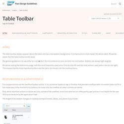
Make sure to use the proposed order if you use more than one of these actions. The dialog that opens when such an action is chosen is called view settings dialog. This dialog can provide any combination of these three settings, including only one setting (e.g. just sort). If sorting, filtering and/ or grouping is a common use case in your app, offer one, two or all of the corresponding features within one or several view settings dialogs.
Please consider: do not provide these features if the table is expected to have only a small number of entries (up to 20 in usual cases).If filtering is a main use case, do not offer filtering in the view settings dialog; use the filter bar instead. There are two ways for triggering the view settings dialog: Trigger the view settings dialog with a button on the table toolbar. Responsive Design: Why and how we ditched the good old select element. How rethinking the way users make complex selections across devices completely changed our design.
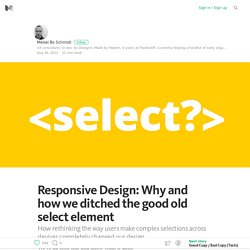
We’ve all seen this and know what it does: It’s the HTML select element. The invention of select dates back to 1995 with the introduction of the HTML 2.0 specification. So most of us have never experienced designing for web without select as an option. But it can be a really, really frustrating component to let into your designs. Good things first By using the select element it’s a no-brainer to create a list of selectable options. So why not just use it? At Tradeshift we’ve been working a few months on some soon-to-be-released updates for our user interface. Presenting option lists to users is most easily done by using checkboxes, radio buttons and by using select. Hierarchical data can be a real pain to deal with using the standard select element.Option groups which is a part of the select element’s features, have limited usage when you deal with complex hierarchies.
The solution. The anatomy of a credit card form — User Experience Design (UX) Paying for something online with a credit card is simple, right?
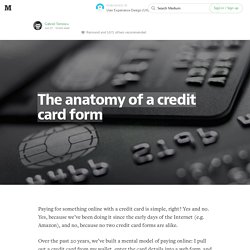
Yes and no. Yes, because we’ve been doing it since the early days of the Internet (e.g. Amazon), and no, because no two credit card forms are alike. Over the past 20 years, we’ve built a mental model of paying online: I pull out a credit card from my wallet, enter the card details into a web form, and click a submit button. But getting from A to Z can be a tricky journey, riddled with questions the user has to answer. Paying for something online is still 2–3x clunkier than paying in-person. Online, we’re getting closer. But before credit card forms become a thing of the past, we still have the present-day task of adding clarity, simplicity, and security to the credit card form. At Wave, our Invoice product enables business owners to create and send invoices to their customers, and to have those invoices paid via credit card. Invisible animation.
There’s no doubt that animating user interfaces is a rising trend.
Risen enough that the emphasis is often put on the animation itself, rather than on improving the user experience through subtle and functional animation. Pasquale D’Silva gave some good advice in his talk at Web Direction South in 2013, including: Good animation is invisible.You shouldn’t notice that you’re looking at animation. It’s great advice that we — the team behind Campaign Monitor’s email builder — have been trying to apply with a few principles in mind: animation must improve the usability, feel natural and subtle, and give feedback to the user.
Having spent the last year working on the email builder, I’ve learned that animation on the web — as opposed to native apps — comes with many challenges that go beyond finding the right timing, spacing, poses or easing. Add layout drop-down When users press the “Add layout” button, the layout drop-down fades in and comes from the button itself. Sidebar accordion. Transitional Interfaces. Designers love to sweat the details.
Much time is spent pixel-fucking buttons, form styles, setting type, & getting those icons as sharp as a tack. A+, great job, don't stop you guys. ...but there's little consideration about how it all fits together outside of a static comp. You tap a button and the form just ...appears? You swipe to delete an item and it just vanishes? UXPLORE - UX & UI Design: Archive.