
CSS Layout Generator About the CSS Layout Generator The CSS Layout Generator was first released by Tony Aslett in October 2003, since then over 871,000 layouts have been generated. Updated in November 2010, HTML5 doctype can now be selected and a simple HTML5 template with appropriate tags will be created. Other HTML and XHTML doctypes are still available. The generator helps you create the structure of your website template using valid HTML and CSS. You can create a fluid or fixed width floated column layout, with up to 3 columns and with header and footer. The generator requires a modern DOM capable browser with JavaScript enabled. Instructions To create your layout select the structural elements your site requires (header, footer, columns). Info popups are available where you see InfoMore info example :) icon, just hover over it for more information. Join the CSS Forum to suggest changes or ask for help where needed. Author: Tony Aslett
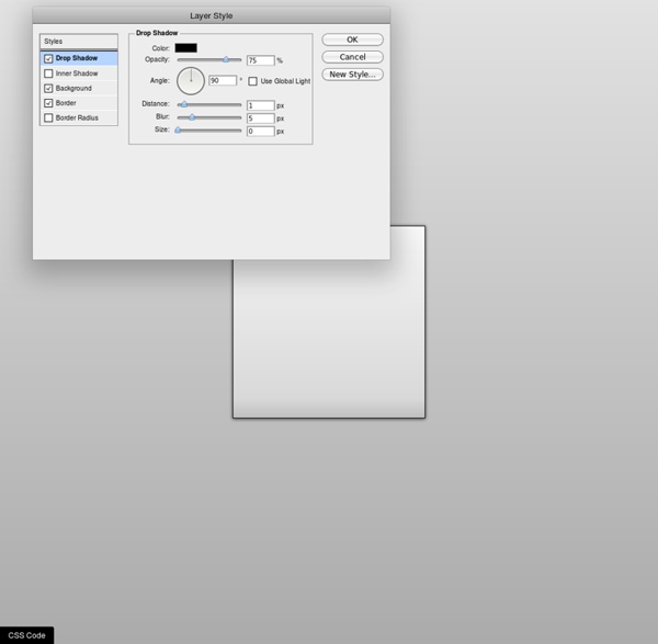
Awesome CSS3 generators to simplify front end development CSS3 Generator This generator is definitely one of my favorites, as it allow you to generate more than 10 different CSS3 effects, such as border radius, text shadows, transitions, and more. Visit css3generator.com CSS Gradient generator CSS gradients are cool, but it’s also a bit tricky to remind all the possibilities. CSS button generator In my opinion, this is the most advanced CSS3 button generator available on the internet. CSS3Gen CSS3Gen is a nice generator which allows you to easily create useful snippets of CSS3 and copy them straight into your projects. CSS3 Please CSS3 Please is a very effective tool to test your CSS3 code: Just edit the CSS rules from the editor, and a special container will receive instant changes so you can have a preview of what you’re doing. Layer Styles If you’re familiar with Photoshop, there’s no doubt that you will love Layer Style, a CSS3 generator which replicate the look and feel of the popular software from Adobe. Border image generator CSS3 Pie
Hollywood Sound Effects and Loops Internet Explorer CSS3 PIE: CSS3 decorations for IE Grid-A-Licious Back in mid 2008, I created a jQuery plugin. I named it Grid-A-Licious and described it as, "Divs are placed in chronological order with a special grid" because I had no clue how to explain it better. I used this script a lot and designed many sites with it during 2008. At first, people were very skeptic and confused on how to read the grid, and thought this kind of layout belonged in real papers. This reaction slowly faded away once the layout became more and more popular when different developers and designers started to create their own script's interpretation of the floating grid layout effect. In Dec 2008, I decided to wrap the script into a Wordpress theme and release it as a christmas gift to the world. Today this floating grid layout effect is heavily used around the net and there are tons of different variations of the script to download and use. So, why am I continuing developing this? If this is something you’ve been looking for, go ahead and download the plugin and use it.
CSS3 Animator, HTML5 Animations, Create Stunning Animations with Ease | Sencha Animator The Sencha Web Application Lifecycle Management platform simplifies the challenges of managing the software development lifecycle of web applications. Now you can seamlessly design, develop, and test data-intensive web applications and deliver the right user experience, on the right screen, at the right time. Sencha Platform for Web Application Lifecycle Management The Sencha portfolio of products and services forms an integrated, modular platform for managing the lifecycle of your cross-platform web applications. Design The Sencha platform helps you accelerate your web application development efforts with out-of-the box theming capabilities across all applications. Learn More: Ext JS | Architect | Themer Develop The Sencha platform offers powerful JavaScript and Java frameworks to help developers do their best work. Learn More: Ext JS | Sencha Test | GXT Test Sencha makes it easy to perform unit and end-to-end functional testing of Ext JS applications. Learn More: Sencha Test An Open Platform