
Create Your Own Infographic. Infographics Galore! Quite a few infographics have been shared recently, and this is an irregular feature I’m calling “Infographics Galore!”
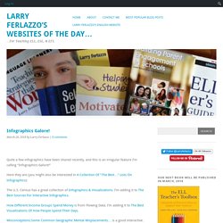
Here they are (you might also be interested in A Collection Of “The Best…” Lists On Infographics): The U.S. Exploiting Infographics. This ebook was designed with English language teachers in mind but should have some value for any teacher who is interested in developing their students’ digital literacy and critical thinking skills.
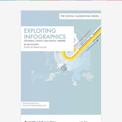
The book contains a wide range of suggested activities for both the creation and exploitation of infographics in the classroom. It also helps teachers with tips and advice on how to plan and create infographics and suggestions for which tools to use to produce different types of infographic. Infographic Layout: How to Design a Comparison Infographic - Piktochart Infographics. Teachers and educators have always used comparison as an effective teaching method.
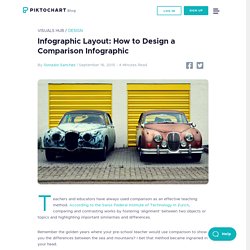
Exploiting Infographics. A Tube map of the London Underground that's far more useful than the 'official' one - UK - News. The new map, by a user called Sameboat, has been praised for being clearer than the old, 80-year old template.
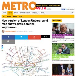
Unlike in the official version, different branches of the fast-expanding London Overground Network are now in different colours, handy interchanges are highlighted and the correct geographical relationship between the two stations in Bethnal Green, east London, is shown. Planned line extensions are also highlighted, meaning that the map is more likely to be 'future proof' compared to the version used by Transport for London. New version of London Underground map shows circles are the way forward. Commuters and tourists may sometimes feel like they are getting nowhere on the London Underground, but a new reimagining of the iconic Tube map has suggested going round in circles is no bad thing.
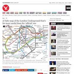
Dr Max Roberts has issued a redesign of the map based on concentric circles, partly inspired by the orbital London Overground. Click here for the full-size version of the map The London Underground map expert, who has also published a curvy version of the Tube map, said the official map was becoming too cluttered. In a posting on the Going Underground blog, he wrote: ‘Grounding a map in familiar shapes such as circles can make it easy to comprehend. We Should Be Teaching Infographics. A couple decades ago or so USA Today did something monumental in the world of news: they made information much more visual.
In an effort to boost readership (and sales) they did something that, at the time, seemed entirely radical: increase the size of the images to make the news much more picture-heavy. Reduce textual content, in other words, and increase visualization. It seemed ridiculous: reduce the amount of news in order to sell the news. What We Think about People according to Google Autocomplete (Infographic) 10 Lame Documents that Would Be Better as Infographics.
Infographics, it seems, have taken the media by storm.
Because they are visually attractive, eye-catching, accessible, fun, and–if done well–quickly and effectively informative, people are drawn to them. 100 Diagrams That Changed the World. Since the dawn of recorded history, we’ve been using visual depictions to map the Earth, order the heavens, make sense of time, dissect the human body, organize the natural world, perform music, and even concretize abstract concepts like consciousness and love. 100 Diagrams That Changed the World (public library) by investigative journalist and documentarian Scott Christianson chronicles the history of our evolving understanding of the world through humanity’s most groundbreaking sketches, illustrations, and drawings, ranging from cave paintings to The Rosetta Stone to Moses Harris’s color wheel to Tim Berners-Lee’s flowchart for a “mesh” information management system, the original blueprint for the world wide web.
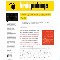
It appears that no great diagram is solely authored by its creator. Most of those described here were the culmination of centuries of accumulated knowledge. 10 Awesome Free Tools To Make Infographics. Advertisement Who can resist a colourful, thoughtful venn diagram anyway?

In terms of blogging success, infographics are far more likely to be shared than your average blog post. This means more eyeballs on your important information, more people rallying for your cause, more backlinks and more visits to your blog. In short, a quality infographic done well could be what your blog needs right now. InfoGraphic Designs: Overview, Examples and Best Practices. Information graphics or infographics are visual representations of information, data or knowledge.
These graphics are used where complex information needs to be explained quickly and clearly, such as in signs, maps, journalism, technical writing, and education. The Anatomy Of An Infographic: 5 Steps To Create A Powerful Visual. Information is very powerful but for the most bit it is bland and unimaginative.
Been wanting to create an infographic but don't know how to start it. Thanks for sharing. It helped though. :) – reynescabruner
Infographics channel information in a visually pleasing, instantly understandable manner, making it not only powerful, but extremely beautiful. Once used predominantly to make maps more approachable, scientific charts less daunting and as key learning tools for children, inforgraphics have now permeated all aspects of the modern world. I designed a couple of infographics back in college, the need arising especially around the time Soccer World Cup fever spiked. It was a fun process representing the different groups, predicting winners in each group at each stage and creating a mock pairing of teams that would clash all the way leading upto the finals. Infographic: Shutterstock's Global Design Trends 2013. Learning Visually. 15 New Extremely Creative Infographics. With the help of evolution and progress, people’s lives become easier day by day. Today everything is simpler than it used to be in the past.
Infographics tools. Escaping The Chains Of The Dreaded JOB (Just Over Broke) Infographics. 40 Useful and Creative Infographics. Six Revisions Menu Main Categories CSS HTML JavaScript Web Design WordPress Web Development Design Inspiration UX Design UI Design Freebies Tutorials Tools Links About Contact Advertise RSS Twitter Facebook. Looking 4 data visualization: Charts.
. www.datavisualization.com et on tombe sur Dundas Software - Editeurs de solutions de tableaux de bord. Sur leur page d'accueil on trouve des exemples de dashboards - normal - certains des visuels affichent un composant graphique tres connu et qui - malgre sa mauvaise 'presse' - est aujourd'hui toujours mis en avant par les marketeux de la plupart des editeurs de solutions BI. Ce composant graphique est le. 10 Steps To Designing An Amazing Infographic. Make your own infographics. 4 Simple Tools for Creating an Infographic Resume.
Free Vector Infographic Kit. Create and share visual ideas online. The Do's And Don'ts Of Infographic Design - Smashing Magazine. Advertisement. Nigel Holmes on 50 Years of Designing Infographics. An HTML5 Interactive Infographic featuring Dribbble. Infographics & Data Visualization. Should I Work for Free? 15 Useful Infographics For Designers And Developers. Writen by Bogdan / Comments Off on 15 Useful Infographics For Designers And Developers Information graphics or infographics are graphic visual representations of information, data or knowledge.
9 Ways You Can Improve Your Infographic Pitches to Blogs & Websites. Over 100 Incredible Infographic Tools and Resources (Categorized) Infographic: How to Use Colors in Graphic and Web Designing. How to Create Infographics Part II. Infographic of the Day: How Color Affects Purchases. The Art of Complex Problem Solving.