
Responsive Design : les bonnes bases à avoir ! #SEO. Bonjour tout le monde !
Aujourd’hui, nous allons parler de SEO technique avec le concept de Responsive Design. En français, on traduit Responsive Design par site web adaptatif. Donc, comme le nom l’indique, l’idée est de faire un site web qui s’adapte à tous les écrans des différents appareils (PC, tablette, portable, etc.). Personnellement, si on me demande de choisir entre : créer un site web mobile (comme m.example .com) ou créer un site en Responsive Design, je réponds le Responsive Design. Avec le concept de la technique adaptative, je trouve qu’il y a moins de risque de Duplicate Content, et la gestion d’un même site, avec les dernières technologies modernes, est tout de même plus sympathique. Pour faire un site web adaptatif, on va s’attaquer au CSS (feuille de style pour mettre en forme le code HTML) qui va nous permettre de créer le design que l’on souhaite pour l’interface.
Source du gif : Site du zéro 2) Utiliser (bien évidemment !) Quels outils pour pré-visualiser votre site responsive ? Durant la conception d'interface responsive (permettant au site de s'adaper aux différents écrans : tablette, mobile et ordinateur), il est nécessaire de tester le résultat sur les différents terminaux afin d'éviter de mauvaises surprises.
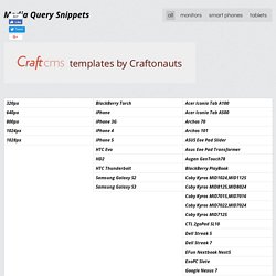
Le Responsive WebDesign connait un fort essor ces derniers temps (Voir notre article sur la conception pour le responsive webdesign), de nombreux outils d'émulation proposent de tester le rendu de ces sites dans un navigateur sur ordinateur. Cela permet d’éviter d’avoir à disposition les multiples appareils à résolutions variables : iPhone et iPad retina, tablette Android, smartphone Windows 8 etc. Dans cet article, nous testerons ces émulateurs pour vous. Quels sont les principaux outils gratuits permettant de simuler l’affichage sur tablettes et mobiles ? Focal Point, un meilleur cadrage des images responsive. Responsify - A responsive template generator. Piresponsive, Responsive design outil de test - Pikock. Media Query Snippets - list of media queries - (Navigation privée)
Landscape.
Un guide simple pour la typographie responsive : blog Scopart. Le 14/12/2012 dans Développement.
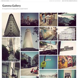
Pixel Perfect Responsive Design Testing Tool. Gamma Gallery - A Responsive Image Gallery Experiment. Assemblage Becoming Sky high Life Beleaguer Chatoyant Denouement Desuetude Diaphanous Desuetude Languor Inglenook Forbearance Penumbra Mondegreen Plethora Onomatopoeia Wafture Cynosure Epiphany Felicity Serenity Furtive Glamour Inure Labyrinthine Lagoon Desire Leisure Softness Moiety Nemesis Panacea Scintilla Example for loading more items...
Responsive Img - a jQuery Plugin for Responsive Images. Gridpak - The Responsive grid generator. Fluid Squares v2. A responsive grid experiment. 16columns ~ margin:22px — based on the Simple Grid system. Responsivepx - find that tricky breakpoint. Grid-A-Licious. Back in mid 2008, I created a jQuery plugin.
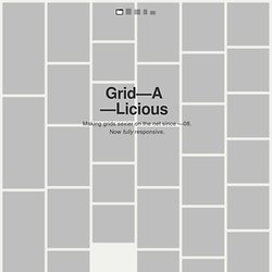
I named it Grid-A-Licious and described it as, "Divs are placed in chronological order with a special grid" because I had no clue how to explain it better. I used this script a lot and designed many sites with it during 2008. At first, people were very skeptic and confused on how to read the grid, and thought this kind of layout belonged in real papers. This reaction slowly faded away once the layout became more and more popular when different developers and designers started to create their own script's interpretation of the floating grid layout effect.
Not saying it was based on my work or script, because there were a few others that brought a similar layout effect to our attention, but not necessarily distributed as a plugin. In Dec 2008, I decided to wrap the script into a Wordpress theme and release it as a christmas gift to the world. So, why am I continuing developing this? Width Default 225px gutter Default 20px selector Default .item queue. Media Queries. How Fluid Grids Work in Responsive Web Design. Responsive design is the process of arranging the layout in a way that all the important information is presented in a user readable way in any kind of device or screen size.

Most designers will choose a grid based layout since it’s easier to handle grid based layouts in different kind of devices. It’s your decision to choose between a fixed or fluid grid to design the layout. Throughout this tutorial we are going to focus on fluid grids and their importance in responsive design. What is a Fluid Grid? It’s important to know the meaning of fluid grids before we start thinking about the designs. A fluid is a substance that continually deforms (flows) under an applied shear stress – Wikipedia So I’ll make things clear by explaining the above definition in simple practical terms.
Importance of Fluid Grids In adaptive grids, we define pixel-based dimensions. Mobile devices are getting smaller in size and people prefer using them in their personal work. MUELLER GRID SYSTEM. Building an Adaptive Grid with MUELLER. MUELLER is a modular grid system for responsive/adaptive and non–responsive layouts, based on Compass.
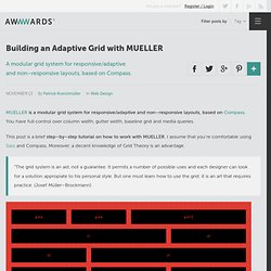
You have full control over column width, gutter width, baseline grid and media queries. This post is a brief step–by–step tutorial on how to work with MUELLER. I assume that you're comfortable using Sass and Compass. Moreover, a decent knowledge of Grid Theory is an advantage. “The grid system is an aid, not a guarantee. Responsive web design. Frameless. Building a Frameless grid 1.
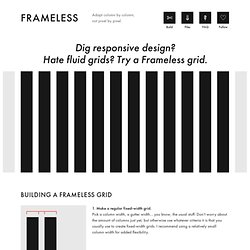
Make a regular fixed-width grid. Pick a column width, a gutter width… you know, the usual stuff. Don’t worry about the amount of columns just yet, but otherwise use whatever criteria it is that you usually use to create fixed-width grids. I recommend using a relatively small column width for added flexibility. 2. Now, give your grid an infinite number of columns, so that no matter how wide you make your viewport, more and more columns come into view. 3.
Align your grid horizontally to the middle of your viewport. 4. Start using the grid. Downloads, on GitHub LESS LESS template Contains a small CSS reset, some consistency fixes, as well as some super-basic customizable variables and functions for starting off a Frameless grid. SASS SCSS template The same as the LESS version above, but written in SCSS instead. HTML HTML starting point This is what I use as a blank canvas. PS Photoshop template.