
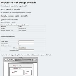
Easy FPO and Dummy Images for Any Project. Media Query Snippets - list of media queries. Responsive Web Design Formula for Percentage - Easy Calculator. It's actually pretty easy with "the magic formula". target ÷ context = result We just enhance the formula with percentage, as follows (target / context) x 100 = result % You get the result in percentage, ex:- (900 / 960) x 100 = 93.75% Note:- decimal numbers acording to maijor browsers Lets start use the formula.
Responsive Web Design. The English architect Christopher Wren once quipped that his chosen field “aims for Eternity,” and there’s something appealing about that formula: Unlike the web, which often feels like aiming for next week, architecture is a discipline very much defined by its permanence.
Article Continues Below. Idiot's Guide to viewport and pixel. Replacing Respond JS with Sass. So you’re building some really cutting/bleeding edge web sites. You’re using HTML5, CSS3, and media quieries to serve your users some fast, repsonsive, and beautiful code/websites. Your life is great, and you love the work you’re producing… Then you have to make sure your code is working in legacy browsers like IE7 and 8… So you throw some polyfils like Modernizr at these legacy browsers… and now they understand HTML5.
You used progressive enhancement from the beginning, so the CSS3 you’re using looks fine in browsers that don’t understand it. Responsive Design bookmarklet. Pixel Perfect Responsive Design Testing Tool. Display and present responsive web designs. Scottjehl/picturefill. A jQuery Plugin for Awesome Navigation. Elastic Image Slideshow with Thumbnail Preview. Today we want to show you how to create a simple elastic slideshow with a thumbnail preview.
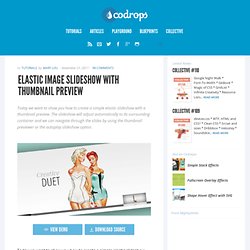
The slideshow will adjust automatically to its surrounding container and we can navigate through the slides by using the thumbnail previewer or the autoplay slideshow option. View demo Download source To make this slideshow responsive, we will use a mixture of JavaScript and CSS techniques. The fabulous photography used in the demo is by Bartek Lurka and it is licensed under the Attribution-NonCommercial-NoDerivs 3.0 Unported License. So, let’s do it! The Markup We will create two unordered lists, one for the main slider and one for the thumbnail navigation beneath the large image.
The list for the thumbnail preview navigation will contain an absolute element (the first list element with the class ei-slider-element and the thumbnail list elements which consist of an anchor and an image (the thumbnail). » The EMs have it: Proportional Media Queries FTW! Cloud Four Blog. Hay, I wrote this in 2012!
I still like the notion of the metaphorical connection between content-based sizing units (e.g. ems) and layout definitions (e.g. breakpoints). And the zooming behavior cited here was always meant more as a sidelong example than a core argument. Nonetheless! You should note that the zooming behavior has long since been made consistent in browsers (i.e. fixed). Chrome Mobile with Brad Frost.
Using jPanelMenu with jRespond. Responsive CSS Framework Comparison: Bootstrap, Foundation, Skeleton. Bootstrap 4.0.0-alpha is a fairly large update to the framework.
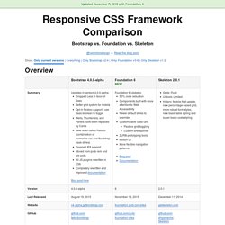
It has dropped Less support in favor of Sass, converted from px-based to rem-based sizing, improved its grid system, and dropped IE8 support. Also, all its JS plugins were re-written in ES6, it now uses a customized reset CSS file called Reboot, and offers flexbox support via a Sass boolean variable. In addition to this update, Bootstrap now offers themes at themes.getbootstrap.com. Also, Bootstrap will continue supporting version 3, unlike the dropping of version 2 support after the release of version 3. Responsive Navigation: Optimizing for Touch Across Devices. As more diverse devices embrace touch as a primary input method, it may be time to revisit navigation standards on the Web.
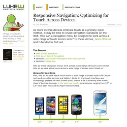
How can a navigation menu be designed to work across a wide range of touch screen sizes? In these demos, Jason Weaver and I decided to find out. The Demos Why do these navigation menus work across a wide range of touch screen sizes? Why do we care about touch across a wide range of screen sizes? Across Screen Sizes First, why do we care about touch across a wide range of screen sizes? The orientation media query. Page last changed today Right now Jason Grigsby’s excellent summary of the orientation media query is making the round of blogs and tweets, and that’s well deserved.
Media queries will become extremely important in the near future, when we have to build websites that work on any device resolution from 300px to 1280px or more. Still, there’s one tiny nitpick I’d like to make, so that you fully understand when to use orientation and when to use device-width. orientation is supported by Android 2, Bolt, MicroB, and Firefox. And now, apparently, by the iPad. Screen size tests. Media Queries for Standard Devices. If you think responsive's simple, I feel bad for you son.
We got 99 viewports, but the iPhone's just one. That Web Guy - An introduction to responsive web design: using media queries. Written December 29, 2011. 4 comments.
You’ve no doubt heard the term by now, but what exactly is Responsive Web Design? As the name suggests, Responsive Web Design (from hereon in referred to as RWD) is about designing your web site with the use of media queries so that it responds (changes the presentation) to the web browser width, or in the case of mobile devices, the capabilities of said device. Essentially it’s about building a web site that’s device unbiased. In this article I’ll demonstrate a basic example which should get your creative juices flowing. How it used to work In the olden days a web designer would typically use Javascript to detect the browser size and redirect to one of the many versions of the web site that had been specifically created for whatever resolution your browser was using. How Responsive Web Design works. A pixel is not a pixel is not a pixel. Media Queries. Fluid Width Equal Height Columns. Unique variations on a 3×4 grid.
Andy Clarke at Smashing Conference. Twitter Bootstrap. 320 and Up ‘tiny screen first’ responsive web design boilerplate. Skeleton: Beautiful Boilerplate for Responsive, Mobile-Friendly Development. The Goldilocks Approach to Responsive Web Design. Less Framework 4. I called Less Framework "a CSS grid system for designing adaptive websites".
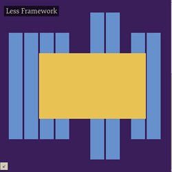
It was basically a fixed-width grid that adapted to a couple of then popular screen widths by shedding some of its columns. It also had matching typographic presets to go with it, built with a modular scale based on the golden ratio. The resources it was originally published with are still available on GitHub. Contrary to how most CSS frameworks work, Less Framework simply provided a set of code comments and visual templates, instead of having predefined classes to control the layout with.