
The 5 Most Popular Frontend Frameworks of 2017 Compared — SitePoint This article was updated on May 17, 2017, to reflect the current status of the features present in the front-end frameworks listed below. Nowadays there is a deluge of CSS front-end frameworks. But the number of really good ones can be narrowed down to just a few. In this article we’ll compare what I think are the five best frameworks available today. Each framework has its own strengths and weaknesses, and specific areas of application, allowing you to choose based on the needs of a specific project.
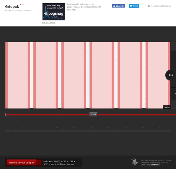
Golden Grid System GGS was my next step after Less Framework. Instead of a fixed-width grid, it used a fully fluid-width one, without even a maximum width. The resources it was published with are still available on GitHub. The idea was to take a 18-column grid, use the outermost columns as margins, and use the remaining 16 to lay elements out. On smaller screens the 16 columns could be folded into 8, 4 and 2. This behaviour was inspired by Massimo Vignelli's Unigrid system.
favico.js - Make use of your favicon Badges Animate your favicon with animated badges. You can customize type of animation, position, background color and text color. Slide animation Fade animation Pop animation Animated Content Tabs with CSS3 About us You think water moves fast? You should see ice.
The Internet map The map of the Internet Like any other map, The Internet map is a scheme displaying objects’ relative position; but unlike real maps (e.g. the map of the Earth) or virtual maps (e.g. the map of Mordor), the objects shown on it are not aligned on a surface. Mathematically speaking, The Internet map is a bi-dimensional presentation of links between websites on the Internet. The Cost of Frameworks Update: Nov 16th 2015 - Added an extra row in the table for React under production conditions. The good news: it’s 3x slower than vanilla, yes, but in actual terms I’d say it’s fast for TodoMVC! The Polymer TodoMVC sample was also updated to version 1.2.2 today, and that, too, is faster. If you prefer watching to reading, here’s the video of the talk (you can also get the slides, too, if you like): If you prefer reading to watching, well, keep reading…
Website speed test Nobody Likes a Slow Website We built this Website Speed Test to help you analyze the load speed of your websites and learn how to make them faster. It lets you identify what about a web page is fast, slow, too big, what best practices you’re not following, and so on. We have tried to make it useful both to experts and novices alike. Why you learned the grid layout system all wrong I mentioned the “Swiss School” and “the grid” layout in another article and while most comments were positive about the article, there were a number of people who asked if the grid was even still alive. I assure you the grid layout is alive, well, and used all the time. Those who never learned it just don’t realize the rules of the grid and how one can use or even bend, or break those rules for success in designing incredible layouts. Firstly, using a grid layout isn’t something assigned to print or digital exclusively.
6 Useful Fallback Methods For CSS CSS is commonly known as cascading style sheets which can be defined as basically a style sheet language and it is used for describing the presentation semantics which in lay man’s language is the looks and formatting of a document that is initially written in markup language. CSS has to perform the basic purpose of separating the content that the document has from the presentation of the document presentation that includes elements such as colors layouts and fonts. If you are working with CSS , it is very important to have a good set of tools so that you can easily speed up the process and not only does it speed up the process but using these tools can also help simplify the work to a very great extent which is also of great help. A few days ago, we had covered some best resources/tools for css and this time we are going to share some best fallback methods for CSS. I hope developers and designers would love to use these code in their next project.
Best practices for navigation on the mobile web The way people access information online is evolving. Google reports that by next year (2013) more than half of website visits will come from mobile devices rather than desktops or laptops. Not only is the medium of accessing the web changing, the needs of most mobile users going online with their smartphone or handheld device is changing as well; becoming more focused and task oriented. Today’s smartphone owners use their phones to perform specific tasks such as checking locations of destinations, public transit schedules, and bank balances. While internet browsing on handheld devices does occur (especially when standing in really long lines or waiting for a bus) many people prefer to surf the web from the comfort of their home or office.