
http://www.awwwards.com/20-best-web-fonts-from-google-web-fonts-and-font-face.html
Related: Web ToolsProyectos Ágiles Scrum es un proceso en el que se aplican de manera regular un conjunto de buenas prácticas para trabajar colaborativamente, en equipo, y obtener el mejor resultado posible de un proyecto. Estas prácticas se apoyan unas a otras y su selección tiene origen en un estudio de la manera de trabajar de equipos altamente productivos. En Scrum se realizan entregas parciales y regulares del producto final, priorizadas por el beneficio que aportan al receptor del proyecto. Planning And Implementing Website Navigation Advertisement The thing that makes navigation difficult to work with in Web design is that it can be so versatile. Navigation can be simple or complex: a few main pages or a multi-level architecture; one set of content for logged-in users and another for logged-out users; and so on.
CSS: Eigene Schriften einbinden - time4joomla Die Überschriften auf dieser Site bestehen aus einem Font, den ich per CSS eingebunden und entsprechend den Joomla-Klassen zugewiesen habe. Leider benutzen der Internet Explorer von Microsoft und die meisten anderen Browser unterschiedliche Fonttypen. Für die meisten Browser reicht ein True-Type-Font (TTF) aus. Der IE benötigt aber einen Open-Type-Font (EOT). XAMPP - Problemas Frecuentes. Soluciones Espero que a estas alturas ya tengas un servidor local para realizar pruebas, bien sea porque has instalado XAMPP o porque lo has puesto en una llave USB. También espero que lo hayas puesto en funcionamiento por primera vez; sin embargo hay posibilidades de que encuentres algún problema, y que no sepas cómo resolver, si ese es el caso sigue leyendo. Vínculo Directo al Panel de Control Si saliste completamente del Panel de Control haciendo click en “Quit”, lo más probable es que estés buscando cómo acceder a él la próxima vez que lo necesites. Recuerda que XAMPP si seguiste la recomendación, está instalado en C:\xampp. Abre esa carpeta con el Explorador de Windows y busca en ella un ícono denominado: xampp-control.exe (ver imagen), hazle click con el botón derecho del ratón y selecciona “Copiar”; a continuación busca un espacio vacío en tu escritorio, haz click con el botón derecho del ratón y selecciona en el menú “Crear Vínculo Directo”.
Pro tips: 20 steps to the perfect website layout When designing a website layout there are some common mistakes that often pop up, especially with interns and new designers. In this list of steps to the perfect website layout, we cover what every new website builder working within a digital agency should know and do before starting a new project, and what they should pay attention to during the process to avoid making these mistakes. These principles cover not only design aspects but also general workflow tips that will get the job done nicely. Follow them and you'll soon be on your way to creating professional website layouts.
Stylesheets / CSS-Eigenschaften / Schriftformatierung mit Schriftartendatei @font-face, src, font-family (Schriftformatierung mit Schriftartendatei) Von diesen in CSS2 eingeführten Angaben wurde nur @font-face vom Internet Explorer und Netscape 4.x unterstützt. Da sie weder in den Mozilla-Nachfolgern noch in anderen aktuellen Browsern implementiert sind, gehören sie in CSS 2.1 nicht mehr zum Standard! Sie sollten also stets auch passende Alternativ-Schriftarten angeben, wenn Ihre Seiten nicht ausschließlich von Nutzern des Internet Explorer besucht werden (die die Schriftart-Installation bei hoher Sicherheitsstufe auch bestätigen). Über @font-face können Sie für den Internet Explorer eine Schriftart definieren und dabei direkt die Daten-Ressourcen der gewünschten Schriftarten ansprechen, also bestimmte Schriftartendateien. Vorgesehen war außerdem, mit Hilfe spezieller Definitionen die Charakteristika der gewünschten Schriftart exakt beschreiben zu können.
Lessons We Learned from Our Biggest UX and Design Mistakes We’ve finally hit the 500,000-user mark at Buffer, a product that helps you share on your social media networks more efficiently. About two years ago when we started on our path to building Buffer, we knew we’d be meeting obstacles and making mistakes along the way. One of the main things we’ve kept in mind is that making mistakes is unavoidable and that if we choose to learn from them, they’ll be helpful in giving us good guidance on how to move forward more effectively. And I believe that it’s partly because of these mistakes that we were able to get to where we are today. The Experience That Shaped How We Build Our Product
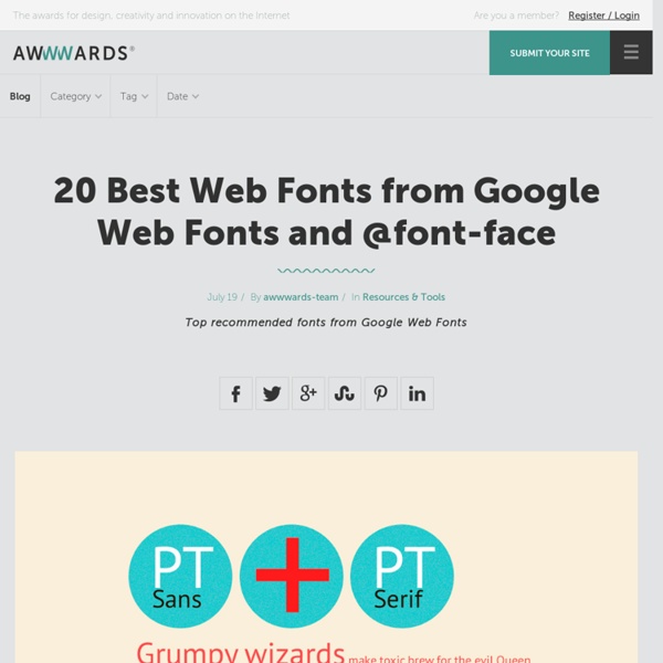
Web fonts with @font-face Home / CSS3 Previews / Web fonts with @font-face Not exactly a feature which is new to CSS3, @font-face was first proposed for CSS2 and has been implemented in Internet Explorer since version 5! However, their implementation relied on the proprietary Embedded Open Type (.eot) format, and no other browsers decided to use this format. mashable With roots in classical Latin literature, lorem ipsum has been the print industry's standard dummy text since the 16th century, and it was popularized in the 1960s. It has become the de facto placeholder text in web design, too (as gathering content from clients can often be a frustrating process), and is used in place of meaningful content during the design phase. Some argue that "real data delivers really effective design," and by using dummy text, you create a domino effect in your design that will have consequences when real content is added. But there are others who believe it can be a useful tool that still has value in the design process.
80 Creative Logo Designs For Your Inspiration They say a picture speaks a thousand words, and that is definitely true when it come logo design. A well-thought logo design can effectively use a simple icon to leave a deep enough impression for the public. Most logos communicate ideas to people, for instance the kind of quality services a company can provide for its customers.
This Summer's Best Logo Designs - 40 Logos Normally, summer is a time for vacation but somebody still has to work and that’s an opinion that some designers share with me. The proof for that lies in this article with 40 great logos, probably the best that appeared in these last months. Creation Rubens Nuts
Developing an Effective Logo Design Brief This post was written with the client in mind, however may also prove to be a useful resource for other designers. To develop an effective brand identity for your business it is essential that you are proactively involved in the process from the start. A designer can’t possibly hope to design an effective logo without your input, which is why the very first step in a logo design process should always be the development of a detailed design brief. logo design Packages Our packages are specially designed, based on our client feedback. Please select from the packages below that best fits your needs. 6 logo design concepts 2 logo designers working on the project 48 hours turnaround. Full copyright ownership