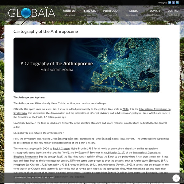
The Geotagger's World Atlas
Every city has something unique about it, whether it’s a memorial statue, a cool coffee shop, a world-renowned museum or a local pizza parlor. These places are visited by hundreds or maybe even thousands of people a year, which translates to dozens of photos, many of which are geotagged to show the location of these popular and special places. So, what would happen if you took all of those photos and created a map, linking the photos to show individual journeys and locations?
Subcomission on Quaternary Stratigraphy, ICS » Working Groups
You are in: Home » Working Groups What is the 'Anthropocene'? - current definition and status The 'Anthropocene' is a term widely used since its coining by Paul Crutzen and Eugene Stoermer in 2000 to denote the present time interval, in which many geologically significant conditions and processes are profoundly altered by human activities. Working group convenor: Dr Jan Zalasiewicz (Leicester) e-mail: jaz1@le.ac.uk
Mapline Blog How to Make an Awesome Data Visualization with Pin Map
What is a Pin Map? 1 location = 1 pin Got the idea? Therefore, a pin map contains pins that each represent a geographical location. Be it a complete address, a county, a region, a state, or a zip code, Mapline can help you plot a pin map. Columns on your Excel spreadsheet data is plotted on your map data, allowing you to search for geographic information faster.
Antonio Stoppani's Anthropozoic
Edited by Etienne Turpin + Valeria Federighi Images Lisa Hirmer Lisa Hirmer, Untitled, from Sudbury Slag, 2012 Introduction
The Agas Map
Our new (as of the beginning of 2015) implementation of the Agas Map is based on the OpenLayers 3.0 library. It presents the map as a zoomable, rotatable tiled image with several hundred locations plotted on it. In the default view, the locations are initially hidden; you can show them by checking checkboxes in the navigation panel which appears at the top right of the map.
How Did Humans First Alter Global Climate?
The scientific consensus that human actions first began to have a warming effect on the earth's climate within the past century has become part of the public perception as well. With the advent of coal-burning factories and power plants, industrial societies began releasing carbon dioxide (CO2) and other greenhouse gases into the air. Later, motor vehicles added to such emissions. In this scenario, those of us who have lived during the industrial era are responsible not only for the gas buildup in the atmosphere but also for at least part of the accompanying global warming trend. Now, though, it seems our ancient agrarian ancestors may have begun adding these gases to the atmosphere many millennia ago, thereby altering the earth's climate long before anyone thought. New evidence suggests that concentrations of CO2 started rising about 8,000 years ago, even though natural trends indicate they should have been dropping.
I-Map: Common Outputs
Interactive Map of Irregular and Mixed Migration Routes in the Budapest Process, Mediterranean Transit Migration Dialogue and Prague Process Regions This interactive map is a common output of the BP, MTM and PP. It was elaborated on the basis of the 2012 MTM Map on Irregular and Mixed Migration Routes, the 2010 Prague Process "Building Migration Partnerships" Map on Illegal Migration Routes and the 2013 Mapping of Migration Routes in the Silk Route Region. Please note that data collection methods vary from one project to the other. This map only provides an overview of irregular and mixed migration routes in the above mentioned regions.
Enter the Anthropocene
Elizabeth Kolbert from Geologic City: A Field Guide to the GeoArchitecture of New York, smudge studio 2011 The path leads up a hill, across a fast-moving stream, back across the stream, and then past the carcass of a dead sheep. In my view it’s raining, but here in the Southern Uplands of Scotland, I am told, this counts only as a light drizzle, or smirr. Just beyond the final switchback, there’s a waterfall, half shrouded in mist, and an outcropping of jagged rock. The rock has bands that run vertically, like a layer cake that’s been tipped on its side.