background preloader

The code-savvy web design tool.

The code-savvy web design tool.

Le Responsive Web Design ou comment améliorer l’expérience utilisateur Ce billet a été lu 3175 fois. À votre tour? Le RWD pour adapter votre site aux comportements de l’utilisateur… Avant d’attaquer le développement, penser expérience utilisateur, ergonomie et contenu! Les comportements des utilisateurs mobiles poussent les entreprises à optimiser leur site pour une lecture adaptée à toutes les tailles d’écran. Le Responsive Design : entendons-nous bien Un site Web non adapté aux smartphones, tablettes, ordinateurs, télévisions connectées… perd une part d’audience (et donc de revenu) non négligeable. Le but du Responsive Web Design est de permettre à un site Web de s’autoadapter à la taille de l’écran de l’utilisateur, pour améliorer encore et toujours l’expérience de l’utilisateur dans la navigation Web. Le Responsive Web Design regroupe une série de techniques de conception graphique, ergonomique et de développement. les media queries (CSS3),les grilles fluides etles images flexibles. Le contenu et la navigation d’abord, le développement ensuite Et vous?

Choisissez votre outil de maquettage ! À l’approche des fêtes, nous avons décidé de remettre à jour notre liste d’outils de maquettage. Parmi trente outils testés, nous en avons sélectionné une vingtaine, en les catégorisant pour vous aider à mieux choisir. N’hésitez pas à réagir à cette liste pour le plus grand bonheur de tous. Vous souhaitant une bonne lecture et d'excellentes fêtes ! Des outils très complets pour des interactions très poussées Axure Axure, est incontestablement indétrônable en termes de maquettage dynamique. Justinmind Justinmind est un concurrent sérieux de notre bon vieux Axure. Une solution plus simple mais efficace Balsamiq Mockup Balsamiq, malgré son manque de richesse en interaction, reste apprécié pour créer rapidement des maquettes. Les outils généralistes Certains outils ont des fonctionnalités qui ne sont pas nativement dédiées au maquettage. Power mockup Power Mockup est une extension de powerpoint, qui permet d’importer une bibliothèque de patterns. Microsoft Visio OmniGraffle Pour les webdesigners Cacoo

10 Responsive Navigation Solutions and Tutorials Planning and creating your menu for mobiles will perhaps be the trickiest aspect of building a responsive layout. It is a juggling act between both readability and functionality. In years gone by, it was about converting your navigation into a <select> drop-down menu, now, its all about the “three line” (or hamburger menu), toggle menu, drawer-style navs and animated side panels. Hopefully the solutions we have for you below will help get you on your way. You might also like to check out this related article: 15 Responsive Navigation jQuery Plugins → Basic Responsive “Three Line” Menu (CSS & jQuery) This tutorial shows you how to, with a relatively short amount of code, progressively enhance a responsive site and build a “three line” responsive menu without adding additional markup to the page. Basic Responsive “Three Line” Menu Responsive Multi-Level Navigation (CSS & jQuery) Responsive Multi-Level Navigation Responsive Toggle Menu (CSS & jQuery) Responsive Toggle Menu Top Drawer MeanMenu

Responsive Web Design: 50 Examples and Best Practices Deren Keskin Sweet Hat Club Glitch dConstruct 2011 Adaptive Web Design Authentic Jobs Five Simple Steps Splendid Ryan O’Rourke FlexSlider El Sendero del Cacao Do Lectures St Paul’s School Naomi Atkinson Design Ben Handzo Photography Stunning CSS3 Media Queries Example Nordic Ruby Conference Halifax Game Jam Diablo Media ASU Online 3200 Tigres Pixelab Kings Hill Cars 8 Faces Asbury Agile Alsacréations Sleepstreet Inspired: Media Queries 13 Super Useful UI Wireframe Tools When you begin to work on a project, it’s always important to begin creating your ideas as a wireframe. It is the step you take to put your ideas in action to see if what you have in mind will work properly. We recently posted an article showcasing Inspiring UI Wireframe Sketches and we received some inquiries about wireframing tools, so we decided to gather a few suggestions for you. pidoco Pidoco is a web-based prototyping software for rapidly creating clickable wireframes and UI prototypes for web, mobile and enterprise applications. It’s easy to use with smart sharing and collaboration features, a convenient usability testing module and much more. justinmind The best platform to define web and mobile apps with rich interactive wireframes. Jumpchart Make planning architecture easier with Jumpchart. Creately Here at Creately, we are focused on making it easier for teams to work collaboratively on all things visual. frame box Easy frame sharing. Pencil JustProto Gliffy WireframeSketcher MockNow

Flat Mobile UI Design with Remarkable User Experience | Design Flat design means designing without the usual gradients, pixel perfect shadows, and skeuomorphism that’s been rampant in recent years (more on this later) to achieve what appears to be a “flat” interface. The most beautiful, modern and amazing Flat Mobile UI Design is right here. Today we’re picked up 50 Flat Mobile UI Design with Remarkable User Experience from behance and dribbble for inspiration. All the Mobile App UI/UX designs are created by professional graphic designers who can join web’s biggest platforms from all over the web. Its a big list of fresh Mobile App UI designs available on the web. The actual fact of User Interface (UI) and User Experience (UX) is that both UI/UX are the two sides of the same coin. If you need Flat UI Kits, Flat Elements or Flat Design Concepts for your website or mobile app then you can get in touch with us. You may be interested in the following modern trends related articles as well. 1. Source 2. Source 3. Source 4. Source 5. Source 6. Source 7. Source

Dossier : comment apprendre le webdesign en ligne ? Inexistant il y a encore 20 ans, le métier de webdesigner suscite aujourd’hui de nombreuses vocations dans notre monde connecté. Si vous faites vos premiers pas dans le web ou que vous souhaitez vous perfectionner en webdesign grâce à Internet, cet article est fait pour vous. Depuis l’ouverture du blog, vous avez été nombreux à m’écrire pour en savoir plus sur les possibilités d’apprendre le webdesign. Quelles études suivre ? Quelles sont les meilleures écoles ? Quel est le parcours idéal pour exercer le métier de webdesigner ? Apprendre sur le web En tant que professionnel depuis presque 3 ans maintenant et intervenant en IUT, j’ai pu échanger avec de nombreux webdesigners. La démocratisation du web a fait naître une génération d’autodidactes. Tels 7 commandements, voilà 7 axes à la fois indépendants et complémentaires sur lesquels vous pouvez vous baser. 1. Les tutoriels se trouvent en général sur des sites spécialisés. Living Tuts AlsacreationS Webdesign Tuts+ Site du Zero Dot Design Tuto

Documentation & Demos – YAML CSS Framework File Structure Within the download package fo you will find a folder called yaml with the following file stucture. This folder contains all components of the framework and should stay unchanged for easy updating. If you want to modify any file, put a copy in your local CSS folder and reference it from there Core Components Part 1: Framework Base "base.css" yaml/core/base.css The stylesheet base.css in the folder yaml/core/ is the first and most important core-file of the YAML framework. List of Core Modules Part 2: Support for old Internet Explorer versions "iehacks.css" yaml/core/iehacks.css The stylesheet iehacks.css from the yaml/core/ folder is the second core component of the YAML framework. This stylesheet is optional but required for legacy support of old Internet Exlorer versions prior IE 8 and should remain unchanged! List of IE 6,7 bugsfixes provided by iehacks.css: Basic HTML/CSS Template Here's a template of an empty HTML5 file containing the integration of YAML's core stylesheets: <!

Apprendre - Best of Webdesign treehouse Official website Code School Official website Codecademy Official website 20 Free PSD Map Designs for Web Designers Maps are almost a MUST when designing contact pages for business companies. If you want your contact page to look better, then you should probably think about creating a custom map design. We’ve made this easier for you by surfing the web and finding 20 of the best, FREE PSD map designs for web designers. Transport Pointers These freebie set contains many transport pointers, created in Photoshop. Map Pins & Tooltips This PSD freebie is a set of map pins and tooltips. Vector Map Location Pins This PSD freebie is a collection of location pins for use on maps. Classy Custom Gmaps Tooltip Overlay This PSD map design freebie is a custom Smart Info Window Gmaps tooltip overlay design with 2 different skins, light and dark. Map, Pin & Tooltip This freebie is a map PSD, with pins and tooltips. Map Pop Up This is a pop up for map UI. Bulb Map Markers Collection This freebie is a map icons collection in bulb style. Flip Over Map Map UI Controls Pixel World Maps Markers for maps User Bubble World Map & Pin

Minimalist Web Design: When Less is More As designers, we all know that a minimalist design can achieve beautiful results. Still, many designers have trouble creating one; either they have a hard time making a page with so few elements look good or the final result just doesn’t look “complete.” There are many articles on the Web about minimalism and this article aims to help you achieve a minimalist design that is beautiful but not bare. To top it off, we’ll present a small showcase of minimalist designs, so that you can analyze why some designs work and others don’t. What Is Minimalist Design? Minimalist design has been described as design at its most basic, stripped of superfluous elements, colors, shapes and textures. Its purpose is to make the content stand out and be the focal point. The design movement began in Switzerland and was then applied to a variety of media: graphic design, architecture, music, literature, painting and, more recently, web design. We’ll go over the basic principles of minimalist design. Less Is More 1.

Graphic Design Tutorials : Graphic Design Software Directory & Portal for Graphics Tips : Desktop Publishing Resources & Graphic Design Links

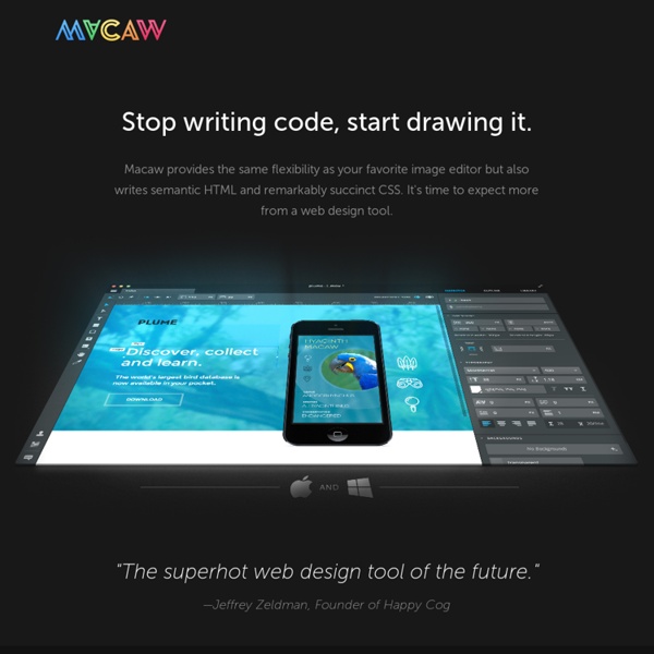
Macaw provides the same flexibility as your favorite image editor but also writes semantic HTML and remarkably succinct CSS. by anturija Oct 23

Related: