background preloader

Create a Zee Vintage Label on Illustrator

Create a Zee Vintage Label on Illustrator
It seems that the past 3 years had a boom of retro design, starting with the "cosmic neon lightning" 80's aesthetic that I think most of you are already bored about. Not just because it became a trend, but also because everyone with a photoshop could emulate one. So here's the thing, this new retro wave more focused on 50's and 60's design and illustration seems to be really different, why? Because most of it is hand drawn, and when it to comes to drawing, you wouldn't believe how many designers can't do it. Let's assume, the last 20 years were pretty revolutionary to design since the computer took a big role on productivity and creation. Step 1 First of all, let's open Adobe Illustrator and create a new canvas with 21 x 21 cm (8,27 x 8,27 inches). You probably already know I'm addicted to guides, they're quite useful to get layout orientation, but not exactly a need to. You should divide your layer like these, use command + L / ctrl + L to create new layers. Step 2 Step 3 Step 4 Step 5 Step 6

Reader Tutorial: Geometric Flower Effect Logo in Illustrator In this tutorial I will show you how I made this nice logo for one of my clients in Czech Republic. Feel free to use it as inspiration, but please do not copy it in any form. All copyrights belong to the owner whom I made it for. The final product will look like this: Step 1 We'll start by making a new document with 180 mm width and height. Select the Ellipse tool (L), create the ellipse, fill it with no color, select black outline and put it in the center of the document. Step 2 Now, we are going to copy the ellipse 8 times around the circle. Step 3 Now press CTRL+D 7 times and you get to this point: Step 4 We can now delete the guide lines; we do not need them later. Step 5 Now press Shift+CTRL+G to ungroup all objects. Step 6 We are going to play with gradients now. Step 7 Then select another group of 6 objects and apply gradient from C80 M100 Y0 K0 to C80 M100 Y0 K80, here we go: Step 8 Select another following group of 6 objects and apply gradient from C0 M100 Y100 K0 to C0 M100 Y100 K80.

Quick Tips: Instagram your images using Photoshop Instagram reinvented the photo sharing on our social media structure. It's a fast, beautiful and fun way to share your pictures to friends and family. And what I like the most about Instagram, are the various schemes that offers you to filter your pictures with your own little touch. My all-time favorite Instagram filter is the "Nashville" and today, I will show you a quick tutorial about how to achieve that same effect on your images. It's a very simple effect and very easy to accomplish in Photoshop. Step 1 Open your image in Photoshop and double-click on the background layer to make into a layer and named it Nashville. For this tutorial, I've used an image from Patrick Smith from Patrick Smith Photography. Step 2 Create a new layer and fill it with the color (Red: 247 , Green: 217 , Blue: 173) and leave the opacity to 100% and your blending options to "Multiply". Step 3 Click back on the "Nashville" layer and click Image > Adjustments > Curves. Step 4 Step 5 Step 6 Step 7 Step 8 Final Words

Tips on Creating Fluffy Characters One of the best things about clients is that they're always surprising us with some random and misterious pitch works. One of my last briefings was to create a fluffy character, but since I always made illustrations more realistic, this was quite a challenge for me. As some of you may have thought, I also tought that creating a fluffy character would be as easy as drawing an apple, but I was wrong and on this tutorial I will explain the reasons why. So, you may be asking yourself, why is not that simple to create a fluffy character? Melanie Matthews Tamara Henderson Jeremy Ville Bruno Mota Ok, now that we are inspired, let's do it! The tips I will describe are all based on my observations and experiences while trying to reach good results on character design, but I'm open for any tips and tricks you may know, so please comment and share your knowledge with us. 1) Remarkable and Simple Silhouette First of of all, let's try a bit of trivia, can you recognize the characters bellow?

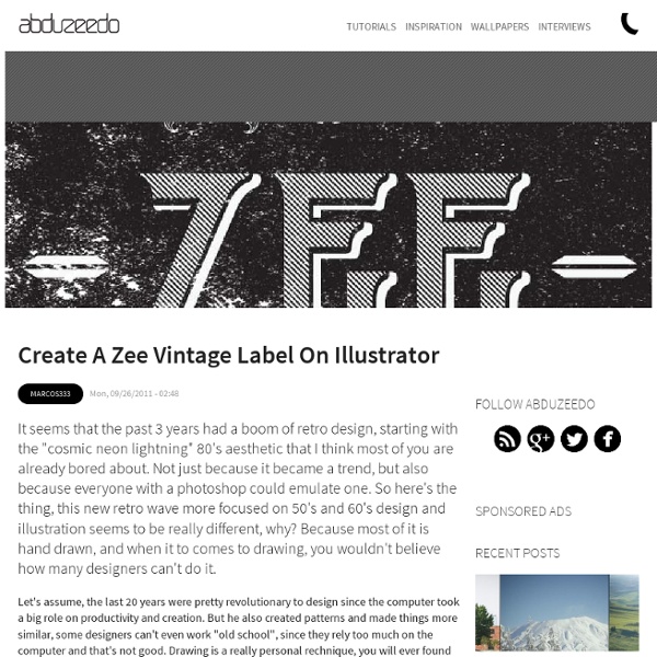
Making a Retro/Vintage Style Badge With Illustrator - Yassine Bentaieb This week we will be making a nice retro/vintage style badge. We will create the badge with all the shapes and text we need in Illustrator and then finish it off in Photoshop with some nice textures to give it that vintage feeling. You will learn more about the Pathfinder, Offset Paths, playing with type, and making an awesome badge! The design below is what we’ll be creating: Creating the badge shape. We’ll dive right in and start with making a simple rectangle with the Rectangle Tool(Shortkey: M). Now click the rectangle you just created and go to Effect > Warp > Bulge, and fill in the settings you see below. Select the bulged rectangle and go to Object > Expand Appearance to make it one unified shape. Now let’s make the corners a bit more interesting. In the next step we select our group of circles, hold Shift and select the bulged rectangle. Spicing up the edges. Now that we have created our badge shape, let’s make a nice dashed line on the edge of it. Adding some decorative elements.

Create a Badass Gas Mask in Illustrator Hi everyone, it's been a while since I dropped my last illustrator tutorial and so I decided to teach a really classy lesson this time. I've been a huge fan of vector art ever since I started working as an art director then as an illustrator. And I always appreciated the work of some of the masters like Pale Horse Design, Hydro 74 and Chris Vector. Their extremely detailed illustrations are really eye catching and sharp, I always wanted to understand how they do that. Years and lots of hours of illustrating later, I think I can finally understand aspects such as sketching, outlining, shading, hachures and filling that are most used to make great artworks. So, today we are going to learn how to create this gas mask using only vectors. Sketch As always, I try to sketch the idea before going to the software, I think a sketch is more than 50% of the work, it's the concept, it's when you see what can be possible and what cannot. Outline Step 1 Step 2 Step 3 Step 4 Step 5 Remember the fan vector?

Design with Swirls and Flourishes It’s very common these days to see swirls and flourishes within graphic design. You can use brushes or vectors to achieve this look, but if you want to customize your own you’ll have to dig in and spend some time creating them. This swirl designs tutorial will cover some of the techniques you can use to create your own beautiful swirls and flourishes. A quick thanks to Zoe who requested this kind of tutorial by dropping me a comment. If there is a tutorial you would like to see covered, I would love to see your suggestions. You should check out My 10 Favorite Swirls and Decorative Brush Sets post for some awesome free design elements you can download. Design with Swirls and Flourishes Tutorial Step 1 Open up Illustrator and create a new document. Step 2 Throughout this tutorial we are going to create brushes and symbols to help us make the shapes. Step 3 Open up the brushes palette. Step 4 Click on the swirl you made and then the new brush you made to apply the brush. Step 5 Step 6 Step 7 Step 8

Create a Business Card in Illustrator and Print it with UPrinting Business cards are one of the staples of any working graphic designer. In this tutorial we'll take the Rockable Press brand we worked through in Part 1 of this set of tutorials and apply it to create and print business cards with UPrinting. Business Cards - Step 1 As we'll be doing tomorrow in the upcoming Brochure tutorial we'll begin by going to the printer that we're going to be using to get our item specs. So we head over to UPrinting and click on Business Cards and decide on the following specifications: Size: 2" x 3.5" Stock: 14pt Cover MatteColor: 4 Color Both Sides Step 2 Next we need to find and download the appropriate template. Step 3 Opening up the template in Illustrator reveals it to be a three layer file. Additionally you should note the Safe Zone which is where our artwork needs to stay inside of to ensure it all gets printed properly. Step 4 Now we add our artwork. So to add the artwork just click on the middle layer on the template file and add your items there. Step 5 Step 6

PS - Painting in Photoshop CS5 (Part 1) | The Complete Picture with Julieanne Kost Share this Episode Please select a language: Autoplay End of Video Show End Screen Default Quality Adjust your embed size below, then copy and paste the embed code above. Community Translation Episode available in 7 languages Available Translations: Join the Community Translation Project Thanks for your interest in translating this episode! Please Confirm Your Interest Thanks for your interest in adding translations to this episode! An error occurred while processing your request. Another translator has already started to translate this episode. Thanks for Participating! This episode has been assigned to you and you can expect an e-mail shortly containing all the information you need to get started. About This Episode In this episode of The Complete Picture, Julieanne Kost shows you some of the new painting features in Adobe Photoshop CS5 including the new Natural Media Bristle Tip Brushes. Presented By

How To Create a Cool Vector Yeti Character in Illustrator Follow this step by step Illustrator tutorial to create a cool vector Yeti character. We’ll use as many basic shapes as possible to achieve that quirky style of illustration, then bring the character to life with a palette of cold colours. Despite the use of basic shapes this tutorial includes a good spread of intermediate to advanced tools and techniques. The Yeti character we’ll be creating is made up of basic shapes to maintain that simple illustration feel. View the vector Yeti character design Whenever you start a character design it’s always worth creating a rough sketch to base any vector element on. Match up basic shapes to flesh out the overall appearance of the character. Blend the rectangle legs with the main oval body using the Merge button from the Pathfinder palette, then use the Direct Selection tool to delete out the upper points from the rectangles and lower point of the circle to leave two open paths. Select one end of the open path and join it to fill the gap.

Fun Print-Ready Doodled Business Card Design There’s nothing more unique to your creative talent than a series of your own doodles and sketches. Let’s use the good old doodle to represent our design services by combining quick and fun doodles with a print ready business card design. We’ll be drawing our doodles directly in Illustrator, and using the application’s print abilities to set up our business card document with the correct margins and bleed to build a complete print-ready PDF document. The design we’ll be building calls upon some random ideas for the topic of your doodles. How about a stick-man battle or a cow abducting UFO for the focal point of your business card? Start work by opening up Adobe Illustrator. Illustrator has kindly positioned a red guide to let you know where your bleed boundaries are, as well as the black outline showing where the final card boundaries will be. Right click and unlock the guides. Repeat the process for the top and right guides, but this time enter -5mm so they are moved negatively.

Vector Tutorial: Creating A Killer 3D Pie Chart in Illustrator I was doing some 3D charts for a project when I thought about sharing a similar tutorial here in Graphic Design Free Resources. In this tutorial we will create visually compelling 3D pie chart from raw data and explore several techniques in enriching graph design and presentation. Is Adobe Illustrator the best tool for this job? Sometimes. If you only create the occasional graph or you need to build highly creative graphs, Illustrator is absolutely the best tool for the job. If, however, you need to create and update graphs often, or your creative needs don’t extend much further than flat charts or rudimentary 3D-style graphs, consider using a dedicated graphing application or Microsoft Excel. As always, prepare your data in advance. In four easy steps we’ll enter data, build a 3D pie graph, and add some enhancements to make it more visually appealing: 1. Graph scenario GDFR conducted an online survey (we gave away a couple of iPhones as incentive! The Tutorial 1. a. b. c. d. 2. a. b. c. 3.

Create Your Own Spoof Airplane Safety Illustrations This post was originally published in 2008 The tips and techniques explained may be outdated. A reader commented on a previous post with the great idea of creating a tutorial on how to produce vector illustrations in the style of the safety cards found in aircraft, as seen on examples from Airtoons.com. Follow this step by step guide to creating your own illustrations, ready for the combination with comedy captions! Unless you are a talented artist, use photography as a base for your poses. This can be sourced from a stock photography website or quickly created by directing a group of friends into the relevant positions and poses. Open up your pictures into Adobe Photoshop. Roughly trace around the outline of the character, minimizing some of the detail if necessary such as the folds and creases in clothing. Continue by creating more paths outlining the shape of the face, here I've used my own discretion to give the character a stylish side parting.

Related: