
Maps. The Map is not the territory. Worldmapper: The world as you've never seen it before. SHOW®/WORLD - A New Way To Look At The World. Trendsmap. Maps and Apps for EveryoneEasy online discovery, access, visualization, and dissemination of geospatial information. Maps on the Web. Maps on the Web: Archive. Sciences Po Map Library. Interactive Maps - Marks & Spencer. World Stats Interactive Maps - Index. This index lists over 400 interactive world maps covering areas such as health, education, drugs & crime, economy, environment, gender and population for all countries.
See also the data sources. Strange Maps. Mappe, Europa e Lingua. Average summer temperature in Italy. Mappa dei dialetti in Italia. Europe etymology maps 1. Languages of Europe. Religions and Language Families in Europe.[[MORE]]... Religions and Language Families in Europe. by midnightrambulador Europe: Pick Your Master RaceReligion and language have been two of the most important factors in shaping cultural identities.
![Religions and Language Families in Europe.[[MORE]]...](http://cdn.pearltrees.com/s/pic/th/religions-language-families-137741275)
So I thought it would be interesting to see language families and religious denominations overlaid on a single map of Europe, and since I couldn’t find such a map, I decided to make one myself. My sources are this map for religion and this one for language (and liberal cross-checking with Wikipedia for both).The classic idea is that “Northern Europe” is Germanic and Protestant, “Southern Europe” Romance and Catholic, and “Eastern Europe” Slavic and Orthodox. And sure enough, these three are the most prominent combinations on the map. Germanic languages and main dialect groups in Europe.
La Svizzera linguistica. CGET - Cartothèque. Map My Surname. 23 maps and charts on language. By Dylan Matthews on April 15, 2015 "The limits of my language," the philosopher Ludwig Wittgenstein once posited, "mean the limits of my world.
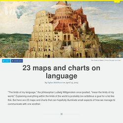
" Explaining everything within the limits of the world is probably too ambitious a goal for a list like this. But here are 23 maps and charts that can hopefully illuminate small aspects of how we manage to communicate with one another. The basics Indo-European language rootsMinna Sundberg, a Finnish-Swedish comic artist, created this beautiful tree to illustrate both the relationships between European and central Asian languages generally, as well as a smaller but still striking point: Finnish has less in common with, say, Swedish than Persian or Hindi do.
Language divides Bilingualism Who in Europe speaks EnglishMany countries have more than one commonly used language, with many residents learning two or more. English American English. How to pronounce “G” in different European languages. How to Say 'raccoon' in Europe. Indo-European languages divided by subgroup.
Order of noun and adjective. Differences in GDP per capita in Europe. European countries by percentage of population living in the capital metropolitan area. Prisoner ratio in Europe. Hypothetical map of Europe if regional independence movements were to split European countries into smaller sovereign states. Carte à la une. Représenter la peur : la carte de la menace ressentie par les Européens. Bibliographie | citer cet article La sécurité et la défense nationale relèvent des domaines régaliens de l’État.
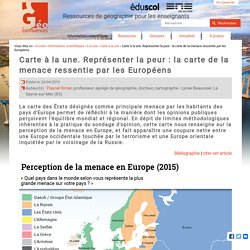
À ce titre, il est chargé d'identifier les menaces extérieures et d’assurer la protection de son territoire et de ses habitants. C'est sur la base de ces menaces qu'une stratégie et une doctrine sont définies ainsi que les moyens pour y faire face. La perception de la menace peut relever de données objectives mais elle comporte aussi une grande part de subjectivité. C’est pourquoi il est difficile et délicat de mesurer la menace comme telle, n'étant par définition ni visible ni quantifiable.
Identifier et nommer la menace, un exercice stratégique aussi incontournable que délicat La question de l'identification d'un ennemi peut relever d'une réalité objective : absence de relations diplomatiques, crises à répétition, embargo et sanctions... mais elle renvoie à une part de subjectivité, à travers la représentation de la menace (réelle ou supposée). Light pollution map. The world split up in two areas of equal population. 8 Maps Showing How The US Fits Into The Rest Of The World. How the US Population Fits in Europe by reddit user jackblack2323 The US is the third most populous country on earth, with over 320 million people according the current U.S.
Census Population Clock. Yet, only around 4.4% of the world’s people live in the country and considering it’s only the 180th most densely populated country on earth, it’s rather sparsely populated. Moreover, if the US ever wanted to catch-up with China (most populated) or India (soon to be most populated), it would have to increase its population fourfold (1.2 billion+). 22 maps that explore modern America. Our home on native land. Thanks to Allison Jones and others for putting this together! Please note: this is NOT a perfect resource! It is very likely that if you do not do any further research or verify our results, you will err in your acknowledgements. We recommend contacting the nations you get in your results directly, to learn more about how they want to be acknowledged and any other nations or peoples in the area. The US really has 11 separate 'nations' with entirely different cultures.
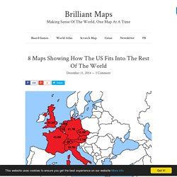
How Much Land the Federal Government Owns Will Surprise You. The rough beauty of the American West seems as far as you can get from the polished corridors of power in Washington DC.
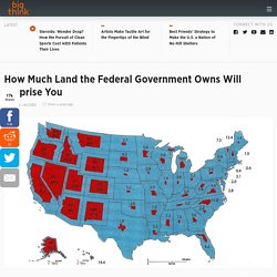
Until you look at the title to the land. The federal government owns large tracts of the western states: from a low of 29.9% in Montana, already more than the national average, up to a whopping 84.5% in Nevada. This map, depicting the distribution and share of federal land per state, was first published on this blog way back in 2008. Nevertheless, it keeps accumulating comments and hits at a steady pace, and is still frequently shared around.
The Obsessively Detailed Map of American Literature's Most Epic Road Trips. The above map is the result of a painstaking and admittedly quixotic effort to catalog the country as it has been described in the American road-tripping literature.
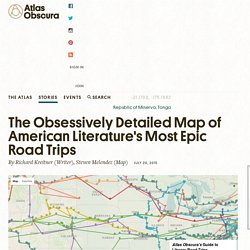
It includes every place-name reference in 12 books about cross-country travel, from Mark Twain’s Roughing It (1872) to Cheryl Strayed’s Wild (2012), and maps the authors’ routes on top of one another. You can track an individual writer’s descriptions of the landscape as they traveled across it, or you can zoom in to see how different authors have written about the same place at different times. Most interestingly of all, for me at least, you can ruminate about what those differences say about American travel, American writing, American history. A word to close readers: I hand-typed most of these 1,500-plus entries and located their coordinates as best I could. Some were difficult to track down. To be included, a book needed to have a narrative arc matching the chronological and geographical arc of the trip it chronicles. The Christianity Map. Australian Aboriginal Map - Indigenous Instyle.
Click on this image to continue to enlarge it and then again to zoom in further.
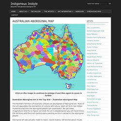
Australian Aboriginal Art in the Top End – Australian Aboriginal Map The Northern Territory of Australia contains an abundance of Aboriginal art. Gapminder: Unveiling the beauty of statistics for a fact based world view. - Gapminder.org. Population par pays - Carte des Pays - Monde. 10 Maps That Will Change How You View The World. Maps are one of those things you can lose yourself in for hours.
Since their humble origins as scribbles in the sand thousands of millennia ago, maps have been useful companions during the development of human culture and society. Top 25 Informative Maps That Teach Us Something Uniquely Different About the World. Population of Southeast Asia Compared to the Rest of the World Maps can be great guides for more than just finding routes for traveling.
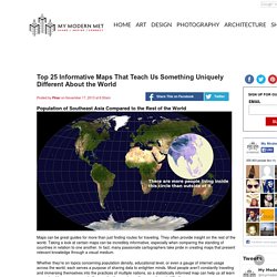
They often provide insight on the rest of the world. Taking a look at certain maps can be incredibly informative, especially when comparing the standing of countries in relation to one another. In fact, many passionate cartographers take pride in creating maps that present relevant knowledge through a visual medium. Whether they're on topics concerning population density, educational level, or even a gauge of internet usage across the world, each serves a purpose of sharing data to enlighten minds.
40 maps that explain the world. By Max Fisher By Max Fisher August 12, 2013.
40 Maps That Will Help You Make Sense of the World. If you’re a visual learner like myself, then you know maps, charts and infographics can really help bring data and information to life. Maps can make a point resonate with readers and this collection aims to do just that.
Hopefully some of these maps will surprise you and you’ll learn something new. A few are important to know, some interpret and display data in a beautiful or creative way, and a few may even make you chuckle or shake your head. If you enjoy this collection of maps, the Sifter highly recommends the r/MapPorn sub reddit. You should also check out ChartsBin.com. 1. 2. The Geography of Empathy and Apathy. Compassion is tricky. Solidarity is a minefield. Did you add the French tricolour to your Facebook profile picture? If not, are you a heartless bastard, or worse, an apologist for the terrorists who killed over 120 innocent civilians in Paris?
Migrations Map: Where are migrants coming from? Where have migrants left? 昼夜問わずたくさんの人が行き交い、様々なカルチャーが混じり合う渋谷は、とりわけ若者やビジネスマンから厚く支持されている人気のキャバクラエリアです。 Croissance et décroissance de la population mondiale : 2005-2010. A Real-Time Map of Births and Deaths - James Hamblin. In 1950, there were 2.5 billion humans. Today there are just over 7 billion. In another 30 years, according to U.S. Census Bureau projections, there will be more than 9 billion. Interactive: Here’s why men on earth outnumber women by 60 million — Quartz. En Europe, des revendications identitaires multiformes, par Cécile Marin (Le Monde diplomatique, novembre 2014) Sects of Islam. The Map Of Native American Tribes - kplu. Finding an address on a map can be taken for granted in the age of GPS and smartphones. But centuries of forced relocation, disease and genocide have made it difficult to find where many Native American tribes once lived.
Aaron Carapella, a self-taught mapmaker in Warner, Okla., has pinpointed the locations and original names of hundreds of American Indian nations before their first contact with Europeans. As a teenager, Carapella says he could never get his hands on a continental U.S. map like this, depicting more than 600 tribes — many now forgotten and lost to history.
Early Indian Tribes, Culture Areas, and Linguistic Stocks (Map ca. 1967)
The Range and Ranch Cattle Area of the United States, 1884. – turok23
ABC Online Indigenous - Interactive Map. Vegetarianism as a percentage of population in India. Malaria Maps. Lion distribution. MapStory. Map creator online to make a map with multiple locations and regions - ZeeMaps. Interactive maps and visualizations.