
Raphaël. Arbor.js. D3.js - Data-Driven Documents. Re-usable charts for d3.js. Over 1000 D3.js Examples and Demos. Area with Missing Data. Labeled Force Layout. Stacked Radial Area. This plot might be suitable for showing cyclical trends, though I'm not sure it’s a great idea as the radial display has a number of limitations: The underlying data goes from Sunday to Saturday, but the chart shows continuity from Saturday through to the previous Sunday.
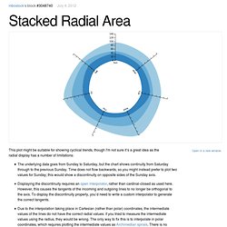
Time does not flow backwards, so you might instead prefer to plot two values for Sunday; this would show a discontinuity on opposite sides of the Sunday axis.Displaying the discontinuity requires an open interpolator, rather than cardinal-closed as used here. However, this causes the tangents of the incoming and outgoing lines to no longer be orthogonal to the axis. Polar charts are pretty. But when in doubt, it’s probably best to stick to Cartesian coordinates. Circular heat chart example. A circular heat chart displays quantitative data as an array of circular segments, coloured according to value.
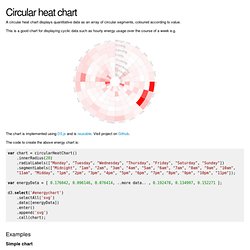
This is a good chart for displaying cyclic data such as hourly energy usage over the course of a week e.g. The chart is implemented using D3.js and is reusable. Visit project on Github. The code to create the above energy chart is: var chart = circularHeatChart() .innerRadius(20) .radialLabels(["Monday", "Tuesday", "Wednesday", "Thursday", "Friday", "Saturday", "Sunday"]) .segmentLabels(["Midnight", "1am", "2am", "3am", "4am", "5am", "6am", "7am", "8am", "9am", "10am", "11am", "Midday", "1pm", "2pm", "3pm", "4pm", "5pm", "6pm", "7pm", "8pm", "9pm", "10pm", "11pm"]); var energyData = [ 0.176042, 0.096146, 0.076414, ..more data.. , 0.192478, 0.134997, 0.152271 ]; d3.select('#energychart') .selectAll('svg') .data([energyData]) .enter() .append('svg') .call(chart);
Generate D3 Bar Chart. The Basics of Responsive D3 Charts. Protovis. Protovis composes custom views of data with simple marks such as bars and dots.
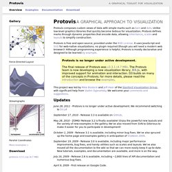
Unlike low-level graphics libraries that quickly become tedious for visualization, Protovis defines marks through dynamic properties that encode data, allowing inheritance, scales and layouts to simplify construction. Protovis is free and open-source, provided under the BSD License. It uses JavaScript and SVG for web-native visualizations; no plugin required (though you will need a modern web browser)!
Although programming experience is helpful, Protovis is mostly declarative and designed to be learned by example. Protovis is no longer under active development.The final release of Protovis was v3.3.1 (4.7 MB). This project was led by Mike Bostock and Jeff Heer of the Stanford Visualization Group, with significant help from Vadim Ogievetsky. Updates June 28, 2011 - Protovis is no longer under active development.
September 17, 2010 - Release 3.3 is available on GitHub. May 28, 2010 - ZOMG! Getting Started. Reclinejs. A simple but powerful library for building data applications in pure Javascript and HTML.
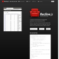
Recline re-uses best-of-breed presentation libraries like SlickGrid, Leaflet, Flot and D3 to create data 'Views' and allows you to connect them with your data in seconds. Documentation » Tutorials » Demos » Get started fast. Rickshaw. Graphing Toolkit Rickshaw provides the elements you need to create interactive graphs: renderers, legends, hovers, range selectors, etc.
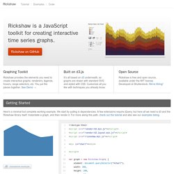
You put the pieces together. See Demo → Built on d3.js It's all based on d3 underneath, so graphs are drawn with standard SVG and styled with CSS. Open Source Rickshaw is free and open source, available under the MIT license. Getting Started Here's a minimal but complete working example. Area Graphs Lines Bars Scatterplot. Sigma.js.