
Proof That Typography And Posters Are A Perfect Match. Although you can’t design without type, you can use mostly, or even only, type to create breath-taking products.

In fact, many graphic designers and artists take exactly this route to communicate their ideas through their work. Sometimes crazy, sometimes artsy, sometimes beautiful, these results often simply differ from what the viewer is used to. As the designers explore these new and unique horizons, their audience gets the opportunity to explore new viewing perspectives. Just don't do it: 14 type crimes to stop committing. Getting your typography correct is not an easy thing to do.
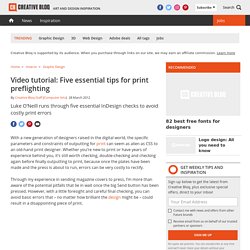
Like graphic design as a whole, is has to be both aesthetically pleasing and functional. Just like you do in a logo, when you’re working with big blocks of text in a print or web design, you have to put a lot of thought into how the type is working. We’ve assembled 13 crimes against type you need to avoid. It’s not an exhaustive list — there are other things that can trip you up as well (oh, the difficulties of being a designer), but it’s a good place to start. An example of creative management for a lot of text, by Atelier Martino&Jaña for the European Capital of Culture. 1. Video tutorial: Five essential tips for print preflighting. With a new generation of designers raised in the digital world, the specific parameters and constraints of outputting for print can seem as alien as CSS to an old-hand print designer.
Whether you’re new to print or have years of experience behind you, it’s still worth checking, double-checking and checking again before finally outputting to print, because once the plates have been made and the press is about to run, errors can be very costly to rectify. Through my experience in sending magazine covers to press, I’m more than aware of the potential pitfalls that lie in wait once the big Send button has been pressed. Respect Thy Typography. Advertisement Good typography shouldn’t have to rely on ornamental crutches to stand tall.
Yet despite all the tools and knowledge available to us, we readily embrace a flourishing, decorative typography, with cheap tricks used in a misguided attempt to make it “pop”. This ancient art may rapidly be gaining popularity, but are we paying it the respect it deserves? 125+ Awesome Typography Collection. 40 Creative & Catchy Typography Print Ads. To make creative print ads that can deliver a message and get attention, is not an easy part. By using typography, effectively and wisely, in print ads you can convey a message and get the attention of consumer. We can say that typography plays an important role to make outstanding print ads.
Today we are showcasing 40 creative and catchy print ads that have used typography effectively. You may also be interested in 30 Amazing Typographic Movie Poster Designs. Advertisement. 25 Must Read articles on Design, Typography and Web Development - 2. 25 Must Read articles on Design, Typography and Web Development – 2 Posted by Richie on Tuesday, August 24, 2010 · 13 Comments I am currently working on a really good article about Inspiration and (coincidentally) Steve Jobs.
In that article, I plan to explain how we can seek inspiration from Jobs’ work ethics, his dynamic attitude towards life, his love towards what he does and everything else. Until that surfaces out, let us look into those articles which have been making some rounds on my Twitter stream lately. “What Font Should I Use?”: Five Principles for Choosing and Using Typefaces - Smashing Magazine. Advertisement For many beginners, the task of picking fonts is a mystifying process.

There seem to be endless choices — from normal, conventional-looking fonts to novelty candy cane fonts and bunny fonts — with no way of understanding the options, only never-ending lists of categories and recommendations. Selecting the right typeface is a mixture of firm rules and loose intuition, and takes years of experience to develop a feeling for. Here are five guidelines for picking and using fonts that I’ve developed in the course of using and teaching typography. 1. Counterpart and Counterpoint in Typographic Hierarchy. Visual design is an information delivery system and the smoother that delivery, the better the design.
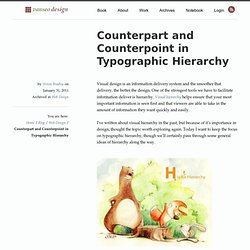
One of the strongest tools we have to facilitate information deliver is hierarchy. Visual hierarchy helps ensure that your most important information is seen first and that viewers are able to take in the amount of information they want quickly and easily. I’ve written about visual hierarchy in the past, but because of it’s importance in design, thought the topic worth exploring again. Today I want to keep the focus on typographic hierarchy, though we’ll certainly pass through some general ideas of hierarchy along the way. Typographic Hierarchy If everything is equal, nothing stands out. The main way we create hierarchy is through similarity and contrast. Every hierarchy will have a most important level, a least important level, and everything else will fall in between.
For elements to be seen as different the contrast needs to be large enough. Visual Punctuation. The Two Functions Of Type: Readability And Legibility. Readability and Legibility are both important for communicating with type.
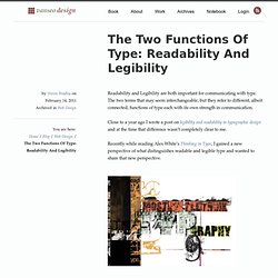
The two terms that may seem interchangeable, but they refer to different, albeit connected, functions of type each with its own strength in communication. Close to a year ago I wrote a post on legibility and readability in typographic design and at the time that difference wasn’t completely clear to me. Recently while reading Alex White’s Thinking in Type, I gained a new perspective of what distinguishes readable and legible type and wanted to share that new perspective.
The Font-Face Rule And Useful Web Font Tricks - Smashing Magazine. Advertisement The possibility of embedding any font you like into websites via @font-face is an additional stylistic device which promises to abolish the monotony of the usual system fonts.
It surely would be all too easy if there was only one Web font format out there. Instead, there’s quite a variety, as you will get to know in this article. This quick introduction to @font-face will lead you towards a guide through the @font-face kit generator. Anatomy of a Typographic Grid. Recently I’ve been trying to expand my knowledge and skills working with typographic grids.
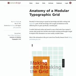
On the knowledge side I sought out definitions for the different parts of a grid, specifically a modular grid. I couldn’t find much online and turned to some of the books I have instead. I assume other people have had the same trouble searching and thought it might be helpful if this information was more readily available online. Most of the information in this post comes from Timothy Samara’s book Making and Breaking the Grid. Ultimate Guide of Web Typography Tutorials, Tips and Best Practices. Web typography is nothing but implementing typography on web page.
This is very important in order to identify oneself in the designing world. It is equally important that understanding and implementing typography successfully on your web page. This is an evolution in web designing to stand apart from all other websites. It offers many tips, tutorials, tools, guides and practices to make the better use of web typography. Those are CSS typography tutorials like typo contrast and flow, emphasizing text, snazzy pullquotes for your blog, better CSS font stacks, gradient text effect and types like emphasize on the typeface, using the grid white space balance, size does matter etc.
Tips & Tutorials Create-a-letterpress-effect-with-css-text-shadowThis article describe about letterpress effect which is becoming popular in web designing. Better CSS Font StacksIn this article you will see the description of font stacks. Best practices. How to Choose a Typeface - Smashing Magazine. Advertisement Choosing a typeface can be tricky.