
Type Terms. Creating Exciting And Unusual Visual Hierarchies. Advertisement Layout, for both print and screen, is one of the most important aspects of graphic design.
Designs that extend across multiple pages or screens, whether containing large or small amounts of type, must be carefully controlled in a way that is enticing and is easy for all to access. Careful control of visual hierarchy is a key aspect of the design decisions we have to consider. In this article, we will look at how frequently type needs to be broken down into different levels, such as topic, importance and tone of voice. We will explore how this can be achieved visually by relying on several things: texture and tone, seeing the designer as reader, combining typefaces, using color, employing multiple types and, of course, using the grid. The Designer As Reader Letterforms make words, and words have meaning. Rebecca Foster’s1 poster for the Young Vic theatre in the UK demonstrates a dramatic use of language, with a clever double meaning. Texture And Tone Colorful Type Useful Links. Thinking with Type. A Comprehensive Guide to Smart Quotes, Dashes & Other Typographic Characters.
Butterick’s Practical Typography. Infographic Of The Day: Why Should You Care About Typography? I have a confession to make.
There was a time, many years ago, where I thought that typography was fashion by another name. I didn't really appreciate how different typefaces function, and how the discipline evolved over time, under pressure from aesthetics and technology. And it makes me particularly red-faced to remember that I once flaunted that ignorance, going so far as to tell a noted creative director that bit about type as fashion.
If only I'd known! The Science Behind Fonts (And How They Make You Feel) I’ve noticed how seemingly small things like font and the spacing between letters can impact how I feel when reading online.
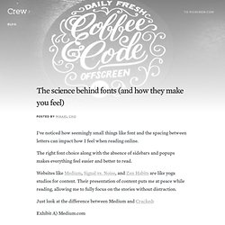
The right font choice along with the absence of sidebars and popups makes everything feel easier and better to read. Websites like Medium, Signal vs. Noise, and Zen Habits are like yoga studios for content. Their presentation of content puts me at peace while reading, allowing me to fully focus on the stories without distraction. Typograph – Scale & Rhythm. This page falls somewhere between a tool and an essay.
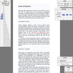
It sets out to explore how the intertwined typographic concepts of scale and rhythm can be encouraged to shake a leg on web pages. Drag the colored boxes along the scale to throw these words anew. For the most part, this text is just a libretto for the performance you can play upon it. Choosing sizes. Checklist for Better Web Typography. Typography influences whether or not viewers read the content, as well as having a subtle effect on how they perceive your site.
Choosing appropriate typefaces and controlling their presentation is critical to conveying your message. The following checklist serves to summarize the major points and to help you ensure you’ve done all you should before finalizing any web site you are creating. Use this navigation and jump directly to content : {Layout} {Typefaces and Formatting} {Content} {Graphic Text} Handpicked free fonts for graphic designers with commercial-use licenses. Typecast. Typ.io: Fonts that go together. Fonts. 15.1 Introduction Setting font properties will be among the most common uses of style sheets.
Unfortunately, there exists no well-defined and universally accepted taxonomy for classifying fonts, and terms that apply to one font family may not be appropriate for others. E.g., 'italic' is commonly used to label slanted text, but slanted text may also be labeled as being Oblique, Slanted, Incline, Cursive or Kursiv. Therefore it is not a simple problem to map typical font selection properties to a specific font. 15.2 Font matching algorithm Because there is no accepted, universal taxonomy of font properties, matching of properties to font faces must be done carefully. The User Agent makes (or accesses) a database of relevant CSS 2.1 properties of all the fonts of which the UA is aware.
(The above algorithm can be optimized to avoid having to revisit the CSS 2.1 properties for each character.) The per-property matching rules from (2) above are as follows: 'font-style' is tried first. Serif icon. Beautiful web type — the best typefaces from the Google web fonts directory. Lucius Annaeus Seneca60 AD Among the numerous faults of those who pass their lives recklessly and without due reflexion, my good friend Liberalis, I should say that there is hardly any one so hurtful to society as this, that we neither know how to bestow or how to receive a benefit.
It follows from this that benefits are badly invested, and become bad debts: in these cases it is too late to complain of their not being returned, for they were thrown away when we bestowed them. WhatFont Tool - The easiest way to inspect fonts in webpages « Chengyin Liu. ← Back to Chengyin's main page What is the easiest way to find out the fonts used in a webpage?
Firebug or Webkit Inspector? No, that's too complicated. WhatTheFont! Type Connection. Lettering.js - A jQuery plugin for radical web typography.