Typography Timeline. The Fell Types modern revival fonts realized by Igino Marini using iKern < The Fell Types. The digitization of the Fell Types began in 2000.
Three books were used as source: Stanley Morison: “THE ROMAN ITALIC & BLACK LETTER bequeathed to University of Oxford by Dr. JOHN FELL,” Oxford University Press, 1951Stanley Morison: “JOHN FELL The University Press and the ‘Fell’ Types,” Oxford University Press, 1967Horace Hart: “Notes on a Century of Typography at the University Press Oxford, 1693-1794,” Oxford, The Clarendon Press, 1970 The first and second are printed using the original types on modern paper.
Typographie & Civilisation. Parker Type History. In honor of Mike Parker, we present a tribute to honor his work and share stories from colleagues.

With contributions from David Berlow, Roger Black, Matthew Carter, Frank Romano, Cherie Cone, and more. ➝ Fontbureau.com/MikeParker More ... We’d like to thank everyone for the support in recent days. We’ve already heard some great stories about Mike. More ... “For more than 50 years, print historian and industry leader Mike Parker has been shepherding the development of typography: from hot metal, to photocomposition, to digital. This eighth installment is as much about printers in the late 16th century as it is about the punchcutters. II. Christopher Plantin (French, c. 1530-1589) Plantin was not a designer but a publisher ... More ... Timeline. Florence Inscriptions.
Research Directory - TypeCulture® Alessandro Segalini - Bibliography on Typography and Type Design. Of the Just Shaping of Letters by Albrecht Dürer. The Crystal Goblet by Beatrice Warde. The Crystal Goblet by Beatrice Warde Excerpt from a Lecture to the British Typographers’ Guild Imagine that you have before you a flagon of wine.
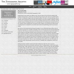
You may choose your own favorite vintage for this imaginary demonstration, so that it be a deep shimmering crimson in color. You have two goblets before you. One is of solid gold, wrought in the most exquisite patterns. The other is of crystal-clear glass, thin as a bubble, and as transparent. Bear with me in this long-winded and fragrant metaphor; for you will find that almost all the virtues of the perfect wine-glass have a parallel in typography.
Italian writing masters and calligraphers of the 16th and 17th centuries. This aims to be a list of the names of all the calligraphic writers, mostly professionals, working in Italy between 1501 and 1700, whose names have been recorded.
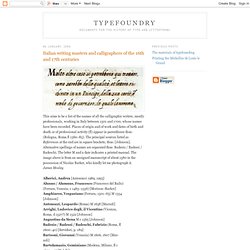
Places of origin and of work and dates of birth and death or of professional activity (fl) appear in parentheses thus: (Bologna, Roma fl 1560–85). The principal sources listed as References at the end are in square brackets, thus: [Johnson]. Alternative spellings of names are separated thus: Badesio / Badessi / Badeschi. The letter M and a date indicates a printed manual. The image above is from an unsigned manuscript of about 1580 in the possession of Nicolas Barker, who kindly let me photograph it.James Mosley Alberici, Andrea [Antonucci 1989, 1993]Alunno / Alumnus, Francesco (Francesco del Bailo)(Ferrara, Venezia, c 1485–1556) [Morison–Barker]Amphiareo, Vespasiano (Ferrara, 1501–63) M 1554[Johnson]Antonozzi, Leopardo (Roma) M 1638 [Marzoli]Arrighi, Ludovico degli, il Vicentino (Vicenza,Roma, d 1527?) References. Incunabula - Dawn of Western Printing. Digital Scriptorium. Digitized Materials (Rare Book and Special Collections Reading Room, Library of Congress)
The Renaissance Letter. Half gothic/semi-humanistic When the German printing capital, Mainz, was sacked in 1462 many printers fled to new locations, most to Italy.
There they fashioned their work to follow the Renaissance movement and the Humanistic handwriting influences. Two German print refuges were Conrad Sweynheym and Conrad Pannartz, (thought to have been associated with Gutenberg's business partner, Schoeffler) who set up the first press in Italy at the Benedictine Monastery of Subiaco. Sweynheim, an engraver, was most likely the punchcutter. His designs were influenced by the calligraphic style of the Italian Humanists—yet still retained influences from the Gothic— hybrid or semi-humanistic form. Humanist minuscule. The evolution of minuscule Latin script Humanist minuscule is a handwriting or style of script that was invented in secular circles in Italy, at the beginning of the fifteenth century.[1] "Few periods in Western history have produced writing of such great beauty", observes the art historian Millard Meiss.[2] The new hand was based on Carolingian minuscule, which Renaissance humanists, obsessed with the revival of antiquity and their role as its inheritors, took to be ancient Roman: "when they handled manuscript books copied by eleventh- and twelfth-century scribes, Quattrocento literati thought they were looking at texts that came right out of the bookshops of ancient Rome".[3] The humanistic term litterae antiquae (the "ancient letters") applied to this hand was an inheritance from the fourteenth century, where the phrase had been opposed to litterae modernae ("modern letters"), or Blackletter.[4] Petrarchan reform[edit] Poggio Bracciolini[edit] Niccoli's cursive and roman typeface[edit]