

Typography Cheat Sheet: The 6 Big Mistakes To Avoid. Typography is one of those strange skills — too mathematical to be pure art, but a touch too intangible to be pure science.
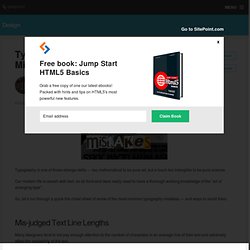
Our modern life is awash with text, so all front-end devs really need to have a thorough working knowledge of the “art of arranging type”. So, let’s run through a quick-fire cheat sheet of some of the most common typography mistakes — and ways to avoid them. Mis-judged Text Line Lengths Many designers tend to not pay enough attention to the number of characters in an average line of their text and adversely affect the readability of the text. Happily, this is an easy mistake to avoid, as the optimal length has long been identified. The great Swiss typographer, Emil Ruder did a lot of work on this topic in the 1950′s.
In his seminal essay, “Typographie: A Manual of Design”, he concluded that the ‘sweet spot’ for line length was around 50 or 60 characters. Shorter line lengths slows comprehension as the eye spends more time tracking back to the next line. Badly Paired Fonts. Type Glossary - Typography Deconstructed. Ampersand A stylized character of the Latin et used to represent the word and.
Definition: The typographic symbol used to designate the word and (& ) is the Latin symbol for et which means and. The name, ampersand , is believed to be derived from the phrase “and per se and.” On a standard English layout... Aperture The partially enclosed, somewhat rounded negative space in some characters. Apex. Web Design Is 95% Typography. By Oliver Reichenstein 95% of the information on the web is written language.
It is only logical to say that a web designer should get good training in the main discipline of shaping written information, in other words: Typography. Back in 1969, Emil Ruder, a famous Swiss typographer, wrote on behalf of his contemporary print materials what we could easily say about our contemporary websites: Today we are inundated with such an immense flood of printed matter that the value of the individual work has depreciated, for our harassed contemporaries simply cannot take everything that is printed today. Reactions to 95% Typography. By Oliver Reichenstein An avalanche of comments, hundreds of applauding blog entries, honorable mentions from cooler and more sublime and hotter and higher places, forum discussions, translations in Chinese and partially in Italian and even blunt plagiarism was incited by one of my recent notes.
In order to not answer to each commentator individually, I decided to write a summary that answers most of the raised concerns, accusations and questions. As a result I think that managed to make things a little clearer. Sensationalist and unfounded! Justin: My issue is quite simply your title. I didn’t intend to be loud or (un)popular. I am writing these entries with the goal of publishing a book on usability and branding one day.
Am I the only one saying so? Joran: Type as interface. “Text as user interface” is a concept and notion coined by Cameron Moll. The Grid The 95%-idea first came to my mind while designing. Most websites try to get text across, and most websites fail in that regard. Piggin.Net Macro-Typography. TypoWiki. Welcome to the Typophile Wiki, a user-created encyclopedia of all things type and design-related.
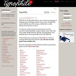
Users create and edit Wiki entries with the aim of becoming a collaborative, useful, balanced and relevant resource. To reference a wiki entry from a forum post or review anywhere within Typophile, simply wrap the name of the wiki entry within double brackets, like this: [[typography]]. Your published post will automatically format the Wiki link. To get started, try accessing one of the Indices or select a recently edited wiki entry from the right. Do not cut and paste from another site. For more instruction on wiki etiquette and how to get started, please see the Wiki FAQs Page. Note: The system now allows ampersands in Wiki titles.
FreeTypography - Best Free Fonts, Typefaces & Typography. Typography Tutorials. Other Typography Pearltrees. PXtoEM.com: PX to EM Converter. 18 Insanely Addictive Font Games. Typography helps you engage your audience and establish a distinct, unique personality on your website.
Knowing how to use fonts to build character in your design is a powerful skill, and exploring the history and use of typefaces, as well as typographic theory, can help. But it doesn't have to be boring. This selection of online and mobile font games will help test and expand both your knowledge and identification skills. 1. The Font Game From I Love Typography The "rather difficult font game" from I Love Typography tests your general knowledge of fonts by displaying 34 samples. You can also download the Font Game iOS app to play on the go. 2. Type Connection is a fun "type dating" game that helps you learn how to pair typefaces. 3. Image: Kern Type Kern Type is a game in which you try to achieve pleasant and readable text by distributing the space between letters, called "kerning" by typographers.