
Developer Stories: The Opportunity of Android Tablets. When Intuit was thinking about expanding their Mint mobile offering to include a version optimized for Android tablets, they knew that taking the layout that worked for phones and simply showing an enlarged version wouldn’t take full advantage of the opportunities that tablets afford.
“We knew we had a lot more real estate, and we wanted to provide a more immersive experience for our users” said Ken Sun, Intuit Group Product Manager at Mint. Intuit’s Mint app, which has a 4-star rating on Google Play, brings a number of features to Android tablets that aren’t available for phones, including a more visual presentation of personal financial data. “Whereas our app for phones is used throughout the day for quick sessions, we’ve seen a larger percentage of our tablet usage happen in the evening, for much longer sessions,” said Sun. “People are doing a lot more than just checking their spending. ING Group News (ING_news) Grid Calculator by Nicolaj Kirkgaard Nielsen.
L’accessibilité et le responsive : un certain conflit d’intérêt ? Si vous vous considérez webdesigner/intégrateur au top de votre art, vous êtes sans doute habitué à contempler les constantes nouvelles tendances que l’on voit défiler dans nos métiers.
Évidemment, j’imagine que vous ne vous autorisez pas à embrasser ces nouvelles tendances sans en remettre en cause les impacts sur les axes habituels de la qualité web (que ce soit par les dégradations apportées par la technologie en elle-même, ou parce que nous en sommes encore au stade de peaufinage des bonnes pratiques). La boîte à outils ultime pour le responsive design. Si vous ne savez pas par où commencer votre webdesign responsive, ni quels outils vont vous faciliter la vie, cette liste d’outils concoctée à l’aide du dernier article de Smashing Hub devrait vous égayer.
Faisons un petit tour des outils pratiques ou simplement indispensables… Le responsive design est relativement récent et les choses bougent très vite. A peine a-t-on pris connaissance d’une technique qu’il faut déjà apprendre une nouvelle chose ou maîtriser le dernier outil sorti. Le responsive design n’est pas une simple mode de passage mais bel et bien une possibilité et une philosophie de conception de sites web bien en place qui fait ses preuves. Avec sa popularité toujours grandissante, de nombreux outils ont vu le jour pour faciliter le travail des concepteurs et intégrateurs de sites. L’article original recense de nombreux outils gratuits qu’on peut trouver sur le web et vous trouverez ci-dessous ma sélection parmi tous ceux présentés dans celui-ci, plus quelques ajouts. 1. 2. Skeleton: Beautiful Boilerplate for Responsive, Mobile-Friendly Development. What Is It?
Skeleton is a small collection of CSS files that can help you rapidly develop sites that look beautiful at any size, be it a 17" laptop screen or an iPhone. Skeleton is built on three core principles: Responsive Grid Down To Mobile Skeleton has a familiar, lightweight 960 grid as its base, but elegantly scales down to downsized browser windows, tablets, mobile phones (in landscape and portrait). Multi-Device Layout Patterns. Through fluid grids and media query adjustments, responsive design enables Web page layouts to adapt to a variety of screen sizes.
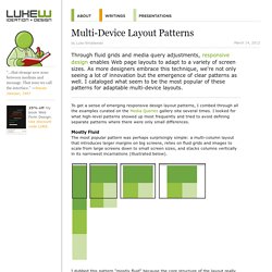
As more designers embrace this technique, we're not only seeing a lot of innovation but the emergence of clear patterns as well. I cataloged what seem to be the most popular of these patterns for adaptable multi-device layouts. To get a sense of emerging responsive design layout patterns, I combed through all the examples curated on the Media Queries gallery site several times. I looked for what high-level patterns showed up most frequently and tried to avoid defining separate patterns where there were only small differences. 50 fantastic tools for responsive web design.
Frameless. Responsive Layouts, Responsively Wireframed. Responsive layouts, responsively wireframed Made with HTML/CSS (no images, no JS*) this is a simple interactive experiment with responsive design techniques.
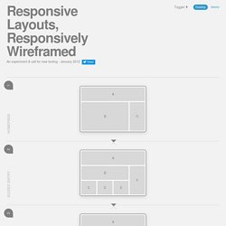
Use the buttons top-right to toggle between desktop and mobile layouts. Using simple layout wireframes, this illustrates how a series of pages could work across these different devices, by simulating how the layout of each page would change responsively, to suit the context. Responsive layouts? Producing static wireframes to design layouts for websites, web applications and user-interfaces has worked well for a long time. However, this solution creates a new problem: How should we go about the process of designing these variable layouts? Enter, responsive wireframes? The 'wireframes' on this page (which are only very simple, high-level examples) were created with HTML/CSS, and some argue that this is the answer; to design in the browser.
So which is better? Traditional wireframes? 10 Excellent Tools for Responsive Web Design. By Jason Gross So, you’ve decided to venture into the creation of responsive web designs.

Wonderful! With the browsing landscape diversifying into mobile devices, netbooks, desktops and so forth, responsive web designs allow web designers to provide different layouts for specific devices (based on screen size and browser features) giving site visitors an optimal user experience. So now, you’ve determined that it would be beneficial to create responsive web designs. Responsive Web Design Patterns. Pragmatic responsive design. 8 Tools and Scripts for Responsive Web Design. At Theme Trust, we recently launched our first responsive WordPress theme.

Since it was also my first time building a responsive website, I had to do some learning and research. Along the way, I discovered some interesting techniques, useful resources, and handy tools to help with the task. So in this article, I’m sharing some of those tools and scripts I came across that make developing a responsive website a whole lot easier. FitText FitText makes font-sizes flexible.
Respond.