

Responsive Web Design - Infographic. Responsive Web Design Patterns. Responsive Patterns A collection of patterns and modules for responsive designs.

Submit a pattern Layout Reflowing Layouts Equal Width Off Canvas Source-Order Shift Lists Grid Block Navigation Single-Level Multi-level Breadcrumbs Pagination. Awesome Tutorials For Responsive Web Design. Create an adaptable website layout with CSS3 media queries With the rise of both very large screens and mobile devices, web developers have to be able to create websites that display correctly and look good whatever the device is.
Sure, you can use good old techniques like fluid layouts, but I’ve got something better to show you today. This tutorial will teach you how you can create an adaptable website layout using CSS3.→ Read tutorial: Create an adaptable website layout with CSS3 media queries Fluid images This tutorial will shown you how to make your image scales down when the browser is resized or when your website is viewed through a smaller screen.→ Read tutorial: Fluid images Elastic videos Nowadays, videos are widely used on the web. Optimizing your emails for mobile devices As mobile devices are more and more used, more people are receiving their emails on their phones instead of their computer.
Images that match text height Hiding and revealing portions of images. Can I Use?... Support Tables For HTML5, CSS3, Ec. 30 Useful Responsive Web Design Tutorials. So we’ve reached the end of our “Responsive Web Design week”, tonight’s post will be the last of the series.
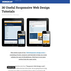
We are going all out to help you hone your skills in manipulating those codes to respond at will when displayed on different devices. And to do this, we are featuring 30 Responsive Web Design Tutorials found online. This list is not meant to be an exhaustive one but it will get you started on understanding the basics of designing an adaptive website that will cater to all sorts of screen sizes. We’ll start off with introductory tutorials in ‘Breaking the Ice’, something like an RWD: 101 class you should attend to get the hang of the concept before we move on to ‘Start Building’ exercises. Lastly we’ll end with a ‘Do More’ section in which we’ll feature tutorials that play with horizontal layouts, ‘elastic’ videos, drop-down menus and slide-to-top accordion navigations, thumbnails and the sticky issue with tables.
But first… Killer Responsive Layouts With CSS Regions. Advertisement As Web designers, we are largely constrained by the layout features available to us.
Content placed inside a container will often naturally extend the container vertically, wrapping the content. If a design requires elements to remain a certain height, then our options are limited. In these cases, we can only add a scroll bar or hide the overflow. The CSS Regions specification provides a new option. Support Regions are a new part of the CSS specification, so not all browsers have implemented them, and in some cases you might have to enable a flag to use them. Regions 101 CSS regions enable us to disperse content across multiple containing elements. To use regions, start by creating a named flow; simply add the CSS property flow-into to your content element, with the value of your flow’s name. Your HTML would contain a content element and the scaffolding of all of the regions that this content will flow through. Flexible Grid Tools For Responsive Websites. By Akhter on March 25, 2014 Flexible Grid Tools For Responsive Websites Don't Forget to participate in a contest where you can win an amazing e-Commerce template from TemplateMonster.
With the introduction of new technologies and usage of new innovative ways, web industry has totally changed the criteria of web development. Today, responsive website layouts are more popular as compared to traditional website layouts. This is because of the reason that responsive website layouts are more interactive and they engage the visitors for relatively longer period of time.
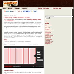
With responsive website layouts, today’s websites are no more nifty looking websites rather they have been evolved and improved. Gridpak. 15 Responsive CSS Frameworks Worth Considering. Taking the next step of our responsive layout coverage (we recently published the articles Responsive WordPress Themes and jQuery Plugins to help with Responsive Layouts), today we are taking a look at responsive CSS frameworks that we feel are worth your consideration.
Just like most CSS frameworks, all of the frameworks below will help you rapidly develop sites by eliminating the need to write basic CSS styles yourself, as you would expect. But, on top of that, they also come with a responsive layout helping you to quickly and easily create mobile-specific sites. Less Framework 4 The Less Framework contains 4 adaptive layouts and 3 sets of typography presets, all based on a single grid, composed of 68 px columns with 24 px gutters. The idea is to first code the Default Layout (992 px), and then use CSS3 media queries to code several child layouts: 768, 480, and 320 px. Foundation MQFramework Golden Grid System The Golden Grid System is a folding grid system for responsive design. Columnal. Google Web Designer: Any Screen Or Device. Illustration tools Import assets from any other creative suite or use the built-in illustration tools to create vector-style artwork – keeping your designs light.
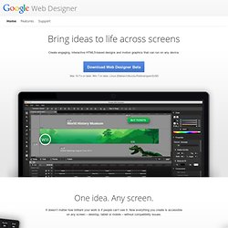
To create new HTML tags in your designs, just draw them in with the Tag tool. Responsive Web Design. Responsive web design.