
Word clouds. Word Clouds and Tag Clouds. Tag cloud. Tag Clouds. Tag Cloud Images. The Future of Visual Content: 6 Predictions About Infographics. The Slow Journalism Magazine. Pros: Laura Brown on curation and the display of information. Being a content curator is all about displaying information.

We don’t create the content, we display it. We share it – and people read it. But, first you have to display it. There are several skills involved in displaying content. Here are some thoughts for you to consider when creating and curating a Scoop.it topic. Avoid the SEO trap Don’t put SEO first! At this point you can think about keywords and other stuff, but use caution. Choosing a Topic Pick topics you value and want to know more about, personally.
Don’t think about Google when you create your topic, think about yourself. What do you want to know more about? My process for finding and displaying content When I actually plan to make posts to Scoop.it I use a feed I have created on Blog Lovin’. One really great way to bring new life to a repost is to add your own ideas, theories, opinions and experience in the “Insight” editor comment section of your Scoop.it post. 3 Trends That Will Define The Future Of Infographics. Now that everyone loves them, early adopters and forward thinkers want to know what is next for the infographic.

Is this just the beginning of a visual revolution, or have they already jumped the shark? This is an important question, especially for those who are making large investments in the medium, such as publishers and marketers. Is the Infographic Dead? My cofounder, Jason Lankow, says it well when people ask about the fate of infographics in the face of increasing web saturation. As he describes it, we are seeing the death of the novelty of infographics, not a decline in their value. Piktochart- Stories from Data. Your presentation/data visualization tool.
On low-quality infographics. This has been sitting in my drafts folder for a few months.

Figured I'd just hit publish and throw it out there. Obvious statement: there are infographics that are horribly made. Some are way too big for the information conveyed and others are useless because the creator had no idea what he was doing. Some infographics are both. Here's the thing though. A couple of years ago, infographics spiked and even what seems like subpar work now, passed as amusing at the least. Or how about blogs? Think of infographics/visualization/etc as a medium instead of a method and it should be much easier to unruffle your feathers. So I don't think a flood of low-quality infographics is going to obscure the work that is actually worth looking at. I've seen this through my inbox already. People can (or will learn to) spot the B.S., and the bad stuff doesn't get shared and doesn't spread.
Infographics. Infographics. Awesome Infographics. Infographic. Infographs. Diagramly – A Handy Tool For Creating Quick Flowcharts. The best thing about Diagramly is how accessible it is.

You just click a URL, and you’re in. There’s no download, no account registration, and you don’t even need Flash to use it. It really couldn’t be simpler to get started. The worst thing about Diagramly (I’ll just get this out of the way right now) is the utter lack of documentation. For example, check out this diagram I made for you, showing the ideal MakeUseOf reader’s workflow: Pretty easy to understand, right? Let’s take a look at the UI: I included Chrome’s address bar on purpose, so you’d see it really is a Web app. Here are just a few samples I picked at random: Why there is a Shield of David there, I have absolutely no idea. Once you’re done crafting your masterpiece, you can save it in one of a number of formats: Saving as an SVG is very handy if you have a desktop vector editing application (such as the free and open-source Inkscape).
10 Awesome Tools To Make Infographics. Advertisement Who can resist a colourful, thoughtful venn diagram anyway?

In terms of blogging success, infographics are far more likely to be shared than your average blog post. This means more eyeballs on your important information, more people rallying for your cause, more backlinks and more visits to your blog. In short, a quality infographic done well could be what your blog needs right now. Designing An Infographic Some great tips for designing infographics: Keep it simple! Ideas for infographic formats include: Timelines;Flow charts;Annotated maps;Graphs;Venn diagrams;Size comparisons;Showing familiar objects or similar size or value.
MetaLayer launches community to make better infographics (exclusive) How can big data and smart analytics tools ignite growth for your company?

Find out at DataBeat, May 19-20 in San Francisco, from top data scientists, analysts, investors, and entrepreneurs. Register now and save $200! MetaLayer, a startup that helps you make visualizations from complex sets of data, has launched a new data community for people to share visualizations they’ve made with its service. “We want to do to data analysis what Apple has done to computers: Make data so intuitive that anyone can gather insights from tons of data,” said Metalayer Chief executive Chris Burrage in an interview with VentureBeat.
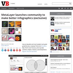
MetaLayer helps you gather insights and make visualizations, also known as infographics, from massive amounts of data on the web. Now the company is launching a community platform called Delv, where infographics can be vetted and shared. “Our new community project platform, Delv, is for people to come delve into the information analyzed on our site,” said Burrage.