
ALA_LITA sur Twitter : "17 Tricks to Master #PowerPoint, because #UX. By @egriffith. 17 Tricks to Master Microsoft PowerPoint. Click To View Slideshow» Ready to master the presentation software that drives business?
These tips will have everyone else in the office jealous of your expertise. There comes a time in almost every young (or old) office worker's life where the cubicle must give way to the boardroom, or worse, to the dais. That means speaking in public, and more often than not, that speaking is usually accompanied by slides. Such presentations are ingrained in the public consciousness, from watching big-name CEOs spew speeds-and-feeds about new gadgets, to fascinating TED talks on every topic under the sun.
It's fair to say that the vast majority of those presentations are created using PowerPoint, the presentation tool that's a staple of the Microsoft Office suite. And most of them suck. This collection of tips is all about the vagaries of the powerful PowerPoint software itself. (Images in slides frequently made with slideshows from SlideShare.) 8 Must-see UX Diagrams. If you’re new to the field of user experience design, welcome! There’s plenty to see and do around here. And although many brilliant contributors have come before us, there’s actually not too much to catch up on—if you know where to look. Because pictures are worth so much, illustrated diagrams have served a critical role in our community.
Our community is filled with thought leaders, those among us that conjure up entirely new ways to look at difficult design problems. Unfortunately, their perspectives are only useful insomuch as they can be communicated to other practitioners; what good is a design process if it’s done in a vacuum? In this post, I’ll share eight diagrams essential to the understanding of user experience design. The diagrams The UX Honeycomb Despite its age (2004!) Finally, one of the freshest takes on illustrating user-centered design comes from Pascal Raabe, a multi-disciplinary designer hailing from the United Kingdom. More to Share? Revamping Reference. Why Your Form Buttons Should Never Say Submit. By anthony on 01/05/11 at 10:27 pm When you see a Submit button on a form, what comes to your mind?
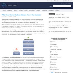
One could easily reason that clicking the button submits the user’s information into the system for processing. A Submit button describes what the system does well, but it doesn’t describe what the user does at all. When users fill out a form, they are engaging in a task. The action button should affirm what that task is, so that users know exactly what happens when they click that button. A form button that says Submit gives users the impression that the form isn’t focused on a specific task. Your form button should describe exactly what the user is doing in their task. Although Submit buttons aren’t as prevalent as they once were, they still exist on forms today. What Is User Experience Design? Overview, Tools And Resources - Smashing Magazine. Advertisement Websites and Web applications have become progressively more complex as our industry’s technologies and methodologies advance.
What used to be a one-way static medium has evolved into a very rich and interactive experience. But regardless of how much has changed in the production process, a website’s success still hinges on just one thing: how users perceive it. “Does this website give me value? Is it easy to use? User experience design is all about striving to make them answer “Yes” to all of those questions. What Is User Experience? User experience (abbreviated as UX) is how a person feels when interfacing with a system. UX Myths.