
World's Easiest A/B Testing Tool - Visual Website Optimizer. UX Movement - Articles on User Experience Design. UX Archive. Designing the Conversation. Good Kickoff Meetings. UX Archive. Userbrain: Usability testing becomes a habit. Design Quips from ZURB. 6 of the Best and Worst Parallax Scrolling Websites for Design Agencies. Psychology and Design - 10 Best Presentations. Time with Users: Set Personal and Company Goals.
Hints from the lazy bear. Is There A Standard Size? What Is The Most Common Dimension? Size Matters: Balancing Line Length And Font Size In Responsive Web Design. Advertisement As we refine our methods of responsive web design, we’ve increasingly focused on measure (another word for “line length”) and its relationship to how people read.
The popularization of the “ideal measure” has led to advice such as “Increase font size for large screens and reduce font size for small screens.” While a good measure does improve the reading experience, it’s only one rule for good typography. Another rule is to maintain a comfortable font size. How People Read People read online text to serve their own needs: to find the information they seek, to discover new ideas and to confirm their notions about life. People Read in Three Ways In 2006, the Nielsen Norman group released images of heat maps from eye-tracking studies. People read casually, skimming over text, reading words and sentences here and there to get a sense of the content. 1The Nielsen Norman Group explored the F-shaped pattern for casual reading in 2006.
Finally, people read in an engaged manner. (il, al) CUBI: A User Experience Model for Project Success. We all want to be a part of compelling creative projects—projects that solve business problems and engage users through meaningful and valuable experiences.
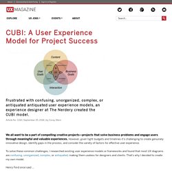
However, given tight budgets and timelines it's challenging to create genuinely innovative design, identify gaps in the process, and consider the variety of factors for effective user experience. To solve these common challenges, I researched existing user experience models or frameworks and found that most UX diagrams are confusing, unorganized, complex, or antiquated, making them useless for designers and clients. That’s why I decided to create my own model. Henry Ford once said … "I invented nothing new. This was exactly my approach. Graphic used with permission from TheFWA.com (Favourite Website Awards). It was impossible for me to determine if each project was successful or not—effective design requires more than a pretty surface or whiz-bang interactions.
ContentUser GoalsBusiness GoalsInteraction The Benefits of CUBI Content. Free tools for your website. Good design. Back in the early 1980s, Dieter Rams was becoming increasingly concerned by the state of the world around him – “an impenetrable confusion of forms, colors and noises.”

Aware that he was a significant contributor to that world, he asked himself an important question: is my design good design? As good design cannot be measured in a finite way he set about expressing the ten most important principles for what he considered was good design. (Sometimes they are referred as the ‘Ten commandments’.) Here they are. Good design is innovative The possibilities for innovation are not, by any means, exhausted. Good design makes a product useful A product is bought to be used. Good design is aesthetic The aesthetic quality of a product is integral to its usefulness because products we use every day affect our person and our well-being.
Good design makes a product understandable It clarifies the product’s structure. Dsia-ux-design-practice-verticals.pdf. Wirify – The web as wireframes. Crazy Egg - Visualize where your visitors click. Over 200,000 businesses Convert Better with Crazy Egg, The Original Heatmapping Technology A heatmap is an easy way to understand what users want, care about and do on your site by visually representing their clicks - which are the strongest indicators of visitor motivation and desire.
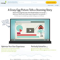
A Crazy Egg heatmap lets you collect more than 88% of the data you would using a traditional eye-tracking process. At a fraction of the price. With no hardware. Almost no IT involvement. Because Google Analytics & Site Catalyst Leave Questions Unanswered, Trust Crazy Egg Visualizations to Help You Understand Your Users. Wouldn't you like to fill in the gaps left by analytics… without A/B testing every little assumption… and without breaking the bank on in-lab usability studies? Heat Maps: At a glance, see the hotspots on each page - so you know what to change, preserve or delete "Do our users think they can click greyed out buttons? " Create Sitemaps Online.