
How to Design UX Search: Organising and Filtering. Google AdWords Case Study. [Free bonus pack at the bottom] In the last article we learned how to develop the best UX Strategy, now we will learn how to work with filters and search solutions with a great User Experience.
I have created this solution in only one day and, of course, it’s not complete (it might needs more than a month, specially if we are going to consider a subject like Google AdWords), it just helped me to resume some of best practices for UX Search Design and Filtering. Search is like a conversation, it’s a bidirectional process between user and system. It can be very rich as a real human conversation. As you can imagine, search results are playing an important role in the search experience.
As general steps you can follow this order: Establish the UX Search Design goal;Assign the proper area to the results and to the filters;Organising the User Experience of the results. Try to think about a site where there are huge amounts of informations (i.e. Credit: ux.stackexchange.com Sidebars. A Guide to User Testing. Jerry Cao is a UX content strategist at the wireframing and prototyping app UXPin.
For advice on how to conduct 30+ different types of usability tests, check out The Guide to Usability Testing. Usability testing is a technique used to help discover problems or bottle-necks in your design. But there are different types of user testing that suit different types of goals. The 5 Building Blocks of Visual Hierarchy in Web Design. Jerry Cao is a UX content strategist at UXPin — the wireframing and prototyping app.
To learn more about how to create visually digestible interfaces, download the free e-book Web UI Design for the Human Eye: Colors, Space, Contrast. Visual hierarchy is the difference between a site that strategically influences user flow and decisions, and a site that just “looks nice.” An interface’s visual hierarchy relies on the same principles of aesthetics used by the Renaissance masters, but on top of that (or rather beneath it) there’s the subtext of secondary goals – promoting specific content, encouraging user signups and call-to-actions, and generally improving the overall experience so users enjoy their visit beyond just accomplishing their goals.
Source: ShareFaith Seems like the Renaissance masters got off easy. In basic terms, visual hierarchy describes which elements dominate your user’s attention and draw their eyes most. 1. 6 Simple Tips for Designing Copy on the Web. Jerry Cao is a UX content strategist at UXPin — the wireframing and prototyping app — where he develops in-app and online content.
For visual case studies of IxD from top companies like Google, Yahoo, AirBnB, and 30 others, download the free e-book Interaction Design Best Practices: Volume 1. The sophistication of articulation. The flow of natural eloquence. The awesomeness of word-using-good-ness. Love it or hate it, your writing has an enormous impact on your website (or app), so you must always take care when composing textual content. The Future of Interaction Design. Jerry Cao is a UX content strategist at UXPin — the wireframing and prototyping app.
To learn how to master the art of modern interaction design, check out the free e-book Interaction Design Best Practices. The book teaches with 30+ examples from companies like AirBnB, Google, Apple, Etsy, and others. As a practice of designing for the intangible, interaction design has always been one of the most difficult UX disciplines. Gone are the days when users were impressed by simple interactions like a bit of unexpected animation – now animations are almost required, along with plenty of microinteractions that can’t be taken for granted. New interaction design patterns continue to arise to support new technologies, but the fundamentals remain timeless. The Nature of Interaction Remains the Same. Best Practices for Buttons: The User Experience of colors. There’s a ridiculously simple way to increase your Buttons CTA (Call to Action) conversion rate: my best practices for buttons.
And once you know what it is, and how it works, you’ll want to kick yourself for not trying it sooner. Dashboard Design 101. By Mike Hughes Published: November 8, 2010 “Typically, the role of an information dashboard is to quickly inform users and, thus, enable them to take immediate action.”
The explosion of information that analysts and executives must consume, as well as the increasing variety of sources from which that information comes, has boosted the popularity of information dashboards. Modeled after the dashboard of a car or airplane—which informs its operator about the status and operation of the vehicle they’re controlling at a glance—dashboard user interfaces provide a great deal of useful information to users at a glance. Empathizing Color Psychology in Web Design. The Psychology Behind Information Dashboards. With data-driven decisions gradually becoming the norm in every industry, the information dashboard has an important role.
With its interactive and intuitive interface and its ability to visualize data in a single screen, it’s becoming a critical tool in the hands of the business user. Four Cognitive Design Guidelines for Effective Information Dashboards. Effective data visualization supports cognition in many ways.
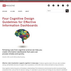
It reduces cognitive load on the user, aids in problem solving, and facilitates discovery of insights. Poor visualizations, on the other hand, confuse and lead to wrong conclusions. Since cognitive science has given us tremendous understanding of the mechanisms and processes by which we perceive things, comprehend them, and use them for decision-making, it’s reasonable to assume that such findings are very relevant to dashboard design issues. How users interpret data, what demands our designs place on their attention, what knowledge they need for making effective decisions―all these factors need to be considered while designing an information dashboard.
Here are four guidelines derived from studies on human cognition that can be applied while designing information dashboards: 1. Psychology Behind Colors - Color Theory Defined. Colors invoke emotion!
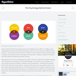
Psychology has proven that different colors affect us in different ways. Depending on the shade of color and the setting, a given color can cause very different human emotions. The meaning of the color red, for instance, is fire and blood. The Gestalt Principles. The Gestalt Principles Gestalt is a psychology term which means "unified whole". It refers to theories of visual perception developed by German psychologists in the 1920s. These theories attempt to describe how people tend to organize visual elements into groups or unified wholes when certain principles are applied. These principles are: Similarity.
Psychological Properties Of Colours - Colour Affects. Colour Accessibility. Here’s a quote from Josef Albers: In visual perception a colour is almost never seen as it really is[…] This fact makes colour the most relative medium in art. Josef Albers, Interaction of Color, 1963 Albers was a German abstract painter and teacher, and published a very famous course on colour theory in 1963. The Value of UX Research in Product Development. When we talk about user experience, we quite often end up discussing UX Design.
Some may even refer to UX and UX Design as a same thing, which they are not. User Stories: A Foundation for UI Design. The design team sits down to share the first round of mockups for a new client’s application. As the team members present their ideas, it becomes clear that everyone has distinctly different ideas about what the app is and how it should function.
The meeting quickly turns into more of a discussion about who—rather than what—is right. Everyone is defending their designs, and no one is defending the user. Sound familiar? It’s times like this that we need to implement user stories. Today, many UI/UX professionals find themselves working in an Agile world. Why Designers Shouldn't Neglect Mockups. This post is an overview of why we recommend mockups, covering some of the points in our free pocket guide Web UI Design Process: The Visual Power of Mockups. We’ll start by explaining what they are, then why they’re useful, and finally where they can fit into your design process. What is a Mockup? Before we get into what a mockup is, let’s talk about what it isn’t. Don’t Forget About Contrast · An A List Apart Blog Post. Article Continues Below. 10 UX Design Trends You Shouldn't Overlook in 2015 - Usability Geek.
In today’s fast-changing world of user experience design, predicting the future is no longer the art of gazing into a crystal ball. How To Change User Habits With Interaction Design. Jerry Cao is a content strategist at UXPin — the wireframing and prototyping app — where he develops in-app and online content for the wireframing and prototyping platform. As creatures of habit, we humans behave predictably. We avoid interactions that make us feel bad, and seek out interactions that make us feel good. T-Shirt: UX is Not UI. How To Reduce Friction With Good Design. La conception centrée utilisateur. Everybody Scrolls. Evolve your design too quickly and you’ll leave your users behind. Design too slowly and your users will do the same to you. Luster. This is a list of guidelines we've been compiling over the last couple years while building high-performance mobile frontends, as well as building the open source library impulse.
Some of these are broadly applicable to any mobile website, some are specifically for people building apps. Xcode For Designers. Stars and Stripes and ISO Codes · An A List Apart Column. This is the real story of a promising French start-up expanding into the U.S. market. The founders now have West Coast offices and the app has been fully translated into English. One minor detail though: to switch to the website’s English version, American customers have to click on… the Union Jack.
Uxbullshit. Responsive Type, part 3: Headers and hiearchy. Responsive Type, part 2: The Base Font. Responsive Type, part 1: Choosing fonts. 7 Rules for Creating Gorgeous UI (Part 2) 7 Rules for Creating Gorgeous UI (Part 1) ✿ Our favorite set — CopyPasteCharacter.com. The Ten Commandments Of Efficient Design In Axure.
Fundamental Principles of Great UX Design. What a Prototype Is (and Is Not) UX Designers Can Learn From Game Design and Gamification. Designers Code Differently — Learning Xcode As a Designer. Reducing Abandoned Shopping Carts In E-Commerce. Feeling Stuck? Design What You Don't Know. Improving Your Information Architecture With Card Sorting: A Beginner's Guide. Lessons Learned From Analyzing Material Design Components. Designing for Dyslexia (Part 1) The Problem With Design Thinking Is That I Still Don't Know What Design Thinking Is by ZURB. Apple on Hamburger Menus. Why Design Documentation Matters. Understanding Affordance in Digital Interfaces.
Prototyping Animation with Keynote. How To Get Started in Web Design. How to Conduct a Usability Heuristic Evaluation. 20 Tips for Selling UX to Clients -UX Mastery. Web Design Tools. Minimum Viable Product: Your ultimate guide to MVP (+great examples) New Rule: Every Desktop Design Has To Go Finger-Friendly - Part 1. A Hands-On Guide To Data-Driven Design. Product Design Process & Documentation Essentials (Part 1) A Front-End Developer's Ode To Specifications.
The web designer’s guide to social media. Mobile Design Pattern: Inventory-Based Discrete Slider. Helpful Tips to Improve Your Checkout Conversions. Responsive Web Design Tips. HeyDesigner. Training the CMS. Create a Mysterious Halloween Scene in Adobe Illustrator. The Skeptic’s Guide To Low-Fidelity Prototyping.
Why you must use empathy effectively in UX design. Icons Of Digital Design. 5 Ways to Improve the Online Shopping Experience. How To Create a Web Design Style Guide. Fractal Art: An Introduction to Apophysis. EmirWeb. Live Perspective: A New Approach to Depth in Drawing. Flatiny - [UIkit] [PSD] on Behance. The Elements of Elegance: What Makes Design 'Sophisticated'? Is Digital Art "Real" Art? Facts and Myths About Digital Creating. 6 easy ways to create an effective typographic hierarchy. Gridlover. Affinity Designer - Vector art & design. Unlock your design potential. Grid Calculator by Nicolaj Kirkgaard Nielsen. Size Matters: Balancing Line Length And Font Size In Responsive Web Design. CUBI: A User Experience Model for Project Success. Applying Participatory Design To Mobile Testing. Speed Design with Illustrator. 14 tips to create interfaces in minutes.
Interaction, Software, and Service Design — Dubberly Design Office. A Look Inside Design at Airbnb. Google Web Fonts Typographic Project. UX Tools: Implementing Doors Diagram. Five Things They Didn’t Teach Me in School About Being a User Researcher. Is There A Standard Size? What Is The Most Common Dimension? UX, Nude Celebrity Selfies, and the Cloud. 4 UX Tips That Will Improve Your Content Strategy. Expérience humaine — UX et ROI: +12M$ de profit par an. The $300 Million Button. Testing Mobile: Emulators, Simulators And Remote Debugging. What a Difference a Lab Day Makes. Ways To Avoid Overwhelming Users: Lessons Learned From My High-School Teachers. Closing the Knowledge Gap with Intuitive Flat Designs.