
Jan Jursa sur Twitter : "Video: "Mobile Marketing Optimization (Chris Goward)" (IA Television) #marketing #ux. Mobile Marketing Optimization (Chris Goward) Raphael Thys on Pinterest. Pin by Raphael Thys on [UX] Research ● Overview. Pin by Raphael Thys on [CONTENT] Icons. Designing an Effective Donate Form. I reached out to the Pittsburgh Food Bank last year about helping them redesign their website largely because I was having a hard time figuring out how to give them money.
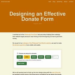
So as part of our redesign of the Pittsburgh Food Bank’s website, we want to make the donate experience more visible and usable. We’re still working hard to finish up the form design along with the rest of the site, but wanted to share some of the things we’re considering as we design the donate form: Be visibleCut out the noiseBreak big tasks into smaller stepsUse buttons for inputProvide smart defaults and suggestionsArticulate impactInline validationUse proper input typesReduce the number of tapsAutomatically generate city and state infoUse single-field credit card input pattern Be visible We’re including the donate form above the footer on almost every page of the site. Pin by Raphael Thys on [UX] User Experience ● Overview. Luis Abreu: Why and How to avoid Hamburger Menus. We now have data that suggests Sidebar menus—sometimes called Hamburger Menus/Basements—might be causing more harm than good.
Here’s some public data: One thing to have in mind is that this is a nuanced issue. I’ve observed these issues in user testing and others have also gone through the same realization. I only ask you to read the problems, solutions and be aware of the consequences before committing to this pattern. The Problems Lower DiscoverabilityLess EfficientClash with Platform Navigation PatternsNot Glanceable Lower Discoverability “what’s out of sight, is out of mind.” In its default state, the Sidebar Menu and all of its contents remain hidden. People need to first be able to identify the Sidebar Menu button as actionable — companies are supplementing the menu icon with a ‘menu’ label or tooltip, and they also have to feel the need to do so — which might not be the case in applications where the main screen offers majority of the value.
Your app makes me fat — Serious Pony. An experiment asked one group of dogs to sit, just sit, nothing else, for a few minutes before being released to play with their favorite treat “puzzle” toy (the ones where the dog has to work at getting the treats out of it).
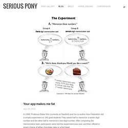
The other group of dogs were allowed to just hang out in their crates before getting the treat puzzle. You know where this goes: the dogs that had to sit — exercising self-control — gave up on the puzzle much earlier than the dogs that were just hanging out in their crate.The dogs that were NOT burning cognitive resources being obedient had more determination and mental/emotional energy for solving the puzzle.
Think about that next time you ask Sparky to be patient. His cognitive resources are easily-depleted too. Now think about what we're doing to our users. If your UX asks the user to make choices, for example, even if those choices are both clear and useful, the act of deciding is a cognitive drain. And when I back away from the screen and walk to the kitchen... The User is Drunk. Picture is part of your content, not something fighting against it. Bad picture choice? #badusability #ux @lalibrebe - Raphael Thys' posterous.
Web Form Design: Filling in the Blanks (9781933820248): Luke Wroblewski. Rthys : #fail #ux : unpause Movie by... Why Password Masking Can Hurt Your Sign Up Form. By anthony on 10/26/12 at 11:00 am Masking passwords is an age-old practice that’s commonly implemented on sign up and login forms.
It’s used to prevent over-the-shoulder snoopers from catching the user’s password. While masking passwords is a good security practice, there’s a chance it could jeopardize the user experience of your sign up form. Is it time for password-less login? Logging in to web sites is ironically one of the most difficult tasks put before our users.
Usernames and passwords are hard to remember, and harder than ever to type on the tiny on-screen keyboards of mobile devices. Even large, successful websites report that they receive an outsized number of support requests pertaining to login problems. We need something better.As multi-device software developers, we’re interested in making these login processes as simple as possible. If you want to access our products on multiple devices, why should you be required to login with a username and password on each device? What a pain! Combined with @lukew’s suggestion of pre-populating the username field, this design would allow existing users to login with only a few clicks and no typing - select an account from a list, click a link, and they’re done. Usability Has Become A Commodity.
Heretical or not, it is time to have more pleasure and enjoyment in life.
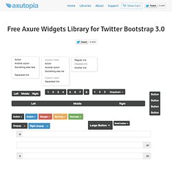
Although the cognitive analyses of usability and function are important, so too is the affective analysis. Let the future of everyday things be ones that do their job, that are easy to use, and that provide enjoyment and pleasure. – Don Norman I couldn’t say it any better than Don Norman. There is no questions that the usability of a user interface (UI) will continue to be essential for the success of a product. Evolution and design Design used to have a low standard of usability. In 1990, the WorldWideWeb (W3) was launched. Free Twitter Bootstrap Widgets Library for Axure RP. Impress clients, managers and peers with realistic app mockups done in minutes!
Create interactive high fidelity UI prototypes quickly and cheaply. We shipped an app that requires WebSockets. Here's why: Last week we launched our newest product, &!
, at KRTConf. It's a realtime, single-page app that empowers teams to bug each other less and get more done as a team. One of our speakers, Scott Hanselman from Microsoft tried to open the app in IE9 and was immediately redirected to a page that tells users they need WebSockets to use the app. He then wrote a post criticizing this choice, his argument being that users don't care about the underlying technology, they just want it to work.