
The Business of Web Design Conference - 18th July, Cardiff. The Business of Web Design Conference - 18th July, Cardiff. The Roadshow (#tboRoadshow) The Roadshow (#tboRoadshow) Affordances matter. BBC Internet Blog: From starting gun to smartphone: delivering the Olympics to your device. Make Content Strategy the Foundation of Social Service Design. “Content,” as we create and distribute it today, has come to mean “published information.”

The problem with this is that it implies a passive, one-way experience. We create content, distribute it, and the customer takes it in. Maybe it’s video, or a Webinar or a podcast, but really this kind of content strategy is a 21st century form of broadcasting. Content is created by a brand and delivered---albeit on demand--to a customer who consumes it. Well, I beg to differ. “The main goal of content strategy is to use words and data to create unambiguous content that supports meaningful, interactive experiences.” The key part of that sentence to me is the last five words: “supports meaningful, interactive experiences.”
We need to stop thinking of content as informational stuff we make for customers to digest so they like us more. Content is a key element of customer experience. Think for a minute about the concept of “content as a service. " So far he’s gotten 600,000 views of the video. Johnnyforeigner.
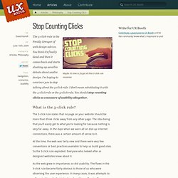
TagThis. Stop Counting Clicks. Maybe it’s time to forget all that 3-click-rule nonsense.

The 3-click-rule is the Freddy Kreuger of web design advice. You think it’s finally dead and then it comes back and starts slashing up sensible debate about usable design. I’m hoping to convince you to stop talking about the 3-click rule. I don’t mean substituting it with the 4-click rule or the 5-click rule. You should stop counting clicks as a measure of usability altogether.
What is the 3-click rule? The 3-click rule states that no page on your website should be more than three clicks away from any other page. At the time, the web was fairly new and there were very few conventions or best practices available to help us build good sites. As the web grew in importance, so did usability. Testing the 3-click rule In 2003, Joshua Porter of User Interface Engineering wrote an article that should have killed the 3-click rule for good. “…the Three-Click Rule does not focus on the real problem. Ignore the codeMeasuring Design (or: You're not Google) There has been a lot of brouhaha about Google’s design process.

It all started when Doug Bowman left Google. He wrote: When a company is filled with engineers, it turns to engineering to solve problems. Reduce each decision to a simple logic problem. Remove all subjectivity and just look at the data. This lead to a number of blog posts complaining about Google’s process, from the strangely confusing to the thoughtful and interesting. Visual design is often the polar opposite of engineering: trading hard edges for subjective decisions based on gut feelings and personal experiences.
There are three problems with the criticism of Google: First, you’re talking about different things. I just read the New York Times article on Douglas Bowman’s departure from Google which made the problem painfully obvious in the first two sentences: Usability & user research articles. Dear camera manufacturers, I’ve been one of your loyal customers.

I’ve had a Canon SLR camera for more than 15 years, and played around with all sorts of cameras since I was 2 years old. But today I find myself less and less inclined to take my camera out for a spin, and that’s not for a lack of inspiration. You’re probably already aware that people haven’t stopped taking photos — they just use their smartphones to do so. According to some sources, shipments of standalone digital cameras almost halved in 2013. I don’t want this to continue. Fix your chargers In a recent trip, I had a bag stolen with my camera charger inside. 15 Common Mistakes in E-Commerce Design Smashing Magazine. Advertisement Selling online can open up huge new markets for many businesses.

When your store can be open 24/7 and you can reach a global market without the costs of mailings and call centers, it can be a huge boon to your business. But there are plenty of things to consider when designing an ecommerce site. It’s not as simple as throwing up some shopping cart software and plopping products into a database. There are tons of mistakes that online retailers make every day, all of them avoidable with a little careful planning.
Below are 15 of the most common mistakes that e-commerce sites make, as well as advice on how to avoid or fix them. 1. When you’re shopping in a brick-and-mortar store, you have the advantage of being able to pick up an item, feel it, look at it from every angle, and read any information on the packaging or labels. How often have we gone to an online store and found their descriptions to be completely lacking? User Interface Resource Center.