
(JUST RELEASED) timetk 2.0.0: Visualize Time Series Data in 1-Line of Code. Written by Matt Dancho on June 5, 2020 I’m EXTACTIC 😃 to announce the release of timetk version 2.0.0.

This is a monumental release that significantly expands the functionality of timetk to go WAY BEYOND the original goals of the package. Now, the package is a full-featured time series visualization, data wrangling, and preprocessing toolkit. I’ll go into detail about what you can do in 1-line of code, and I have several more articles coming on how to use several of the new features. But first a little history… Background. Displaying time series with R. How to use hierarchical cluster analysis on time series data - Storybench. Which cities have experienced similar patterns in violent crime rates over time?
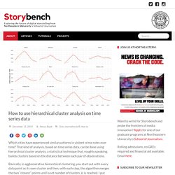
That kind of analysis, based on time series data, can be done using hierarchical cluster analysis, a statistical technique that, roughly speaking, builds clusters based on the distance between each pair of observations. Basically, in agglomerative hierarchical clustering, you start out with every data point as its own cluster and then, with each step, the algorithm merges the two “closest” points until a set number of clusters, k, is reached. I put closest in quotation marks because there are various ways to measure this distance – Euclidean distance, Manhattan distance, correlation distance, maximum distance and more.
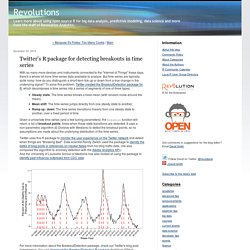
I’ve found this post and this post to be helpful in explaining those. For the purposes of this tutorial, we’ll use Ward’s method, which “minimizes the total within-cluster variance. RamiKrispin/TSstudio: Tools for time series analysis and forecasting. Guide to Time series data and ARIMA(X) model visualization by plotly [TSplotly] Introduction for the TSstudio Package. Seasonality analysis The TSstudio provides a variety of tools for seasonality analysis, currently supporting only monthly or quarterly data.
The monthly consumption of natural gas in the US (USgas dataset) is a good example of a seasonal pattern within time series data: # Load the US monthly natural gas consumptiondata("USgas") class(USgas) ## [1] "ts" ts_plot(USgas, title = "US Natural Gas Consumption", Xtitle = "Year", Ytitle = "Billion Cubic Feet" ) MarginTale: ggplot2 Time Series Heatmaps: revisited in the tidyverse. Xts cheat sheet. Seasonal decomposition in the ggplot2 universe with ggseas. The ggseas package for R, which provides convenient treatment of seasonal time series in the ggplot2 universe, was first released by me in February 2016 and since then has been enhanced several ways.
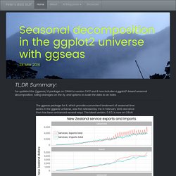
The latest version, 0.4.0, is now on CRAN. The improvements since I last blogged about ggseas include: added the convenience function tsdf() to convert a time series or multiple time series object easily into a data frame added stats for rolling functions (most likely to be rolling sums or averages of some sort) stats no longer need to be told the frequency and start date if the variable mapped to the x axis is numeric, but can deduce it from the data (thanks Christophe Sax for the idea and starting the code) series can be converted to an index (eg starting point = 100) added ggplot seasonal decomposition into trend, seasonal and irregular components, including for multiple series at once (thanks Paul Hendricks for the enhancement request) Range Selector. You can add range selector to the bottom of a dygraph that provides a straightforward interface for panning and zooming.
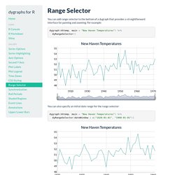
For example: dygraph(nhtemp, main = "New Haven Temperatures") %>% dyRangeSelector() You can also specify an initial date range for the range selector: dygraph(nhtemp, main = "New Haven Temperatures") %>% dyRangeSelector(dateWindow = c("1920-01-01", "1960-01-01")) Twitter's R package for detecting breakouts in time series. With so many more devices and instruments connected to the "Internet of Things" these days, there's a whole lot more time series data available to analyze.
Bfast breakpoints. #analyze breakpoints with the R package bfast #please read the paper #Verbesselt J, Hyndman R, Newnham G, Culvenor D (2010) #Detecting Trend and Seasonal Changes in Satellite Image Time Series.
#Remote Sensing of Environment, 114(1), 106–115. The Baseline. The left lane on the freeway, commonly known as the fast lane, is sometimes mistaken as the slowest lane on the planet.
It's especially weird when there aren't many cars on the road, and you're driving in the fast lane only to find yourself slowed down by the person in front of you who moves at 60% of the speed limit. The decent thing to do is for the slow person to switch to the right lane so that you can pass. But instead, he carries on with his slowness, so after a mile or two, you switch lanes to pass.
You speed up, and then all of a sudden he speeds way up, only to make you the slow one. I bet I'm the slow one in front more than I am the annoyed one in the back. R Financial Time Series Plotting. Displaying time series, spatial and space-time data with R: stories of space and time. This is the accompanying website of the book "Displaying time series, spatial and space-time data with R" to be published with Chapman&Hall/CRC.
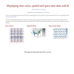
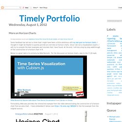
This book will provide methods to display time series, spatial and space-time data using R. More on Horizon Charts. #look at steps in constructing a horizon plot version #of #do horizon of percent above or below 10 month / 200 day moving average.
Apple Compared to Others with ggthemes. Require(ggplot2) #to get ggthemes from jrnold github if you have not installed. Generating polygon boundaries for plotting simple time series data with missing data. December 19, 2012 Tags: plotting, polygon, R-project Every so often I want to plot some data with pretty upper and lower error bounds, such as temperature data through time, perhaps with the maximum and minimum temperature range or standard error bounds for averaged data.
The polygon( ) function can make those sorts of pretty plots. However, I’ll often have chunks of missing data for periods of time, so I have to break up the polygons that go with the plotted data. I could swear I wrote a function to do this several months ago, but it’s lost in a pile of other scripts, so I re-wrote a function to accomplish the task. Quantmod: examples.
If there was one area of R that was a bit lacking, it was the ability to visualize financial data with standard financial charting tools. By virtue of no other package implementing this, quantmod took up the call and took a shot at providing a solution. What started with a single OHLC charting solution has grown into a highly configurable and dynamic charting facility as of version 0.3-4, with more coolness slated for 0.4-0 and beyond. For now, let's take a look at what its currently in place: Financial Charts in quantmod: Most of the charting functionality is designed to be used interactively. Let's get charting! Introducing chartSeries chartSeries is the main function doing all the work in quantmod. By default any series that is.OHLC is charted as an OHLC series. The default choice ['auto'] lets the software decide, candles where they'd be visible clearly, matchsticks if many points are being charted, and lines if the series isn't of an OHLC nature.
Ryan Peek on using xts and ggplot for time-series data. At Davis R Users’ Group today, Ryan Peek gave a presentation on how he takes data from his field instruments and visualizes it in R. Here are his notes. Shading and Points with xtsExtra plot.xts. Visualize multivariate time series – R is my friend. A few days ago a colleague came to me for advice on the interpretation of some data. The dataset was large and included measurements for twenty-six species at several site-year-plot combinations. Even More JGB Yield Charts with R lattice. See the last post for all the details. I just could not help creating a couple more.