
What Makes A Good Data Visualization? Hi there.
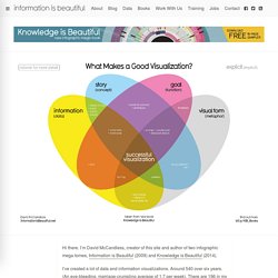
I’m David McCandless, creator of this site and author of two infographic mega-tomes, Information is Beautiful (2009) and Knowledge is Beautiful (2014). 27 hilariously bad maps that explain nothing. By Max Fisher on May 21, 2015 Maps can illuminate our world; they can enlighten us and make us see things differently; they can show how demographics, history, or countless other factors interact with human and physical geography.
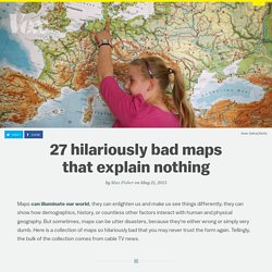
But sometimes, maps can be utter disasters, because they're either wrong or simply very dumb. Here is a collection of maps so hilariously bad that you may never trust the form again. Tellingly, the bulk of the collection comes from cable TV news. Famous Movie Quotes as Charts. Relative_abundance.jpg (Image JPEG, 3038 × 2414 pixels) - Redimensionnée (26%) NovelViews.
Billion $ weather. Pies. Tracking personal data. State Government Control. Diet Stupid. Humans differ from their primate ancestors in a few obvious ways (our conspicuous lack of body hair, our short arms), but evolutionary researchers all agree that what really sets us apart--what makes us social and creative and human--is our big brains.
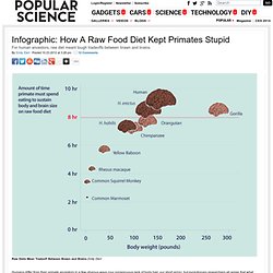
The question researchers are still trying to answer is: How did it happen? What conditions or changes or achievements made it possible for our ancestors' brains to grow to twice the relative size of monkeys, orangutans, and chimpanzees? A study published yesterday in the journal PNAS puts weight behind the hypothesis that--more than any social or environmental factor--humans own their giant cognitive leap to the ancestral chefs and proto grill masters who invented cooked food. Why? According to the researchers, a diet of raw foods can's support an endless growth of both brawn and brains.
The Global Brain Trade. Which countries have the most foreign scientists, and which ones suffer from the worst brain drain?

To answer these questions, researchers at the National Bureau of Economic Research, in Massachusetts, conducted a Web-based survey of over 17 000 published scientists in 16 countries. (China wasn’t surveyed: The researchers tried but were unsuccessful in administering the survey to scientists there.) While the United States is, unsurprisingly, a popular destination for scientists from around the world, Switzerland actually has the highest percentage of immigrant scientists. On the other side of the coin, Japan is the most insular country surveyed, exchanging relatively little scientific talent with the rest of the world. Source: “Foreign Born Scientists: Mobility Patterns for Sixteen Countries,” by Chiara Franzoni, Giuseppe Scellato, and Paula Stephan, May 2012, National Bureau of Economic Research Click on the image to enlarge. Cold: the chart. Growing metropolitan economies. Economic Indicators Dashboard. Emotional-map2.jpg. Heatmap birthdays. Traffic Fatalities. Cold Remedies.
Burgers. Wind Surpasses Nuclear in China. February 19, 2013 Wind Surpasses Nuclear in China J.
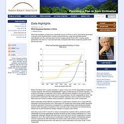
Matthew Roney Wind has overtaken nuclear as an electricity source in China. In 2012, wind farms generated 2 percent more electricity than nuclear power plants did, a gap that will likely widen dramatically over the next few years as wind surges ahead. Before the March 2011 nuclear disaster in Japan, China had 10,200 megawatts of installed nuclear capacity. When authorities finally lifted the moratorium on approvals in October 2012, it was with the stipulation that going forward only “Generation-III” models that meet stricter safety standards would be approved.
Energy Related Flow Diagrams. London Underground 1932 Map. London Underground 1933Map. What do people die of ? It may happen to all of us eventually, but fewer of us are dying right now than at any time since mortality data was collected.

In a dramatic report the latest figures also show that more people are dying of cancer than of circulatory diseases, for the first time since the data was recorded. The latest figures from the Office for National Statistics show there were 484,367 deaths registered in England and Wales in 2011, a fall of 1.8% compared with 2010. The age-standardised mortality rates (which takes account of aging population) in 2011 were the lowest ever recorded for England and Wales, at 6,236 deaths per million population for males and 4,458 deaths per million population for female. Cancer death rates have fallen by 14% for men and 10% for women in the previous decade. And between 2001 and 2011, the death rates for circulatory diseases fell by 44% to 1,803 deaths per million population for males and 1,110 deaths per million population for females.
Males Mortality interactive. The Various Varieties of Fruits. Family Tree Diagram of Greek Mythology. Choosing-a-tablet-guide. Danger of death! How you are unlikely to die ON FEBRUARY 15th DA14, an asteroid 45 metres across, will sail past the Earth at 7.8km a second (4.9 miles a second).
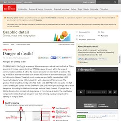
Worldmapper: The world as you've never seen it before. 17 ways to tie shoes. The new punk. This is a chord… this is another… this is a third.
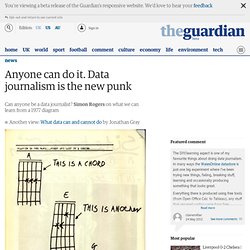
NOW FORM A BAND. Underskin. Digital dump. Cover race. The Beatles Song Chart Volume 1. Seasons, Fruits, Vegetables & Herbs. Kitchen 101: Fruits, Vegetables & Herbs.

Lunar Calendar. Get Your Dose of Innovation. The Beatles: Song Keys.