
In Climbing Income Ladder, Location Matters. ATLANTA – Stacey Calvin spends almost as much time commuting to her job — on a bus, two trains and another bus — as she does working part-time at a day care center. She knows exactly where to board the train and which stairwells to use at the stations so that she has the best chance of getting to work on time in the morning and making it home to greet her three children after school. “It’s a science you just have to perfect over time,” said Ms. Calvin, 37.
Her nearly four-hour round-trip stems largely from the economic geography of Atlanta, which is one of America’s most affluent metropolitan areas yet also one of the most physically divided by income. The low-income neighborhoods here often stretch for miles, with rows of houses and low-slung apartments, interrupted by the occasional strip mall, and lacking much in the way of good-paying jobs. “Where you grow up matters,” said Nathaniel Hendren, a Harvard economist and one of the study’s authors. The gaps can be stark. 10th percentile. Charts Gallery - Google Charts. Free Visualization Software.
Thumbnails: ON off Sort by: name DATE To create a new visualization, choose a base dataset.
Loading datasets and visualizations... Visualization Options. The Daily Graph - AppTrac. "The Daily Graph" re-creates charts from The Economist's Graphic Detail blog using standard run-of-the-mill Excel techniques without macros. We do try to milk Excel for all it's worth and apply techniques that may not have been intended in the way we use them. In the end, it's the result that counts. "The Daily Graph" is published whenever we spot an interesting chart on The Economists's blog that looks like it cannot be done in Excel. Typically once or twice a week if we can find the time.The Daily Graph blog comes with a dowloadable version of an Excel workbook so that you can follow what we did... or you can "borrow" our work and use it for something entirely different.
"The Economist" is a trademark of The Economist Newspaper Limited. Graphic detail - The Economist. Bullet graph. A bullet graph is a variation of a bar graph developed by Stephen Few.
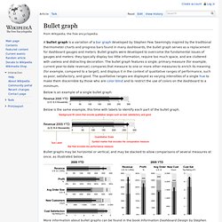
Seemingly inspired by the traditional thermometer charts and progress bars found in many dashboards, the bullet graph serves as a replacement for dashboard gauges and meters. Bullet graphs were developed to overcome the fundamental issues of gauges and meters: they typically display too little information, require too much space, and are cluttered with useless and distracting decoration. The bullet graph features a single, primary measure (for example, current year-to-date revenue), compares that measure to one or more other measures to enrich its meaning (for example, compared to a target), and displays it in the context of qualitative ranges of performance, such as poor, satisfactory, and good.
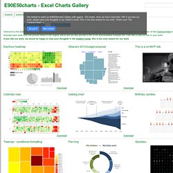
The qualitative ranges are displayed as varying intensities of a single hue to make them discernible by those who are color blind and to restrict the use of colors on the dashboard to a minimum. Juice Labs - Chart Chooser. E90E50charts - Excel Charts Gallery. Obama's 2014 budget proposal Iceberg chart Pie+ring Arrow chart - Critical step Combinatorics - with formatting Rectangle tangled Square chart with legend Arrow circle chart Percentage Chart.
Excel Charts. Sample Excel Dashboards A Hospital Administrator Shows How Excel Dashboards Improve Outcomes "In healthcare, there has been a lot of attention recently paid to patient safety, quality improvement, and measurement," a hospital administrator wrote.
"I'm using your Excel dashboard method to apply towards quality improvement teams as well as to general indicators. " Excel Dashboard Templates New! IncSight DB, Version 2, includes 20 dashboard report workbooks all linked to an Excel database. Data Visualization Dashboard gauges are still a terrible idea! "Your product doesn't even cover gauges," a customer fumed when she asked for a refund. Dashboard History The World's First Excel Dashboard Report Excel dashboard reports have been around a lot longer than you might think. . • 1986 -- The world's first spreadsheet dashboard report, with Lotus 1-2-3. • 1990 -- The world's first Excel dashboard report. • 1992 -- Excel dashboard report showing public financial data. Bad Practices Oh, No! FrankensTeam's Excel Collection.