
Infographics: The great circle debate. If you’re ever at a loss for conversation amid a group of information-graphics professionals, bring up the topic of pie charts or proportional circles.

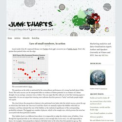
Then stand back and watch the sparks fly. At the World Infographics Summit in Pamplona, Spain, this past week, the love/hate relationship with circular data presentations was a common theme. Purists, such as Stephen Few (founder and principal, Perceptual Edge) and John Grimwade (graphics director, Conde Nast Traveler) are wary of the functionality of circle-based charts. Indeed, the human brain is more adept at comparing lengths than areas. For example, the largest wedge in this pie chart is clearly identifiable (figure 1). Others, such as Alberto Cairo (director for infographics and multimedia at Época-Editora Globo), worry that bar and line charts have become too familiar, and risk being overlooked or dismissed too quickly by the reader. I have certainly been seduced by the format. In my opinion, context is key.
Infographic How-To: Comparative Bubble Charts. This week during an infographic critique we were brainstorming ways to make a certain data set more effective and clear. We decided that a comparative bubble chart would be an effective method as it would allow a reader to easily compare and comprehend the difference in the values. We started testing out the idea and I was quickly reminded that making a custom bubble chart can quickly go awry if the math behind the chart is not understood.
Math is not always a right brained graphic designer’s strength. That can be problematic when designing an infographic as effective infographic design requires more than just an understanding of what looks nice and how to make things “pop.” Junk Charts: Bubble chart. Loyal reader John M. expressed dismay over Twitter about 538's excessive use of bubble charts.
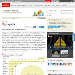
Here's the picture that pushed John over the edge: The associated article is here. The question on the table is motivated by the extraordinary performance of a young baseball player Mike Trout. The early success can be interpreted either as evidence of future potential or as evidence of a future drought. As an analogy, someone wins a lottery. The chart shows the proportion of players who performed even better after the initial success, given the age at which they first broke out. This bubble chart is no different from others: it is impossible to judge the relative sizes of bubbles. The designer should have just replaced each bubble with an error bar, and the chart is instantly more readable. The rest of the design elements are clean and well-done, particularly use of notes to point out interesting aspects of the data. Why two seasons? This chart is excellent on many levels. Daily chart: High spirits. Who drinks most vodka, gin, whisky and rum?
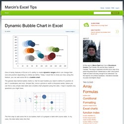
ASIA'S growing middle classes are driving demand in the global spirits market. According to IWSR, a market-research firm, consumption last year grew by 1.6% to 27 billion litres—and China, the world’s biggest market, quaffed 38% of that. The national liquor, baijiu, accounts for a whopping 99.5% of all spirits consumed there, so China does not even feature in rankings of the best-known internationally consumed spirits, below. The most popular of these is vodka, mainly because it is drunk in copious amounts in Russia. Russians downed nearly 2 billion litres of the stuff in 2012, equivalent to 14 litres for every man, woman and child. Dynamic Bubble Chart in Excel » Marcin's Excel Tips. One of handy features of Excel is it’s ability to create dynamic ranges which can change their size and position depending on criteria we define.
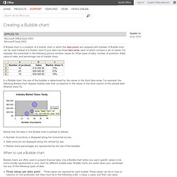
Today I would like to show you how, using this feature, you can add some life to a bubble chart. The general idea behind bubble charts is, that for each bubble you need to define it’s position (X and Y coordinates) and size. Simple! But, since a picture is worth a thousand words, below you can find a very simple data table and a bubble chart prepared using this data. I hope it explains any questions you might have. The first step to add some life to our bubble chart is to prepare a table with source data. All data is prepared for years 1999-2005 and for 6 countries. I have also decided that my “tail” with historical data will follow the chosen year data for a span of 4 years. Creating a Bubble chart. A Bubble chart is a variation of a Scatter chart in which the data points (data points: Individual values plotted in a chart and represented by bars, columns, lines, pie or doughnut slices, dots, and various other shapes called data markers.
Many Eyes - Bubble Chart guide. Bubble chart summary (wiki) This bubble chart show the relationship between three variables.
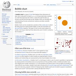
A bubble chart is a type of chart that displays three dimensions of data. Each entity with its triplet (v1, v2, v3) of associated data is plotted as a disk that expresses two of the vi values through the disk's xy location and the third through its size.