
Banshee - Wikipedia, the free encyclopedia. The banshee (/ˈbænʃiː/ BAN-shee), from Irish: bean sí [bʲæn ˈʃiː] ("woman of the sídhe" or "woman of the fairy mounds") is a female spirit in Irish mythology, usually seen as an omen of death and a messenger from the underworld.
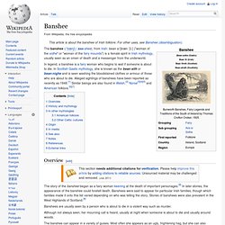
In legend, a banshee is a fairy woman who begins to wail if someone is about to die. In Scottish Gaelic mythology, she is known as the bean sìth or bean-nighe and is seen washing the bloodstained clothes or armour of those who are about to die. Alleged sightings of banshees have been reported as recently as 1948.[1] Similar beings are also found in Welsh,[2] Norse[3][4][5] and American folklore.[6][7] Overview[edit] The story of the banshee began as a fairy woman keening at the death of important personages.[8] In later stories, the appearance of the banshee could foretell death. Banshees are usually seen by a person who is about to die in a violent way such as murder. The banshee can appear in a variety of guises. History and mythology[edit] American folklore[edit]
Tag "E-Commerce" on Smashing UX Design. Product findability is key to any e-commerce business — after all, if customers can’t find a product, they can’t buy it.

Therefore, at Baymard Institute, we invested eight months conducting a large-scale usability research study on the product-finding experience. We set out to explore how users navigate, find and select products on e-commerce websites, using the home page and category navigation. 7 Responsive Design Tips to Revamp Your Workflow. Responsive design is rapidly becoming the new standard in our industry, along with its evolving carousel of best practices, platforms and tools.
The movement has caused a shift in thinking, especially as we adapt our workflows for a more efficient project process. Dissecting the responsive design workflow, though, can be difficult — it's highly individual and iterative. However, you can apply general tips and techniques to almost every responsive project. From content structure to scalable images, we'll cover seven techniques to consider in your next responsive design. If you are a designer or developer, what are some of your strategies for responsive web design? 1. Starting with a mobile first approach and designing with progressive enhancement covers all bases, helps you focus and prioritize the constraints of mobile design, while you build new innovative experiences and capabilities. It means the default presentation and base content is mobile, optimized for the simplest devices first. Vim documentation: insert. WALL.BARCAMP.HK. What is this?
Back in 2010, we were at BarCamp Hong Kong, standing and looking at the BarCamp Wall, neatly filled with Post-its which made up the speaking schedule of the day. Right next to the schedule, Simon from Frenzoo decided to start another board -- a job board. It was divided into four sections -- the same that you see on this site -- and sure enough, people started putting stuff up on it. In the right sections, too. The people that weren't posting were actually reading it.
We wondered what it would be like if looking for jobs, talent and resources online was like this. The original Barcamp Job Wall at PolyU, BarCamp Hong Kong 2010. Why do I need to login thru Facebook and Twitter to post? Of course not. Why was my post deleted? Because you wrote something that caused a bunch people to Flag your post, which resulted in it being removed.
How to Recover Windows 7 Password With Chntpw USB Disk: 8 Steps. PHP: How to change configuration settings - Manual. Course: HTML5 - Free sample course. Below, you will find sample content from a September 2014 version of the "HTML5" course.
This small set of pages and activities is designed to show you what it's like to take an online training course with W3C. We'll begin with a few introductory words to help you find your way around: this is an online course, being taught in a "virtual classroom" - that is, on the Web site that you are looking at. As in "real world", the course has a teacher and students. At the beginning of each week, the teacher posts new course material, and is available to answer questions and help through the discussion forum or directly if need be. Here's what you need to do as a student to fully benefit from the course: study the lectures to learn the week's subject matter,work on the exercises and assignment for the week. You will need to spend around 6-8 hours per week on the course.
During the actual course, we provide several links to different resources: