
Sea Ice Max Continues Downward Trend In September 2012, the ice cap over the Arctic Ocean shrank to its lowest extent on record, about half the size of the average summertime extent from 1979 to 2000. That sea ice minimum continued a long-term trend of diminishing ice cover over the past few decades. During the darkness and bitter cold of Arctic winter, new sea ice forms and older ice re-freezes and grows. According to a NASA analysis, this year’s annual maximum extent was the fifth lowest in the past 35 years. Scientists at the National Snow and Ice Data Center (NSIDC) assert that the Arctic ice maximum occurred on March 15, 2013. The maps above show the Arctic sea ice extents from March 15, 2013 (top) and March 14, 1983 (bottom), an average year for sea ice maximum. The 2013 map was compiled from observations by the Advanced Microwave Scanning Radiometer 2 (AMSR-2) sensor on the Global Change Observation Mission 1st–Water (“Shizuku”) satellite, operated by the Japan Aerospace Exploration Agency (JAXA). Instrument(s):
and World Book <center><div class="site_errors"><div class="floatType_site_error_top"></div><div class="floatType_site_error"><table summary="layout table"><tr><td bgcolor="#000000"><font color="#ffffff"><h2><img src="/templateimages/redesign/modules/overlay/site_error.gif" title="Site Error" alt="Site Error"/>There's a problem with your browser or settings. </h2></font><font color="#ffffff"><p>Your browser or your browser's settings are not supported. To get the best experience possible, please download a compatible browser. If you know your browser is up to date, you should check to ensure that javascript is enabled. </p></font><p><a target="_blank" href="/home/How_to_enable_Javascript.html">› Learn How</a></p></td></tr></table></div><div class="floatType_site_error_bottom"></div></div></center> Follow this link to skip to the main content NASA - National Aeronautics and Space Administration Charles F. Lori B. News & Features News Topics News Releases Media Resources Speeches Budgets & Plans Reports
2011 Global Temperatures Nine of the top ten warmest years in the modern meteorological record have occurred since the year 2000. Last year was another one of them, coming in at 9th warmest since 1880. The map above shows temperature anomalies, or changes, by region in 2011; it does not depict absolute temperature. On January 19, 2012, researchers at NASA’s Goddard Institute for Space Studies (GISS) released their annual analysis of global temperatures, noting that Earth’s land and ocean surfaces continue to experience higher temperatures than several decades ago. “We know the planet is absorbing more energy than it is emitting,” said GISS director James Hansen. The difference between 2011 and the warmest year (2010) is 0.22 degrees F (0.12 C). Higher temperatures today are largely sustained by increased concentrations of atmospheric greenhouse gases, especially carbon dioxide. ReferencesNASA (2012, January 19) NASA Finds 2011 Ninth-Warmest Year on Record. Instrument(s): In situ Measurement
The James Webb Space Telescope Le blog de l'image satellite – CNES bulletins-electroniques.com : toute l'actualité technologique internationale en français, en accès libre et gratuit ! accueil plasma Accueil > Erreur 404 Erreur 404
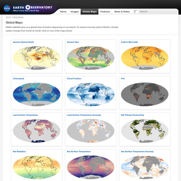
Global Maps
NASA satellites give us a global view of what’s happening on our planet. To explore how key parts of Earth’s climate system change from month to month, click on one of the maps below. by meike53 Apr 17