
Python. Python. Maps & Location Analytics. Online Visualization Platforms. Various. Guides. Ask the Question, Visualize the Answer Let's work through a practical example to see how asking and answering questions helps guide you towards more focused data graphics.
Interactive Chart Chooser. VALiD netflower. Text Visualization Browser. Analyzing 2018 Gartner BI Magic Quadrant – Part 2 - Analytics Industry Highlights. In analyzing the 2018 Gartner BI Magic Quadrant – Part 1, we revisited how to interpret this report, discussed new criteria, who’s missing, top shockers, recurring themes and the three Leaders.
Don’t overlook the innovative gems in this next mix when putting together your short list. In Part 2, we will explore the Visionaries, Niche Players and Challengers. Beware it is a looooooong read. Visualization Universe - The Most Searched for Visualization Types, Tools, and Books. The Chartmaker Directory. Chart Chooser - Max Marboeuf. Chart Chooser. Unexpected Error An unexpected error occurred.
If you continue to receive this error please contact your Tableau Server Administrator. Chart Chooser - Adam E McCann. Resources. Easily Build Custom Reports and Dashboards - Google Data Studio – Google. What I Learned Recreating One Chart Using 24 Tools. Back in May of this year, I set myself a challenge: I wanted to try as many applications and libraries and programming languages in the field of data visualization as possible.
To compare these tools on a level playing field, I recreated the same scatterplot (also called a bubble chart) with all of them. Chart-doctor/visual-vocabulary at master · ft-interactive/chart-doctor. Exploring Histograms. Gather your data A histogram is based on a collection of data about a numeric variable.
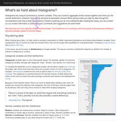
Our first step is to gather some values for that variable. The initial dataset we will consider consists of fuel consumption (in miles per gallon) from a sample of car models available in 1974 (yes, rather out of date). We can visualize the dataset as a pool of items, with each item identified by its value—which in theory lets us "see" all the items, but makes it hard to get the gestalt of the variable. 9 Low-Cost KPI Analytics Dashboard Tools That Are Ridiculously Easy to Setup.
Sign in - Google Accounts. Collection of data visualizations to get inspired and finding the right type. Cytoscape.js. Sigma js. Blueprint – A React-based UI toolkit for the web. Palantir - Plottable. The Power Of Whitespace – UX Planet. Whitespace (or “negative space”) is an empty space between and around elements of a page.

Although many may consider it a waste of valuable screen estate, whitespace is an essential element in design: “Whitespace is to be regarded as an active element, not a passive background” — Jan Tschichold Today, I’ll cover how you can use whitespace in your designs to give it a clean, uncluttered feel. Whitespace And Negative Space The term “negative space” originates from traditional art where it used to capture the shape of the object more accurately. How Human Memory Works: Tips for UX Designers. – UX Planet. Coolors.co - The super fast color schemes generator. Home - State.of.dev. +100 herramientas para el análisis de redes sociales #sna #ars. El Análisis de Redes Sociales (ARS) o Social Network Analysis (SNA) es una técnica clave en muchos campos como la sociología, la biología, comunicación, política… Permite analizar relaciones entre elementos para determinar la importancia de los actores, cómo se han agrupado en subcomunidades, el flujo de la información, qué es clave en la transmisión de la información… Ya hace unos años que la vengo utilizando de manera habitual.
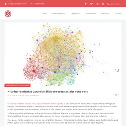
Algunos programas de cabecera durante este tiempo han sido Gephi, NodeXL y de manera más esporádica, aunque no menos importante, R Project y algún que otro script en Python. Poco a poco he ido recopilando recursos para el análisis de redes. En las siguientes listas hay de todo un poco, desde módulos para python o java, aplicaciones especializadas en texto, en visualización de redes, en análisis, bases de datos de grafo… Soy consciente que este sector crece día a día y que seguramente faltará alguna referencia. A Periodic Table of Visualization Methods. Vizipedia. What I Use to Visualize Data. Mar 8, 2016 “What tool should I learn?
What’s the best?” I hesitate to answer, because I use what works best for me, which isn’t necessarily the best for someone else or the “best” overall. If you’re familiar with a software set already, it might be better to work off of what you know, because if you can draw shapes based on numbers, you can visualize data. After all, this guy uses Excel to paint scenery. It’s much more important to just get started already.
Dataviz.tools. Best Business Intelligence Software Comparison: User & Analyst View. No one knows more about how a business intelligence tool performs in the real world than the customers already using it.
All too often, they find that products don’t live up to expectations, or that the business intelligence vendor does not support the BI tool properly. Therefore, when comparing BI software, there is almost nothing more valuable than user reviews. This is where The BI Survey comes in. Collecting feedback from business intelligence software users every year for the last 15 years, The BI Survey provides detailed analysis of which BI software products get the best user ratings. This year’s BI Survey is based on the analysis of the real-world experience of 3,137 respondents with 2,611 answering a series of detailed questions about their usage of a named business intelligence software tool. Altogether, the BI Survey compares 37 business intelligence tools (or groups of products) in detail. Interactive: The Top Programming Languages 2016.
This app ranks the popularity of dozens of programming languages.
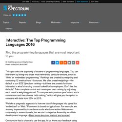
You can filter them by listing only those most relevant to particular sectors, such as “Web” or “embedded programming.” Rankings are created by weighting and combining 12 metrics from 10 sources. We offer preset weightings—the default is our IEEE Spectrum ranking—but there are presets for those interested in what's trending or most looked for by employers. Don't like the defaults? Lisa Charlotte Rost · A world view. Home. Bokeh Docs. GitHut - Programming Languages and GitHub. Turn Data Into Visuals: 28 Apps that Generate Reports and Charts.
Humans love patterns—in fact, our superior ability to process patterns is what sets us apart from other species. We still need help drawing conclusions from data, though. That’s where reports come in: They provide a visual overview of information, From summarizing work expenses to recapping research findings, reports help sort connect the dots. Visualization Tools List. HelpMeViz - Helping people with everyday data visualizations.