
Display size. Comparison of screen sizes by width, height, diagonal, area, and aspect ratio.
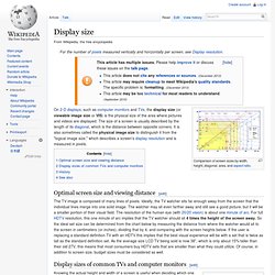
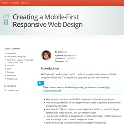
On 2-D displays, such as computer monitors and TVs, the display size (or viewable image size or VIS) is the physical size of the area where pictures and videos are displayed. The size of a screen is usually described by the length of its diagonal, which is the distance between opposite corners. Display resolution. This chart shows the most common display resolutions, with the color of each resolution type indicating the display ratio (e.g. red indicates a 4:3 ratio).
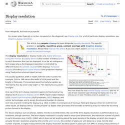
The display resolution or display modes of a digital television, computer monitor or display device is the number of distinct pixels in each dimension that can be displayed. It can be an ambiguous term especially as the displayed resolution is controlled by different factors in cathode ray tube (CRT) displays, flat-panel displays (including liquid-crystal displays) and projection displays using fixed picture-element (pixel) arrays. It is usually quoted as width × height, with the units in pixels: for example, "1024 × 768" means the width is 1024 pixels and the height is 768 pixels.
This example would normally be spoken as "ten twenty-four by seven sixty-eight" or "ten twenty-four by seven six eight". Web Design Image Gutters. Scaffolding. Need reasons to love Bootstrap?

Look no further. By nerds, for nerds. Built at Twitter by @mdo and @fat, Bootstrap utilizes LESS CSS, is compiled via Node, and is managed through GitHub to help nerds do awesome stuff on the web. Made for everyone. Bootstrap was made to not only look and behave great in the latest desktop browsers (as well as IE7!) A Simple, Responsive, Mobile First Navigation. We're going to build a simple, responsive web site navigation.
Our solution will help us place emphasis on the content of our page, arguably the top priority when designing for mobile. There'll be no JavaScript involved, and we'll tackle it from a Mobile First approach. Mobile Navigation If you've read Luke Wroblewski's Mobile First you'll be familiar with his statement that: As a general rule, content takes precedence over navigation on mobile.
What he means by this is that mobile users are often looking for immediate answers; they want the content they went searching for, not more navigation options. Many sites, even responsive ones, stick to the convention that navigation belongs at the top of any given page. Take this example from London & Partners: A perfectly decent responsive design, but at standard mobile viewport dimensions (320px x 480px) all you really see is a navigation menu. So What are the Solutions? Big screen, little screen.
Pure CSS Solution Step 1: Markup Step 3: CSS Reset. Tips to design your site for mobile devices. Some day ago my friend Lucas asked to me some suggest to design a mobile version of his blog.
So, in this post I want to illustrate some simple tips about how to develop a mobile version of your site such as: choosing an URL address for your mobile site version, using a redirect script for mobile devices, designing a mobile-friendly layout using CSS and HTML and (if you are a WordPress user) using a free WordPress plugin to develop your mobile site quikly. Choose an URL address for the mobile version of your site First step is choosing an URL address for the mobile version of your site. You have some options, for example, you can create a folder (mobile) in the root of your site so your mobile version will be publishet at this URL: ...or if you can add custom sub domains to your domain, you can use an url like this or which links to the folder mobile which will contain all files of your mobile site version. Redirect a mobile/PDA to a "lite homepage" Device detection using PHP It'all!
Creating a Mobile-First Responsive Web Design. Introduction We're going to walk through how to create an adaptive web experience that's designed mobile-first.
This article and demo will go over the following: There is even more up to date responsive guidance on our new Web Fundamentals site. Why we need to create mobile-first, responsive, adaptive experiences How to structure HTML for an adaptive site in order to optimize performance and prioritize flexibility How to write CSS that defines shared styles first, builds up styles for larger screens with media queries, and uses relative units How to write unobtrusive Javascript to conditionally load in content fragments, take advantage of touch events and geolocation What we could do to further enhance our adaptive experience The Need for Adaptivity As the web landscape becomes increasingly complex, it's becoming extremely important to deliver solid web experiences to a growing number of contexts.
However, mobile context is much more than just screen size. View the demo Structure. List of common resolutions. Computer graphics[edit] For the table below, SAR (storage aspect ratio) is based solely on pixel count.
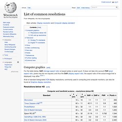
It does not take into account PAR (pixel aspect ratio, pixels may be non-square) and thus the DAR (display aspect ratio, the aspect ratio of the actual image that is displayed) may differ.