
Gephi - was ich suche. Circos, Kreisdiagramme. Mit Zeitleisten Abläufe übersichtlich darstellen - torial blog. Michael Hörz stellt die Tools Tiki-Toki, Dipity, Timeline JS, TimeMapper und StoryMap JS vor.
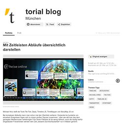
Bei komplexen Abläufen kann man schon mal den Überblick verlieren. Dutzende bis hunderte von einzelnen Ereignissen fügen sich zu einem großen Ganzen zusammen - aber wie will man das dem geneigten Mediennutzer nahebringen? Ein reiner Fließtext ist da wenig hilfreich, auch die häufig hierfür eingesetzten Fotostrecken werden dem Ziel „bessere Durchschaubarkeit" nur in Maßen gerecht. Tiki-Toki und Dipity Deutlich besser für solche Zwecke sind Zeitleisten geeignet, die in zahlreichen kostenlosen und kostenpflichtigen Versionen verfügbar sind. Sie stellen die Einzelereignisse auf einer horizontalen Leiste dar, so dass die Abfolge der Ereignisse deutlich wird. Ein grandioses Ding: ThingLink. Seit einiger Zeit schon war ich auf der Suche nach zwei Dingen für meine Facebook-Seite: 1. ein einfaches Tool, um einen Willkommens-Tab zu generieren und 2. ein Timeline-Tool, um meine aufgezeichneten Vorträge und Slides übersichtlich auf einer Seite einzubetten.
Mit ThingLink habe ich die Lösung meines Problems gefunden, auch wenn die ursprüngliche Idee der finnischen Erfinder eine andere war: Communities um Dinge schwebten Gründerin und CEO Ulla-Maaria Engeström 2008 vor. Gemeint war der ”social graph of things” vom Designer über den Hersteller und die Verkäufer bis zu den Konsumenten. Auf der Suche nach tragfähigen Finanzierungsmodellen hat sich der Fokus inzwischen etwas verschoben, wie sie auf der Next 2012 vortrug. Make Your Images Interactive - ThingLink. Mind the Map: Karten. “What is it we want our maps to be now, if no longer a single authoritative view or the world?”
- Brooke Gladstone, Host of NPR’s On the Media Maps are rhetorical devices. Propositions. Arguments. Stories. They present the world according to how the mapmaker sees it. Lucidchart > diagramme, mindmaps. Create and share visual ideas online. Create Easy Infographics, Reports, Presentations. Diagram Examples Drawn Using Creately. Online Diagram Software and Flow Chart Software - Gliffy. Piktochart : Make Information Beautiful - Login. JavaScript InfoVis Toolkit.
Infoactive, zu teuer. Welkin. What is this?
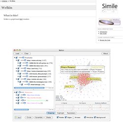
Welkin is a graph-based RDF visualizer. What's New in Version 1.1 Works on Windows, Linux and MacOSX. Added support for Turtle/N3 RDF syntax. Dramatically reduced size for increased startup performance. Ok, how do I run it? The easiest way is to run Welkin thru Java WebStart. If the application doesn't start when you click the link above, you don't have Java WebStart installed in your machine.
Cool, now what? Welkin visualizes RDF models. A word of warning: above 1000 nodes, real-time drawing performance degrades dramatically even on beefy machines. The Data Visualisation Catalogue. Ly. Over 100 Incredible Infographic Tools and Resources (Categorized) This post is #6 in DailyTekk’s famous Top 100 series which explores the best startups, gadgets, apps, websites and services in a given category.

Total items listed: 112. Time to compile: 8+ hours. 36 Excellent Data Visualization Tools. Data is always useful but it is not easy to comprehend it when it is not presented understandably.
This is where data visualization comes in; there are many tools and techniques of providing data in a way that helps the viewers to apprehend the given data. It is very important to draw in the user’s attention via proper data visualization so that he/she is better capable of retaining facts. It would definitely require the media, through which the data is presented, to present the information in such a way that it catches the user’s eye and still be intelligible to him at all counts and levels because representation of facts is always better shown through pictorial representation of statistics.
20+ Tools to Create Your Own Infographics. A picture is worth a thousand words – based on this, infographics would carry hundreds of thousands of words, yet if you let a reader choose between a full-length 1000-word article and an infographic that needs a few scroll-downs, they’d probably prefer absorbing information straight from the infographic. What’s not to like? Colored charts and illustrations deliver connections better than tables and figures and as users spend time looking back and forth the full infographic, they stay on the site longer. Plus, readers who like what they see are more likely to share visual guides more than articles.
9 Powerful Free Infographic Tools To Create Your Own Infographics - DATA VISUALIZATION. 20 free data visualisation tools. In this article, I want to focus on tips and tools that are free and easily accessible.
There are loads of great paid tools out there, and I use many of them. But it is hard to expect someone just getting into this field to pay for expensive software without actually knowing what they are getting into. This article looks to expand the list to even more tools and resources you can use to help you get started creating beautiful data visualisations for the web and print. From data journalism, where you are scrubbing and combining datasets, to ornately designed infographic style posters, you need to understand the tools and your audience to succeed. 10 Fun Tools To Easily Make Your Own Infographics. People love to learn by examining visual representations of data.
That’s been proven time and time again by the popularity of both infographics and Pinterest. So what if you could make your own infographics ? What would you make it of? It’s actually easier than you think… even if you have zero design skills whatsoever. Below are my two favorite infographic-making web 2.0 tools that I highly recommend. 10 Awesome Free Tools To Make Infographics. Advertisement Who can resist a colourful, thoughtful venn diagram anyway?

In terms of blogging success, infographics are far more likely to be shared than your average blog post. This means more eyeballs on your important information, more people rallying for your cause, more backlinks and more visits to your blog. In short, a quality infographic done well could be what your blog needs right now. Infographic Website Offering Infographics and Data Visualization. Submit & share infographics - Infographics Submission Site & Community.