
CSS Shapes, une introduction. L'article de Sara Soueidan paru dans A List Apart a fait le buzz dernièrement.
Sara présente ici avec clarté ce qui sera l'avenir des formes et du design dans CSS. Par Sara Soueidan Des rectangles dans des rectangles, telle est depuis toujours la structure de nos pages web. Depuis longtemps, nous tentons de nous libérer de leurs limitations en utilisant CSS pour créer des formes géométriques, mais ces formes n'ont jamais affecté le contenu situé à l'intérieur des éléments, ni la façon dont ces éléments affectent les autres éléments de la page.
La nouvelle spécification CSS Shapes change tout cela. Dans l'image qui suit par exemple, remarquez comment le texte entoure les images circulaires. Regardons maintenant la façon dont fonctionne Shapes, et comment vous pourrez l'utiliser. Creating Different CSS3 Box Shadows Effects. In this tutorial we are going to be creating box shadow effects with just CSS.
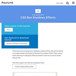
Below is an image created in photoshop of different box shadows effects. These used to be the only way of creating this effect but thanks to CSS3 we can now do all this with just CSS. View Demo page to see what we are going to create CSS Box Shadow Effects Demo CSS Box Shadow We are going to be using the CSS box shadow property which is one my favourite CSS properties which you will see in this tutorial how easy you can use it.
The box-shadow property allows you to easily create multiple drop shadows on box elements by specifying values for colour, size, blur and offset. The box-shadow property accepts 2-6 options, the required options are horizontal offset and vertical offset, the two optional options are spread distance and colour. CSS Media Queries for iPads & iPhones. iPad Media Queries iPad Media Queries (All generations - including iPad mini) Thanks to Apple's work in creating a consistent experience for users, and easy time for developers, all 5 different iPads (iPads 1-5 and iPad mini) can be targeted with just one CSS media query.
The next few lines of code should work perfect for a responsive design. iPad in portrait & landscape.
Better Paragraphs with CSS3 Hyphenation. Hyphenation is usually needed when the width of the page or column is too narrow to accommodate the line.
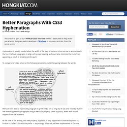
It allows paragraphs to align with proper spacing, and could also minimize the rivers from appearing, a result of breaking words apart. To compare, let’s take a look at the following screenshot, note the spacing between the words. We have been able to hyphenate paragraph in print media for so long but it was only recently that we are able to hyphenate paragraphs using a new CSS3 property called hyphens, albeit with lack of support from the browsers. At the time of the writing, this new property, hyphens, is only supported in Internet Explorer 10, Firefox 6+, Safari 5.1+ with the prefix — surprisingly it has not yet been implemented in Chrome.
View Demo Usage The hyphens property accepts two values auto and manual. This gives us the following result. <p>Lorem ipsum dolor sit amet, consectetur adipisicing elit, sed do eiusmod tempor incididunt ut labore et dolore magna aliqua [...] Bootstrap, from Twitter. Selectivizr - CSS3 pseudo-class and attribute selectors for IE 6-8.
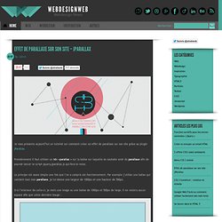
Dashboard - BrowserStack. CSS3 Please! The Cross-Browser CSS3 Rule Generator. Thumbnail Proximity Effect with jQuery and CSS3. Effet de parallaxe sur son site – jParallax. (function(jQuery) { function stripFiletype(ref) { var x=ref.replace('.html', ''); return x.replace('#', ''); function initOrigin(l) { if (l.xorigin=='left') {l.xorigin=0;} else if (l.xorigin=='middle' || l.xorigin=='centre' || l.xorigin=='center') {l.xorigin=0.5;} else if (l.xorigin=='right') {l.xorigin=1;}
Parallax Content Slider with CSS3 and jQuery. A simple parallax content slider with different animations for each slider element and a background parallax effect.
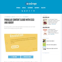
View demo Download source Today we want to share a simple parallax content slider with you. Using CSS animations, we’ll control the animation of each single element in the slider and create a parallax effect by animating the background of the slider itself. The idea for this comes from the slider of the Kendo UI homepage, a framework for modern HTML UI. After we got some requests and questions about how to do something like that, we decided to recreate the effect. How it works The slider contains several slides and each one will have an h2 element, a paragraph, a link and a division with an image: The core of this slider is the animations for each one of the elements. How to create animated tooltips with CSS3. How to create some simple, animated tooltips using CSS transitions and the pseudo-classes :before and :after View demo Download source In today’s tip we’ll show you how to create some simple, animated tooltips using CSS transitions and the pseudo-classes :before and :after.
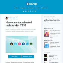
The idea is to have a list with links or in our case, social icons, that reveal a little tooltip on hover. The unordered list will look like this: Fullscreen Background Image Slideshow with CSS3. CSS3 breadcrumbs. A breadcrumb navigation allow users to know where they are in a hierarchical structure and navigate back to higher-level pages in the hierarchy.
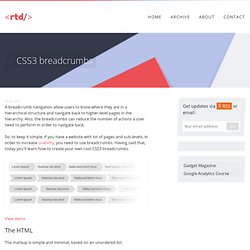
Also, the breadcrumbs can reduce the number of actions a user need to perform in order to navigate back. So, to keep it simple, if you have a website with lot of pages and sub-levels, in order to increase usability, you need to use breadcrumbs. Having said that, today you'll learn how to create your own cool CSS3 breadcrumbs. View demo The HTML Tha markup is simple and minimal, based on an unordered list. Animated Radio Inputs. HTML5 & CSS3 Support, Web Design Tools & Support - FindMeByIP - CSS3 & HTML5 Browser Support.