
An Ultimate Guide To CSS Pseudo-Classes And Pseudo-Elements. Hola a todos!

(Hello, everyone!) In my early days of web design, I had to learn things the hard way: trial and error. There was no Smashing Magazine, Can I Use, CodePen or any of the other amazing tools at our disposal today. Having someone show me the ropes of web design, especially on the CSS front, would have been incredibly helpful. Now that I am far more experienced, I want to share with you in a very friendly, casual, non-dogmatic way a CSS reference guide to pseudo-classes and pseudo-elements.
Better CSS Drop Caps With “initial-letter” Drop caps are a form of decoration sometimes used at the beginning of a block of text; the initial letter running several lines deep and indenting the body text within these lines.

It’s a typographic tradition as old as the history of typesetting itself, and these days we can emulate it with CSS using the ::first-letter pseudo element. Styling that first letter, however, is notoriously clumsy, but the proposed initial-letter property aims to fix that. Stand by me. Inline-block whitespace fixing. Justified and Vertically Centered Header Elements. A little journey into positioning header elements to be centered vertically and justified with the help of pseudo-elements.
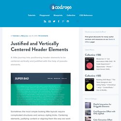
Sometimes the most simple looking little layouts require complicated structures and various styling tricks. Centering elements, justifying content or aligning them the way we want can get really funky and frustrating. One of those little simple things that comes with many pitfall when laying it out is the justified header: title on the left and navigation on the right side. You could use floats, position one of the elements absolutely and more, no big deal. Crafting Better Responsive Image Galleries With Flexbox.
One common issue in responsive design is the “odd man out” problem.

Laying out a series of elements of approximately equal size is easy when there’s enough room: But the moment the browser window narrows, the last element drops off the edge and is left hanging by itself.