
Web Starter Kit — Web Fundamentals. Download Web Starter Kit (beta)
A Scaffolding for CODEKIT...and Cool People. Twitter Bootstrap DropDown on Hover and Activating Click Event on Parent Item » WP Eden. By default bootstrap drop down opens on click and parent item link don’t work anymore as the parent item simply used for triggering drop-download.
But the following js code will help you to open drop down on hover and also will activate the link with parent menu item. <script>jQuery(function($) {$('.navbar .dropdown').hover(function() {$(this).find('.dropdown-menu').first().stop(true, true).delay(250).slideDown();}, function() {$(this).find('.dropdown-menu').first().stop(true, true).delay(100).slideUp();});$('.navbar .dropdown > a').click(function(){location.href = this.href;});});</script>
Twitter Bootstrap DropDown on Hover and Activating Click Event on Parent Item » WP Eden. Gridless - An awesome HTML5 & CSS3 boilerplate for mobile first responsive, cross-browser websites. Golden Ratio Calculator. The Golden Ratio in Web Design. 1.
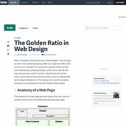
Anatomy of a Web Page The elements of a web page are like organs; they are vital to a properly functioning and aesthetically pleasing web page. These are the main elements of a web page. There are many different ways to organize them but this is perhaps the most common basic layout used online. 2. All web pages use a container and for the same purpose; to contain page elements, however the way it is accomplished varies.
Types of container: Liquid: Expands to fill the width of the browser window.Fixed: A specific width you choose which does not change regardless of browser window size. Less+ Framework. LESS « The Dynamic Stylesheet language. Less is a CSS pre-processor, meaning that it extends the CSS language, adding features that allow variables, mixins, functions and many other techniques that allow you to make CSS that is more maintainable, themable and extendable.
Less runs inside Node, in the browser and inside Rhino. There are also many 3rd party tools that allow you to compile your files and watch for changes. For example: compiles to Less can be used on the command line via npm, downloaded as a script file for the browser or used in a wide variety of third party tools. Installation The easiest way to install Less on the server, is via npm, the node.js package manager, as so: $ npm install -g less Command-line usage Once installed, you can invoke the compiler from the command-line, as such: CSS.
Get the lowdown on the key pieces of Bootstrap's infrastructure, including our approach to better, faster, stronger web development.
HTML5 doctype Bootstrap makes use of certain HTML elements and CSS properties that require the use of the HTML5 doctype. Include it at the beginning of all your projects. Less Framework 4. I called Less Framework "a CSS grid system for designing adaptive websites".
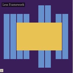
It was basically a fixed-width grid that adapted to a couple of then popular screen widths by shedding some of its columns. It also had matching typographic presets to go with it, built with a modular scale based on the golden ratio. The resources it was originally published with are still available on GitHub. Contrary to how most CSS frameworks work, Less Framework simply provided a set of code comments and visual templates, instead of having predefined classes to control the layout with. Base - Grid Layout. A Basic Grid Example Start by adding a parent element with a class of .clear as this will ensure all the columns are cleared correctly.
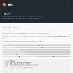
A grid can be centered by adding the .container helper which adds a left and right padding of 10px. The Semantic Grid System. A Responsive HTML CSS LESS SCSS Framework. Setting it up Everything comes more or less preconfigured for usage.
There are a couple of things you'll want to do before getting started though, set up a less compiler and add the htaccess for allowing the IE7 polyfill to work on your server jQuery function to add the Modernizr test for box model support and the function to recalculate the widths for browsers without it. Codekit We can't recommend Codekit enough, it hugely changed our workflow and to be honest Responsable works best with it.
Note: When importing your project into Codekit it will set both the style.less and the style.scss to compile to style.css. Grid. Kube Grid is very simple to start.
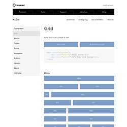
Hello world! It's Kube Grid System <div class="units-row"><div class="unit-50">Hello world</div><div class="unit-50">It's Kube Grid System</div></div> Units How it works First, create a row that will contain blocks. Now add your desired number of blocks with appropriate sizes. An example of multiple rows.
By default, each row has bottom margin of 1.618em, and if you don’t need this margin, do the following: You can set any padding to the blocks using styles. Grid LESS. What the hell is it?
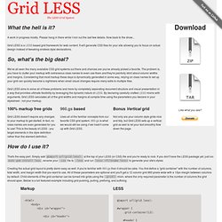
A work in progress mostly. Please hang in there while I iron out the last few details. Now back to the show... Grid LESS is a LESS based grid framework for web content. It will generate CSS files for your site allowing you to focus on actual design instead of tweaking endless style declarations. So, what's the big deal? We've all seen the many available CSS grid systems out there and chances are you've already picked a favorite. Grid LESS aims to solve all of these problems and more by completely separating document structure and visual presentation in a way that provides ultimate flexibility by leveraging the dynamic nature of LESS. 20 Exceptional CSS Boilerplates and Frameworks. CSS frameworks have been the foundations of web projects for many years. However, in the age of responsive design, a framework has even more benefits.
A well-built CSS framework or boilerplate can streamline the design process, save huge chunks of development time and ensure your website scales properly on all devices. With so many choices available, though, it can be difficult to choose a framework to build on. It's important to consider the following when making a decision: whether you require a grid, and if so, will it be fluid or fixed? What level of customization do you require? This post details 20 CSS boilerplates, frameworks and systems to help you make that decision.