
A Collection of 23 Amazing and Free Fonts from Behance. I wanted to welcome the New Year by bringing about a collection of amazing fonts from fellow designers.
Examples of Web Designs Featuring Big Website Menus. Navigation is a highly complex concept and of course, an integral component of every web project.
Being some kind of a gateway into main sections, basically it is a list of links that is responsible for a comfortable and handy existence of your users on a website. It is able to pleasantly display the whole structure and information hierarchy without providing even tiny opportunity to get lost. Well-thought-out navigation is a first successful step to attracting and forcing to stay as many visitors as possible, so a great deal of developers starts their projects exactly with analyzing and building a decent navigation system. In this article, we are going to talk about visual representation of navigation, it can be a simple lined up array of titles, huge drop-down menu, juicy icon menu, picturesque graphical menu, professional photo-based menu, and even plain circles, which quite often are used in parallax-based websites.
Useful Typography Tutorials to Enhance your Skills. Typography is one of the most important elements of a design, if not the most important.
Content can be put in focus by many elements or design laws, but if it is not readable, there is no way users will engage in reading it. In our era filled with distractions only one click away, users need to make an effort to stay focused on reading something, especially if it’s a long set of paragraphs. And while the content is actually the most important, the way it’s laid out comes right after. You can have the most interesting copy text in the world. The Year on Designmodo: Best Articles, Freebies and Products. In 2013, several important web design and development techniques emerged. Here at Designmodo, we work to publish only the best articles and resources, and we’ve decided to prepare a list of the top articles and resources for 2013 on Designmodo. Of course, many topics remained uncovered, and we hope to guide design in right direction in the coming year. In 2013, 17,800,000 people visited our website and we are sure that we helped many designers and developers along the way.
We’ve gathered the best articles, freebies and products that became most popular in terms of views and shares in the social media. Best articles for 2013. Time-Saving Tools and Resources for Freelance Designers. As freelance designers, we rely on many tools and resources to assist in our day to day activities and to plain and simply put – make life easier.
From the software we use to the various sites that allow us to host portfolios, there’s something for every freelance designer to utilize to save time. Index. In the previous article I used an example developed by Carl Dair to illustrate the concept of "legibility".
In this article, I introduce you to one of the towering typographic minds of the mid 20'th Century and show you how his "Seven Principals of Typographic Contrast" apply to web design. The thing about this is, these principals were proposed before the word "internet" was invented. Focus On Typography, Part 1: Contrast. There’s a lot more to typography that just picking a font.
It is the ability to choose an arrangement of type that is legible and attractive. In this series, I’m taking a look at four fundamentals that can help you maximize the readability and improve the look of your website. They are; ContrastHierarchySpaceSize Today, let’s look at contrast. When we talk about contrast in typography, it can mean several things. • The contrast between large and small type. • The contrast between different typefaces, for example a script font used for a heading and a sans-serif font used for body copy. • The contrast between the font colour and the background it appears on.
A Guide to Web Typography. The Basics: contrast, size, hierarchy, space. The Basics Typography for the Web has come a long way since Tim Berners-Lee flipped the switch in 1991.
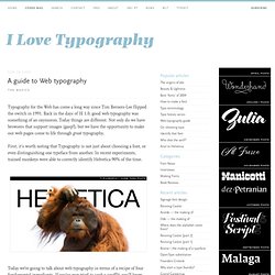
Back in the days of IE 1.0, good web typography was something of an oxymoron. Today things are different. Not only do we have browsers that support images (gasp!) , but we have the opportunity to make our web pages come to life through great typography. First, it’s worth noting that Typography is not just about choosing a font, or even distinguishing one typeface from another. 14 Top Free Serif Fonts with Multiple Weights. By Douglas Bonneville on April 15, 2013 If you have a growing collection of usable free sans-serif fonts, you are going to have to have some free serif fonts to go with them!
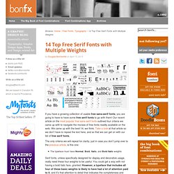
Our recent article on the most popular free sans-serif fonts outlined four criteria we came up with to navigate the morass of free fonts readily available on the web. 19 top fonts in 19 top combinations. Sign up and download immediately to take your typography to the next level!
This classic contains some great stuff: An exceptional glossary of typography terms Killer tips on establishing typographic color Choosing and using the right typefaces 20 Action-packed info-dense pages! Typographic Contrast and Flow. As you have probably know, most online readers don't read line by line, instead they scan (from one point to another).
For this reason, designers create typographic contrast and flow by emphasizing certain text. Contrast is important because not all the content within a page have the same value, some have greater significance than the others. By creating contrast, you can direct the reader's attention to the important messages and at the same time enhance the visual appearance. Here are seven basic methods on how you can create typographic contrast. 1. Larger font size indicate higher priority because it draws reader's attention, therefore this method is commonly applied on headings. On the other hand, you can de-emphasize by using smaller font size. 29 principles for making great font combinations. By Douglas Bonneville on August 11, 2010 When it comes to making font combinations, there are principles and methods, but no absolutes.
Interview with Designer: Justin Mezzell. I have taken the liberty of asking the awesome Justin Mezzell for an interview to get inside his creative head. Using Space to Create a Simple and Effective Design. Sometimes the most effective design technique involves nothing at all. And it is quite intentional. Space can be one of the greatest tools in your design kit. It can make text easier to read, bring focus to certain parts of the design and help create an overall mood or feel.
Startup Design Framework - Website Builder. Using Square Blocks in Web Design. There are so many different things that come to mind when you take a look at the examples below in terms of how or why they use square – or rectangular – elements. To just list a few some are utilized for alignment, organization, decoration or juxtaposition between circular and boxed elements on the page.
Pantone Color of the Year 2014 - Radiant Orchid: Perfect Accent Color. In the daily world we live in, and especially so in design, color influences us greatly. When it comes to design, color is a very meticulous thing that can make or break your whole design if you choose the wrong hues. This year Pantone has selected Radiant Orchid 18-3224 as the 2014 color of the year. Holiday Themed Websites: How to Avoid Cliche Design. Misalignment and Asymmetry in Web Design. Collection of Useful and Free Photoshop Scripts. The Pros and Cons of Responsive Web Design vs. Mobile Website vs. Native App. Less Text more Multimedia - New Approach in Website Design. Coming and Going Web Design Trends for 2014. 10 Tips for Designing with Type on a Photo.
Scroll Activated Animations - New Trend in Web Design. Sanctum Sanctorum: Website Designs Featuring Workspaces. Showcasing a workflow in website design has begun with creative agencies that tried to make their online portfolios look ingenious and unique through supplying them with extra process sections that break the monotony of regular text-style pages with its fantastic and creative solutions.
This trend has smoothly flowed into the other one – incorporating an image or video background, which depicts workspace or distinct stages of working process into a website. Infinite Scrolling: Is It Good or Bad for Your Website? The Art of Mixing Fonts in Web Design.