
US Federal Contract Spending Data Visualization. This is our original work A sans-circle version An additional iteration that helps address the overlap and transparency between the connections and labels.
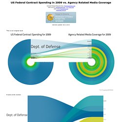
What our government spends vs. how much we talk about it. Two important aspects that help define and shape our society. Most Americans know that our government spends an insane amount of our tax dollars on defense, but how do you show just how much we spend compared to all other areas in our country? For the right visualization, we used the New York Times API to parse through all articles written in 2009.
You can find detailed federal spending data on this page and the results of the NYT API call we made. Gulf Oil Spill amazing animated info-graphic. Vegetables Pictures - Free Images of Vegetables. Marketing Circle Icons Stock Illustration 24449261. What's to love about food co-ops? Vector Map of Belize - Single Color. Map of Belize - Single Color is a fully layered, editable vector map file.
All maps come in AI, EPS, PDF, PNG and JPG file formats. Creative Commons Attribution License: Please provide the following note and link on your website or design: "Map of Belize - Single Color by FreeVectorMaps.com" Learn more. File:Belize Export Treemap.jpg. Trade and Transport. Humans have been creative in coming up with ways to trade and transport food. © AMNH/D.
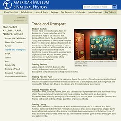
Finnin Modern Markets. Hungry Planet: What The World Eats. Grocery store geography. I've been poking around grocery store locations, courtesy of AggData, the past few days.
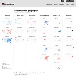
There's a grocery store just about everywhere you go in the United States, because, well, we gotta eat. They look similar in that they sell produce on one side, meat in the back, and snacks and soda on the side opposite the produce. New Food System Diagram. [Infographic of the Week] How to Create 189k Jobs & Increase Healthy Food Sales by $9.5B. USDA dietary guidelines recommend that 50 percent of our daily food intake should be fruits and vegetables.
![[Infographic of the Week] How to Create 189k Jobs & Increase Healthy Food Sales by $9.5B](http://cdn.pearltrees.com/s/pic/th/infographic-increase-healthy-51467352)
The growing obesity epidemic in the U.S. and it’s impact on the economy and public health, underscores the importance of these recommendations. But there is clearly a disconnect between the guidelines and the mere 2 percent of U.S. farmland actually growing such foods, according to a new report from the Union of Concerned Scientists. The report, Ensuring the Harvest: Crop Insurance and Credit for a Healthy Farm and Food Future, outlines the obstacles for farmers that want to plant fruits and vegetables, and policy changes to remove the.
A summary of their recommendations is available here. The infographic below, “Plant the Plate,” illustrates how American farmers could produce enough fruits and vegetables to meet growing demand, create jobs and support their local economies. Food 40 Ways. Some people keep a food journal because, according to nutrition experts, it's one of the simplest and most effective ways to lose weight.
But for New York-based designer Lauren Manning, the "food" part of the food log was borderline irrelevant. What Lauren wanted to get at, in tracking 730 days' worth of chicken, french fries, and falafel, was a single, robust data set that she could use to explore multiple visualizing possibilities. Hellmann's short film (Eat Real. Eat Local) True Food Kitchen Ads on Behance. aitc.ca/bc/uploads/resources/Grow%20BC%20Map%20Colour.pdf. NCGA - Craig Nordeen Illustration + design. Linda Nakanishi's Awesome Portfolio » Food Banks Canada Annual. I was delighted to work with the non-profit organization Food Banks Canada to create chart graphics for their 2011 Annual Hunger Count Report.
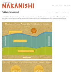
This reports highlights the key points related to food bank usage for the past year, and helps to spell out the story that more needs to be done to address the issue of under funding and hunger amongst Canadians. View More Information. Visualizing the World's Food Consumption. This website requires JavaScript to function correctly.
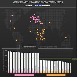
Please ensure that it's turned on. Thanks! Hey there! Looks like you're using Internet Explorer 6. Unfortunately this browser is no longer supported as it is now about ten years old. Calories (daily average consumed per person) Average percentage of income spent on food 100% 75 50 25 0 United States of America 1 Austria 2 Greece 3 Belgium 4 Luxembourg 5 Italy 6 Malta 7 Portugal 8 France 9 Israel 10 Germany 11 Canada 12 Ireland 13 Romania 14 Turkey 15 Norway 16 Hungary 17 United Kingdom 18 Lithuania 19 Switzerland 20 Palestinian Territories 21 Tajikistan 22 Sierra Leone 23 Bolivia 24 Mozambique 25 Kenya 26 Rwanda 27 Chad 28 Yemen 29 United Republic of Tanzania 30 Timor-Leste 31 Central African Republic 32 Angola 33 Ethiopia 34 Zambia 35 Comoros 36 Haiti 37 Burundi 38 Eritrea 39 Dem. 20 Highest Consuming Countries 20 Lowest Consuming Countries.
The Hidden Water We Use. ShiftN-Global-Food-System-Maps-2.jpeg 4,670×3,224 pixels. Changing the Global Food Narrative. www.policyalternatives.ca/sites/default/files/uploads/publications/BC%20Office/2010/11/ccpa_bc_every_bite_counts_full.pdf. Unusual Art by Kevin Van Aelst (37 pics) Pics | 2 Apr, 2010 | Views: 9000 |

Layouts. Photographs.