

Create Infographics. Swimming in Data? Three Benefits of Visualization - John Sviokla. By John Sviokla | 4:11 PM December 4, 2009 “A good sketch is better than a long speech…” — a quote often attributed to Napoleon Bonaparte The ability to visualize the implications of data is as old as humanity itself.
Yet due to the vast quantities, sources, and sinks of data being pumped around our global economy at an ever increasing rate, the need for superior visualization is great and growing. To give dimension to the size of the challenge, the EMC reports that the “digital universe” added 487 exabytes — or 487 billion gigabytes — in 2008. They project that in 2012, we will add five times as much digital information as we did last year. I believe that we will naturally migrate toward superior visualizations to cope with this information ocean.
About ten years ago, I vividly remember visiting the Cabinet War Rooms in the basement of Whitehall, where Churchill had his war room during WW II. What is Web 2.0? Ideas, technologies and implications for education (TechWatch report) Within 15 years the Web has grown from a group work tool for scientists at CERN into a global information space with more than a billion users.

Currently, it is both returning to its roots as a read/write tool and also entering a new, more social and participatory phase. These trends have led to a feeling that the Web is entering a ‘second phase’—a new, ‘improved’ Web version 2.0. But how justified is this perception? Executive summary This TechWatch report was commissioned to investigate the substance behind the hyperbole surrounding ‘Web 2.0’ and to report on the implications this may have for the UK Higher and Further Education sector, with a special focus on collection and preservation activities within libraries. A Periodic Table of Visualization Methods.
SWF Charts > Introduction. XML/SWF Charts is a simple, yet powerful tool to create attractive charts and graphs from XML data.
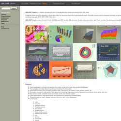
Create an XML source to describe a chart, then pass it to this tool's flash file to generate the chart. The XML source can be prepared manually, or generated dynamically using any scripting language (PHP, ASP, CFML, Perl, etc.) XML/SWF Charts makes the best of both the XML and SWF worlds. XML provides flexible data generation, and Flash provides the best graphic quality. Features: Map Reduce. Visualization. 20+ Tools to Create Your Own Infographics. A picture is worth a thousand words – based on this, infographics would carry hundreds of thousands of words, yet if you let a reader choose between a full-length 1000-word article and an infographic that needs a few scroll-downs, they’d probably prefer absorbing information straight from the infographic.
What’s not to like? Colored charts and illustrations deliver connections better than tables and figures and as users spend time looking back and forth the full infographic, they stay on the site longer. Plus, readers who like what they see are more likely to share visual guides more than articles. While not everyone can make infographics from scratch, there are tools available on the Web that will help you create your very own infographics.
In this article, we’re listing more than 20 such options to help you get your messages across to your readers, visually. Read Also: The Infographic Revolution: Where Do We Go From Here? Visual Analytics. Big Data Means More Than Big Profits - Jim Fruchterman. By Jim Fruchterman | 8:00 AM March 19, 2013 Big Data is all the rage in Silicon Valley.

From Facebook to Netflix, companies are tracking and analyzing our searches, our purchases, and just about every other online activity that will give them more insight into who we are and what we want. And though they use the massive sets of data they collect to help create a better experience for their consumers (such as customized ads or tailored movie recommendations), their primary goal is to use what they learn to maximize profits. But can Big Data also create positive social change? Many activities in the social sphere also generate lots of information. Swimming in Data? Three Benefits of Visualization - John Sviokla. Create An Infographic With Your Daily Facebook Activity. Radio Lingua Network: Language-learning where and when it suits you.
Azendoo. Create Infographics. Envisioning Information. InfoGraphic Designs: Overview, Examples and Best Practices. Information graphics or infographics are visual representations of information, data or knowledge.
These graphics are used where complex information needs to be explained quickly and clearly, such as in signs, maps, journalism, technical writing, and education. They are also used extensively as tools by computer scientists, mathematicians, and statisticians to ease the process of developing and communicating conceptual information. They can present a rich amount of information without intimidating you. Or sometimes they intimidate you, but make the digesting of the information much more bearable. Here in this article below, we are going to discuss best practices for designing infographics followed by some examples which might help you learn a thing or two. You may be interested in the following related articles as well.
Feel free to join us and you are always welcome to share your thoughts that our readers may find helpful. Don’t forget to and follow us on Twitter — for recent updates. 01. Online Diagram Software and Flowchart Software - Gliffy. Many Eyes.
Zeen. List of Tweetchats By Day of Week. From Gnosis Media Group Looking for a tweetchat?

Below is a list of tweetchats in both alphabetical order and by day. Thank you to @merylkevans for the inspiration to build this Twitter chat wiki. A detailed list appears after the list sorted by the day of the week. Tweetchats - or Twitter chats as they are sometimes called - are virtual meetings or gatherings held on Twitter. Text GNOSISARTS to 368266to get tweetchat info by text message! Note: All times listed in Central Standard Time with a couple of noted exceptions. Blogs, Articles and Videos from the World's Top Thinkers and Leaders. Create and share visual ideas online. Exploratree - Exploratree by FutureLab. Cacoo - Create diagrams online Real time collaboration.
Many Eyes. Interactive maps and visualizations. Public Data Explorer. E-Learning Authoring Tools and e-Learning Software - Composica. E-Learning. Information Is Beautiful. Comic Books/Super Heroes/Super Villians. InfoGraphic Designs: Overview, Examples and Best Practices. Public Data Explorer. TED Education Talks. Online Diagram Software and Flowchart Software - Gliffy. Data Visualization, Infographics, and Statistics.
MOOCs. Graphing tools. Data. Data visualisation. Visual Explanations: Quantities, Evidence. Piktochart. Information Is Beautiful. Data Visualization Review: Gephi, Free Graph Exploration Software. I do not often get to play with networks, yet I find them fascinating and full of knowledge gathering potential.
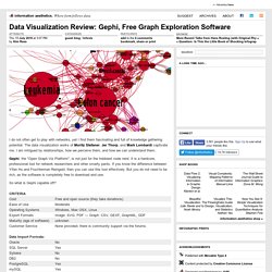
The data visualization works of Moritz Stefaner, Jer Thorp, and Mark Lombardi captivate me. I am intrigued by relationships, how we perceive them, and how we can understand them. Gephi, the "Open Graph Viz Platform", is not just for the hobbiest node nerd. It is a hardcore, professional tool for network researchers and other smarty pants.
If you know the difference between Yifan Hu and Fruchterman Reingold, then you can use this tool effectively. So what is Gephi capable off? Gephi interface displaying airline traffic data. Pros — Options! Cons — Interface is a bit cluttered. Main interface displaying the Diseasome data. Review Overall, Gephi is a useful and interesting tool. There are some plugins available for Gephi that extend the functionality. The only thing keeping Gephi from being a professional grade tool is its bugginess and lack of documentation. Easel.ly. Gapminder: Unveiling the beauty of statistics for a fact based world view. Data Visualization, Infographics, and Statistics. Create and share visual ideas online. If you have to use circles…
Stats Chat is an interesting kiwi site—managed by the Department of Statistics of the University of Auckland—that centers around the use and presentation of statistics in the media.

This week there was an interesting discussion on one of those infographics that make you cringe: I understand the newspaper’s need to grab our attention, as well as the designer’s esthetical considerations, but they have to follow avoiding misleading the reader and providing at least a ball-park idea of the importance of whatever issue is under discussion. Clearly, as pointed out in the discussion, a line chart would convey the message with a minimum of ink; however, the designer may still want to use circles, and here we could go back to a faceted version of the always maligned pie chart. Faceted pie charts using ggplot2 The code reads the data, reshapes it and plots it using pretty much the explanation for pie charts in the ggplot2 documentation.
Eletter/Caffea-Review-Bergner.pdf. Infographics & Data Visualization. Color Scheme Designer 3. Information Is Beautiful. Pictures of Numbers. Data Visualizations, Challenges, Community. Many Eyes. 10_Ways_to_Enhance_Communication_and_Collaboration_in_Education_en.pdf.
Communication & Collaboration. Information Is Beautiful. True Colors: What Brand Colors Say About A Business. Studies have shown that a product’s color influences 60-80 percent of a customer’s purchasing decision, which makes choosing the wrong color a death sentence before your brand ever has a chance to get off the ground.
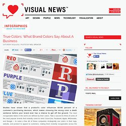
The most recognizable labels in the world are defined by their colors. Take a second to think of some of the most popular brands that instantly come to mind: Coca-Cola, Facebook, Apple, McDonalds, and Google – to name a few. All of these companies strategically use colors in their logo, website, and product to appeal to customers, making them instantly recognizable across the globe. Information Is Beautiful. Public Data Explorer. Qualtrics. Data Visualization Review: Gephi, Free Graph Exploration Software.
Infographics. Pictures of Numbers. Information Is Beautiful. Color Scheme Designer 3. Azendoo. Create and share visual ideas online. Datavisualization.ch Selected Tools. Public Data Explorer.
Indicateurs de développement humain Rapport sur le développement humain 2013, Programme des Nations Unies pour le développement Les données utilisées pour calculer l'Indice de développement humain (IDH) et autres indices composites présentés dans le Rapport sur le développement humain ...
Eurostat, Indicateurs démographiques. Communication & Collaboration. True Colors: What Brand Colors Say About A Business. Create and share visual ideas online. 10 Fun Tools To Easily Make Your Own Infographics. People love to learn by examining visual representations of data. That’s been proven time and time again by the popularity of both infographics and Pinterest. So what if you could make your own infographics ? What would you make it of? It’s actually easier than you think… even if you have zero design skills whatsoever. Below are my two favorite infographic-making web 2.0 tools that I highly recommend. Click the name of each tool to learn more!
Visual.ly One of the more popular ways to discover infographics, Visual.ly actually just launched a design overhaul of their website. Dipity. Data Visualization, Infographics, and Statistics. Exobrain. Visualization. Data Visualizations, Challenges, Community. Infographics Lesson Plans. 10 Fun Tools To Easily Make Your Own Infographics. Citation Machine. Information Is Beautiful. Pictures of Numbers.