
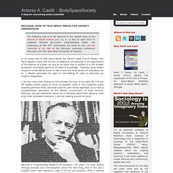
Michelangelo_menu_fish_bread_wine_1518.jpg 785×1.116 píxels. How to talk about media you haven’t understood. The following text is to be featured in the special issue of the Journal of Visual Culture (vol. 13, n. 1) due on April 2014 to celebrate Marshall McLuhan’s Understanding Media: The Extensions of Man 50th anniversary.
For more on this, see the transcript of my talk at the McLuhan centenary conference McLuhan 100 Then Now Next (University of Toronto). In his essay How to Talk About Books You Haven’t Read, French literary critic Pierre Bayard insists that the act of reading is not essential to the appreciation of the essence of a book—as long as we know how to position it in the broader ecosystem of a literary genre or of a field of knowledge.
Following Oscar Wilde’s tongue-in-cheek advice never to read a text one must review (‘it prejudices you so…’), Bayard advocates the right to non-reading, in order to stimulate our creative imagination. I, for one, have been sticking to this principle for most of my adult life. McLuhan’s Understanding Media is no exception. Damien kempf. What Did Medieval Kings Really Look Like? The first 10 folios of Royal MS 20 A II (the newest upload to our Digitised Manuscripts site) are a portable portrait gallery of the kings of England in chronological order. Each king is depicted in a tinted drawing, surrounded by symbols or events from his reign.
The images of later kings are followed by genealogical tables or Latin verses about the monarch in question. Here are some examples of the ways that artists in the 14th century portrayed their rulers. The question is - can the images tell us anything at all about how these kings really looked? Edward the Confessor is shown in the manuscript as tall, upright, and elegantly dressed, posing with a sceptre and a book, looking pensively into the distance.
Detail of a miniature of Edward the Confessor, England, c. 1307 - c. 1327, Royal MS 20 A II, f. 5r In his portrait, Richard I (or Richard the Lion Heart), though seated on his throne, appears ready to leap into action and his garments seem rather ill-fitting.
¿Es el mundo tal y como sale en los mapas? El espejismo de Mercator. Todos hemos tenido un mapa en nuestra casa en algún momento de nuestra vida.
Ya sea bien por el famoso atlas que la mayoría de nosotros hemos tenido o consultado por los deberes del colegio, o bien por las esferas retroiluminadas con el globo terráqueo que iluminaban nuestras mesitas de noche, o bien por esos inmensos mapas que cubrían alguna pared de nuestro hogar. Pues bien, la verdad es que ninguno de esos mapas representa el mundo tal y como es en realidad. ¿Por qué? Básicamente por una cuestión de dimensiones espaciales. Nuestra tierra es esférica (3 dimensiones) y nuestros mapas planos (2 dimensiones). ¿Qué es una proyección cartográfica? La proyección de Mercator A lo largo de nuestra vida habremos visto cientos de mapas, tanto en papel como digitales. La proyección de Mercator trata a la Tierra como un globo hinchable que se introduce en un cilindro y que empieza a inflarse ocupando el volumen del cilindro, imprimiendo el mapa en su cara exterior.
Los niños de la generación touch. Cromo » Destacadas / Tecnología Noelia González / @NoeliaGMo - 20/04/2013 Actualmente, los pequeños empiezan a usar dispositivos móviles antes de caminar y hasta mejor que muchos adultos.
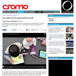
Pero, ¿qué efectos tendrá esta tecnología en su desarrollo? YouTube Direkt La lógica es simple: arrastrar el dedo por la pantalla para mover los objetos que aparecen en ella hacia arriba, abajo, a los costados. En apariencia, la escena no tiene nada fuera de lo ordinario. La respuesta no está escrita aún, aunque la pregunta esté haciendo efervescencia en las cabezas de científicos, tecnólogos, educadores y padres.
Video Channel Chromeless w/ quality selector. YouTube. Seven dirty secrets of data visualisation. Dear Photograph. No, they¿re not photographs: Astonishing acrylic paintings which are so detailed they look like they were taken on a camera. By Damien Gayle Published: 11:28 GMT, 9 June 2012 | Updated: 14:56 GMT, 9 June 2012 With their spectacular use of focus and reflected light, these incredible artworks look like carefully composed still-life photographs.
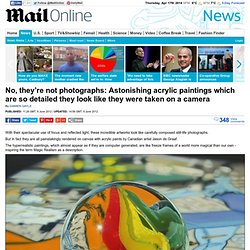
But in fact they are all painstakingly rendered on canvas with acrylic paints by Canadian artist Jason de Graaf. The hyperrealistic paintings, which almost appear as if they are computer generated, are like freeze frames of a world more magical than our own - inspiring the term Magic Realism as a description. The X-Statix: Acrylic on canvas 30in x 24in Untitled (Self-portrait): Acrylic on canvas 30in x 30in.