
CSS Grid Layout Terminology, Explained. In the CSS Grid Layout Specification, a grid is defined as the following - The grid is an intersecting set of horizontal and vertical grid lines that divides the grid container’s space into grid areas, into which grid items (representing the grid container’s content) can be placed Err… what?
Tutorials about layout. 50 Free Wireframe Templates for Mobile, Web and UX Design. In the initial stages of a project, when ideas aren’t quite fully formed, it’s good practice to wireframe the layout of your mobile app or web project by stripping away all design elements and flourishes to help define and better communicate the information hierarchy of the layout and plan for functionality and user flow.
Whether you create them using a whiteboard, pencil and paper, web-based tools, or using a graphic application, effective wireframing and planning play a critical role in the success of your product. While most wireframing tools are readily and freely available (pen, paper, markers…), you may have to pay to use some web-based tools, and if you know where to look, you can also grab some free, templates for graphic applications like Photoshop, Illustrator or Sketch. Lucky for you know where to look, as you have landed on this page! Material Design Wireframe Kits Material Design Wireframe Kit (Sketch). Material Design Mobile Wireframe Templates (PSD). iOS Wireframe Kits.
CSS Grid Layout. CSS Grid layout excels at dividing a page into major regions, or defining the relationship in terms of size, position, and layer, between parts of a control built from HTML primitives.
Like tables, grid layout enables an author to align elements into columns and rows. However, many more layouts are either possible or easier with CSS grid than they were with tables. For example, a grid container's child elements could position themselves so they actually overlap and layer, similar to CSS positioned elements. Basic example The below example shows a three column track grid with new rows created at a minimum of 100 pixels and a maximum of auto.
<div class="wrapper"><div class="one">One</div><div class="two">Two</div><div class="three">Three</div><div class="four">Four</div><div class="five">Five</div><div class="six">Six</div></div> Reference. CodePen - Responsive Periodic Table with CSS Grids.
Templates. How To Use CSS3 Media Queries To Create a Mobile Version of Your Website. Advertisement Many companies try to create a great experience for customers.
But few are willing to make the changes required to deliver on that promise. In fact most don’t even realize just how bad their experience can be. This is why we made a new book called “User Experience Revolution,” a practical battle plan for placing the user at the heart of your company. Get the book now! CSS3 continues to both excite and frustrate web designers and developers. Further Reading on SmashingMag: Link In this article I’ll explain how, with a few CSS rules, you can create an iPhone version of your site using CSS3, that will work now. If you have ever created a print stylesheet for a website then you will be familiar with the idea of creating a specific stylesheet to come into play under certain conditions – in the case of a print stylesheet when the page is printed.
The Media Queries5 in CSS3 take this idea and extend it. The dConstruct 2010 website in Safari on a desktop computer Tidying up Link. CSS Positioning 101. If you’re a front end developer or a designer who likes to code, CSS-based layouts are at the very core of your work.
In what might be a refresher for some, or even an “a-ha!” For others, let’s look at the CSS position property to see how we can use it to create standards-compliant, table-free CSS layouts. Article Continues Below CSS positioning is often misunderstood. CSS Floats 101. The float property is a valuable and powerful asset to any web designer/developer working with HTML and CSS.
Tragically, it can also cause frustration and confusion if you don’t fully understand how it works. Article Continues Below Also, in the past, it’s been linked to some pretty nasty browser bugs so it’s normal to get nervous about using the float property in your CSS rule sets. Let’s calm those nerves and ease that frustration. I’ll show you exactly what the float property does to your elements and how incredibly useful it can be once you master it. We see floats in the print world every time we pick up a magazine article with an image on the left or right with text flowing nicely around it.
The definition#section1 Let’s start with the definition of a float. A float is a box that is shifted to the left or right on the current line. The float property has four values that we can apply to it: left, right, inherit, and none. How floats behave#section2. Fluid Images. Things are looking good so far: we’ve got a grid-based layout, one that doesn’t sacrifice complexity for flexibility.
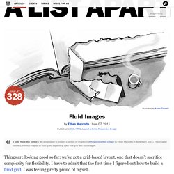
I have to admit that the first time I figured out how to build a fluid grid, I was feeling pretty proud of myself. Article Continues Below But then, as often happens with web design, despair set in. Currently, our page is awash in words, and little else. Actually, nothing else: our page is nothing but text. So what happens when we introduce fixed-width images into our flexible design? Fig 3.0: Our flexible grid is finally finished. not a pixel value in sight, and we didn’t have to skimp on the aesthetics.
Going back, back to markup, markup#section1. Content-out Layout.