
Imperiia: Mapping the Russian Empire. Beautiful Spaces. Digital Giza. Master of Science in Digital Humanities – EPFL. Doctorado Online en Humanidades. Wikidata. Vilnatroupe. Kindred Britain. Gephi - The Open Graph Viz Platform. Cytoscape: An Open Source Platform for Complex Network Analysis and Visualization. Full-text data from English-Corpora.org (COCA, COHA, GloWbE, NOW, Wikipedia, Spanish.
TEI: Text Encoding Initiative. Mirador Viewer. Sistema de información geográfica. Homepage. Real Time Data - Decoding European Creative Skills. DECS. Creative Decoding Tool. Jamaican Slave Revolt. Digital Tool Builder Tutorial. Natural Earth. Spatial Data Repository - Welcome. Home. Microsoft Access Database Software & Apps.
China Biographical Database Project (CBDB) Social network analysis (SNA) provides an alternative to the factor-based approach in L.

Stone's discussion of prosopography. Charles Wetherell writes: “Conceptualizing community as collections of personal relationships … provides historians with a blueprint for evaluating when, how and why people in the past used kin and non-kin in the course of their lives. The findings of social network analysts that people need and seek emotional and economic support of different kinds, from different kinds of people, suggest new analytical imperatives. It is not enough now to look solely at how people used kin in times of crisis. Rather, historians need to pursue how people in the past used the kin and friends they had, for different things, throughout the life course, and in the context of the opportunities they enjoyed and the constraints they faced courtesy of demography and culture.
Openrefine.github.com. Análisis y visualización de datos del sistema red #15m. Aquí, de omnibus dubitandum. 14 Ejemplos De Las Mejores Visualizaciones De Datos. El siguiente artículo es una traducción del blog data-visualization.org.
Gracias a su propietario por concederme el permiso de traducción. He traducido únicamente las 14 de las 20 visualizaciones que más me han gustado. La visualización de datos no solo tiene como propósito el análisis de dichos datos, a menudo combina elementos estéticos. A continuación se muestran 14 ejemplos de las mejores visualizaciones de datos encontrados en internet. 1.
+100 herramientas para el análisis de redes sociales #sna #ars. El Análisis de Redes Sociales (ARS) o Social Network Analysis (SNA) es una técnica clave en muchos campos como la sociología, la biología, comunicación, política… Permite analizar relaciones entre elementos para determinar la importancia de los actores, cómo se han agrupado en subcomunidades, el flujo de la información, qué es clave en la transmisión de la información… Ya hace unos años que la vengo utilizando de manera habitual.
Algunos programas de cabecera durante este tiempo han sido Gephi, NodeXL y de manera más esporádica, aunque no menos importante, R Project y algún que otro script en Python. Poco a poco he ido recopilando recursos para el análisis de redes. Center for Spatial Research. On the eve of an historic and controversial peace agreement in Colombia we have launched an investigation into the spatial characteristics of the decades long conflict between multiple state and non-state actors in the country.
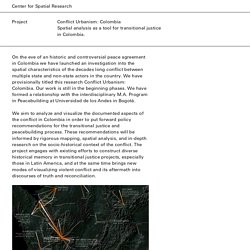
We have provisionally titled this research Conflict Urbanism: Colombia. Our work is still in the beginning phases. We have formed a relationship with the interdisciplinary M.A. Program in Peacebuilding at Universidad de los Andes in Bogotá. We aim to analyze and visualize the documented aspects of the conflict in Colombia in order to put forward policy recommendations for the transitional justice and peacebuilding process. 9 Beautiful Maps That You Would Like To See. Maps show us direction and beauty definitely add values to them.
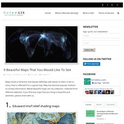
It tell us story, that is reflected if it is a good map. Map has become popular medium to convey information. Below beautiful maps are my collection, collected from different websites. If you find any maps that you thing is beautiful and aesthetic, please share with us. 1. D3.js - Data-Driven Documents. WTF Visualizations. Data & Visualisation. Over 100 Incredible Infographic Tools and Resources (Categorized) This post is #6 in DailyTekk’s famous Top 100 series which explores the best startups, gadgets, apps, websites and services in a given category.

Total items listed: 112. Time to compile: 8+ hours. Datavisualization.ch Selected Tools. Basics of Mapping for the Digital Humanities – IDRE Sandbox. To start, navigate to this page via the URL below: “What is a map?
What is in a map? How do you map?” In the Humanities, mapping can be defined in so many different ways, there is no easy answer to these questions. In fact, your research can dictate the parameter of choices that define your map. “Everything is related to everything else, but near things are more related than distant things.” Waldo Tobler’s statement defines his first law of geography, in ways stating the obvious correlation between objects in space, paving the foundation behind spatial dependencies.
As mentioned at the top of the syllabus for this course, space and time are dimensions that are forever intertwined due to their ontological nature. Bourgogne Franche-Comté schéma complet. Tabeau Public. A Guide to Digital Humanities. Voyant Tools: Reveal Your Texts. Tagxedo - Word Cloud with Styles. Digital Humanities Pedagogy: Practices, Principles and Politics. 4.
Digital Humanities and the First-Year Writing Course Olin Bjork Stanley Fish’s contention, in Save the World on Your Own Time, that “composition courses should teach grammar and rhetoric and nothing else” because “content is always the enemy of writing instruction” was provocation enough for a 2009 Modern Language Association (MLA) convention session on the relation between composition and the humanities.1 The first two panelists, John Schilb and Arabella Lyon, argued that, pace Fish, composition courses should not focus on writing itself, but rather on humanistic topics like political theory or philosophy.2 They agreed with Fish, however, that a first-year writing course—required at most American colleges and universities for students who do not “place out” through certain standardized tests—afforded little or no time to teach students to analyze the objects of digital culture, much less to use new media technologies.
Humanities Computing for Computers and Writing Figure 1. Figure 2.