
12 Website Design Decisions Your Business or Organization Will Need to Make. You may be on your first website.

But more likely you’re faced with redesigning a website that isn’t functioning as well as it should. I see 12 vital decisions involved with developing a website, and I want to explain them with you in mind: You’re the owner or marketing director of a small business and know that getting your website to pull its share of the load is vital for success. But your budget is severely limited! You’ve just been assigned the task of redoing your company’s website. I want to help. Since then I’ve built and assisted with dozens of online stores and hundreds of websites for all kinds of businesses and organizations, from mom and pops to major corporations and international organizations. There are twelve critical places in building a website where you must make the right decision, or you’ll have to repeat this task again and again until you get it right.
Okay, let’s roll up our sleeves and get started. 1. Dear friends, recognize your own needs — they’re legitimate. Guide to Website Navigation Design Patterns. In web design, there are certain common design patterns that are used for interaction.
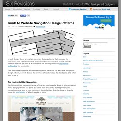
Site navigation has a wide variety of common and familiar design patterns that can be used as a foundation for building effective information architecture for a website. This guide covers popular site navigation design patterns. For each site navigation design pattern, we will discuss its common characteristics, its drawbacks, and when best to use it. Top Horizontal Bar Navigation Top horizontal bar navigation is one of the two most popular kinds of site navigation menu design patterns out there.
The top horizontal bar navigation design pattern is sometimes paired with drop-down menus whereby hovering on a navigation item reveals second-level child navigation items. Common Characteristics of Top Horizontal Bar Navigation Navigation items are text links, button-shaped, or tabbed-shapedHorizontal navigation is often placed directly adjacent to the site’s logoIt is often located above the fold. 10 Tips How To Handle Responsive Navigation Menus Successfully. Responsive web design is quite a new approach to handling your website on different devices.
While your content stays the same, the layout changes according to the screen resolution. Responsive design allows you to create a unique user experience on different platforms and at the same time keep maintenance efforts at a minimum. There have been numerous articles lately that cover this topic. Some help us understand the anatomy of responsive websites with guidelines and tutorials, others shed light on the role of media queries, and yet others offer inspiring collections of responsive designs. Let’s not focus on these more general aspects now. Prioritize your content Probably the most obvious way to go about the limited real estate on small devices is by prioritising your content.
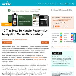
Only include high priority content Prioritize your content and leave out less important items on smaller devices. The website of The Sweet Hat Club prioritizes and rearranges the main menu items for mobile devices. Planning And Implementing Website Navigation. Advertisement The thing that makes navigation difficult to work with in Web design is that it can be so versatile.

Navigation can be simple or complex: a few main pages or a multi-level architecture; one set of content for logged-in users and another for logged-out users; and so on. Because navigation can vary so much between websites, there are no set guidelines or how-to’s for organizing navigation. Designing navigation is an art in itself, and designers become better at it with experience. It’s all about using good information architecture: “the art of expressing a model or concept of information used in activities that require explicit details of complex systems.” Organizing Navigation Structure Perhaps the most difficult part about navigation on the Web is organizing and designing it. Primary vs. Most websites, especially those with a lot of content or functionality, need navigation menus. 1SpeckyBoy2 Primary navigation stands for the content that most users are interested in.
How to Design the Best Navigation Bar for Your Website. Daniel Alves is the design director for the small business web design division at the digital marketing and web design company 352 Media Group.
The navigation bar is the most important design element on a website. Not only does it guide your users to pages beyond the homepage, but it’s also the singular tool to give users a sense of orientation. With this in mind, it’s important to adhere to time-tested design and usability conventions. Doing so will give your users a comfortable and easy reference point to fully engage with your content. Despite the necessity of an accessible navigation bar, usability studies on navigation across the web aren’t positive.
So how do you ensure that your users are able to quickly and easily find the information they need? The Basics Employ these basic concepts to help users move more efficiently through your website.