
Off Canvas Menus with CSS3 Transitions and Transforms. Now as an easy to use jQuery Plugin # Introduction Off Canvas Menus are used primarily with Mobile and touch devices and can provide an extremely useful and beautiful experience for your users.
This tutorial will cover an introduction on them, a getting started guide, some improvement tricks, and then finally some awesome demos for you to build off of. 16 jQuery Off Canvas Slide Menu Plugins. In this post i have put together 16 jQuery off canvas slide menu plugins for you to use and add to your next web design project. scotchPanels.js is a jQuery plugin for easily creating off canvas menus, navigations, and other panel types such as images, videos, and iframes.
Come realizzare un menu a comparsa laterale con un clic. jQuery off canvas menu Plugins. Overlay jQuery - effetto popUp con finestra modale di dialogo. In questo articolo scopriremo come creare un effetto di finestra animata in overlay grazie alle potenti librerie jQuery.
Per chi non lo sapesse per overlay si intende l’apertura di una finestra in popUp restando però nella stessa pagina di navigazione e rendendo lo sfondo “oscurato” per centrare l’attenzione sulla finestra e sul suo contenuto. Un po come avviene, ormai spesso, per le immagini. jQuery Mobile Panels. Tryit Editor v2.5. Tryit Editor v2.5. Create An Off-canvas Sidebar Navigation with jQuery and Bootstrap. jQuery.mmenu on-canvas and off-canvas menus. By default, the plugin will prepend the menu to the BODY and hide it from sight.
When the menu is being opened, the page slides out of view, revealing the menu and blocking the page from interaction. In other forms, the menu can be revealed by sliding in view, hiding the page behind it. This kind of behavior is called an "off-canvas" menu. An "on-canvas" menu on the other hand, is always opened and visible. It is not prepended to the BODY and will not slide out the page. Off-canvas. The Psychohistorians Set in the year 0 F.E.
("Foundation Era"), The Psychohistorians opens on Trantor, the capital of the 12,000-year-old Galactic Empire. Though the empire appears stable and powerful, it is slowly decaying in ways that parallel the decline of the Western Roman Empire. Hari Seldon, a mathematician and psychologist, has developed psychohistory, a new field of science and psychology that equates all possibilities in large societies to mathematics, allowing for the prediction of future events.
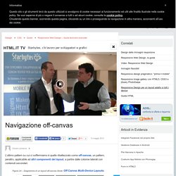
Using psychohistory, Seldon has discovered the declining nature of the Empire, angering the aristocratic members of the Committee of Public Safety, the de facto rulers of the Empire. Basic. Off-Canvas Menu Effects. Perspective Page View Navigation. Some effects for a perspective page view navigation where the page itself gets pushed away in 3D to reveal a menu or other items.
This navigation idea is seen in mobile app design and we wanted to explore some more effects. View demo Download source Pushing the site content aside to reveal a navigation has certainly become a trend for mobile navigations. The approach reflects some practices in app design where “views” are shown with animations. We’ve experimented a bit and we’ve come up with a small set of effects that take the page and move it in 3D to reveal a navigation (or some other content if you like).
Please note that this is highly experimental, so let us know if you find any bugs or problems. For the general effect to work, we need to wrap our page into a perspective wrapper. When we trigger the effect, we’ll need to change the position and overflow of the divisions to just show the current view. There are two styles for the menus which is a horizontal and a vertical one.
Responsive Web Design - tecniche avanzate. L’ultimo pattern su cui ci soffermiamo è quello ribattezzato come off-canvas, un pattern, peraltro, applicabile ad altri componenti del layout, a partire dalle colonne laterali con contenuti secondari.
In questo scenario, abbiamo sempre elementi inizialmente ‘nascosti’ che vengono poi mostrati a richiesta. La differenza è che sono ‘nascosti’ collocandoli in un’area esterna alla parte visibile della finestra del browser. Se sui browser desktop la cosa potrebbe avere poco senso, lo ha sui browser di dispositivi come tablet e smartphone che quando sono aperti coincidono di fatto con le dimensioni dello schermo e non possono essere ridimensionati. Resa popolare dall’applicazione mobile di Facebook, questa tecnica è implementata, tra gli altri, sulla versione mobile di Wikipedia. Off Canvas Multi-Device Layouts. Most multi-device layout patterns for the Web are designed to rearrange page elements within a visible browser window.
Off canvas multi-device layouts, on the other hand, use the space outside a browser’s viewport to hide secondary elements until people need them. Jason Weaver and I put together demonstrations of several new off canvas layout patterns. Why Off Canvas Layouts? In my survey of multi-device layouts patterns, I found several common ways to adapt Web page designs to a variety of screen sizes. Across most of these patterns though, small screens got the shaft. Since many multi-device layout patterns are only considering the visible browser window as their canvas, this situation is pretty much inevitable.